The German Ivory Museum, Germany
Through the collection of Count Franz I of Erbach-Erbach (1754-1823), the Odenwald town of Erbach became the centre of German ivory carving and has exhibited its extensive collections at the Werner Borchers Halle for many years. As of autumn 2016, a small but exquisite part of the ivory sculptures moved to a new home in the Erbach Palace.
The remarkable exhibition concept was developed by Sichau & Walter Architects BDA with lighting design from Licht Kunst Licht, who came on board after the architects convinced the client – the Administration of National Palaces and Gardens of Hesse – to include a lighting designer in the process.
The concept of displaying ivory artefacts is a controversial one, something that Licht Kunst Licht were all too aware of before joining the project. However, Stephanie Grosse-Brockhoff, of the Germany-based firm, believes that the lighting design isolates the sculptures as relics of a bygone era:
“Ivory is a controversial subject. Species protection programmes have successfully lobbied to outlaw poaching and the procurement of ivory, which should be applauded,” she said. “Exhibiting ivory artefacts, although old ones, did raise moral concerns.
“This is a powerful built metaphor of how this art seems to have fallen out of time and now exists in a kind of parallel universe.”
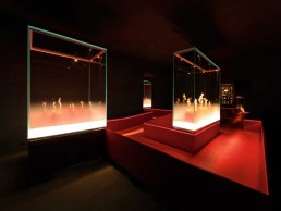
The concept for the museum, which was already established before Licht Kunst Licht came on board, was for the exhibition to free itself from the building envelope and present the collection of intricately carved ivory in darkened rooms with spatial boundaries sprayed in anthracite. The idea for this, according to Stephanie Grosse-Brockhoff of Licht Kunst Licht, was: “to create an exhibition where the exhibits appear to be floating in mid-space,” and “visually disappear above a certain height.”
Achieving this ‘floating’ aesthetic wasn’t easy, as Grosse-Brockhoff explained: “It was extremely difficult to maintain the invisibility of the space, as we had to pay attention that no light source would be reflected in the show case glazing.
“Not only did we try to avoid the mirror reflections of the light sources in glass surfaces, but also projected reflections from glass surfaces on the ceiling and walls. Therefore, all light sources had to be carefully shielded, particularly when located outside a show case.”
In order to get the right look, and in a bid to avoid any unwanted reflections, the lower third of the glass panes in each show case is frosted, and fitted with XAL edge lighting, integrated into the base. This frosted glass dissolves smoothly into clear glass. By virtue of the edge light, the frosting assumes a gentle brightness, evocative of a haze that shrouds the object holders.
Alongside this, small profiles with miniature projectors, also provided by XAL, are installed in the upper corners of the showcases. A test on site revealed that in this spatial context, silver anodised profiles and luminaires are less visible than black anodised equipment.
The miniature projectors stage the exhibits in an accentuating and glare-free fashion. Larger display cases make use of an alternating layout of spot and medium optic luminaires. This creates the impression that the luminous figurines within emerge from a sort of haze. The converters for both the frosted glass edge light and the miniature projectors are removed and stored in an accessible void in the show case’s plinth.
The small, delicately integrated lighting was difficult for Licht Kunst Licht to implement, but Grosse-Brockhoff is still pleased with the outcome: “The integrated lighting had to be mounted inside a cabinet with a fully glazed hood, using glass mitre joints,” she explained.
“There were no corner profiles to conveniently hide our lighting devices, therefore the light fittings had to be as ‘invisible’ as possible, and therefore particularly small.
“The beauty of the light profile that we used is that it not only houses all the lighting elements, but also shrouds all the cabling and branches. The electrical feed, connecting the immediate profile with the show case’s base, runs in the mitre joints of the glazing. Using a flat cable allowed us to keep it hidden.”
The idea of ‘maximum containment’ of the lighting elements initially led Licht Kunst Licht to try and integrate all light sources within the cross section of the profile. However, Grosse-Brockhoff explained that these light sources were “impossible to shield” in a way that would still respect both the scenography and the brief itself.
Because of this, the lighting design team opted for individual adjustable projectors that were added to the profiles, which helped to create the dramatic effect that they sought.
This approach also combined well with the ‘haze’ lighting, as Grosse-Brockhoff continued: “We didn’t directly specify the fitting for the edge light, we just stated our requirements to the show case manufacturer, who then directly integrated it into the show case.
“In order to support the idea of a haze, the light colour was always meant to be neutral or cool, as opposed to the otherwise warm white light colour of the show case lighting,” she added. “Initially, we specified 4,000K for this element, but it ended up being 5,000K, and the contrast works nicely.”
Leading across this visually dissolved space is a ‘pier’ that offsets the differences in light levels and interconnects the show cases with a proverbial red thread. Like luminous glass cubes, the display cases are lined up on the walkway.
The pier and its low balustrade are clad in red leather, and the walking surface transforms into a seemingly suspended path in an intangible, almost imperceptible spatial envelope, by virtue of concealed LED light ribbons in its balustrade, courtesy of LED Linear. For this purpose, a groove had been milled into the upper part of the inward-facing balustrade flank. The slanted apertures are aimed at the path and house LED light ribbons fitted with honeycomb louvers that shield the light sources even from longitudinal views. The upper part of the guard can be removed for installation and maintenance of the LED strips. Yet, the balustrade appears to be massive and carved from one piece. The LED converters are remote and hidden in a cavity underneath the raised pier.
Although the design brief was mostly consistent, from Licht Kunst Licht’s early involvement right through to the actual execution, the balustrade did go through a number of changes, owing to the need for ‘invisible’ lighting.
“Initially, it was a slender metal frame on either side of the pontoon. It would have been considerably more difficult to invisibly integrate a lighting profile within that frame,” Grosse-Brockhoff explained. “Then the balustrade became a massive wood element, a vertical extension of the pontoon, creating a seamless, sleek element that was definitely an improvement of the exhibition design – and facilitated the integration of lighting in the balustrade.”
Throughout the museum, Licht Kunst Licht employed a very minimalist lighting scheme, whereby the majority of the lighting was on the walkway balustrades and the exhibits themselves. As such, the exhibition appears to have very little ‘contact’ with the building itself, save for in the final ‘temporary’ exhibition, which features unprocessed tusks, where tracks with miniature spotlights were installed on the ceiling. This approach throughout the museum serves to make the rest of the space disappear, allowing visitors to focus purely on the intricate ivory carvings on show.
One of the spaces within the museum uses existing historical closets that now display a wealth of objects that have been fastened to the molleton fleece-clad rear wall. These are set in scene by linear light sources concealed inside the furniture. For this purpose, the continuous LED light strips have been installed horizontally in the overhead part and vertically in the flanks of the closets. The mounting locations have been chosen in such a fashion as to combine an optimum illumination with a minimum visibility of the light sources.
The display case illumination, the glass edge lighting, the pier illumination and the orchestration of the existing closets can all be switched and dimmed individually by showcase and by room. The dimming values of each component are adjusted to meet dramaturgical and spatial criteria. Following the prevalent red hues of the showcase plinths and pier, all lighting elements use warm white light. This further emphasises the exhibits by virtue of colour perspective and helps to materialise them through focal glow.
The final space, dedicated to temporary exhibitions, sees the visitor off with a view of yet to be processed elephant tusks, revealing the more controversial side of the exhibit. Ceiling mounted miniature projectors from XAL underline the exhibit‘s drama. These luminaires originate from the same system as the display case lighting, but are more powerful. In order to better fit into the spatial envelope’s colour, they are anodised in black, forming a frame to ensure that with changing contents, exhibits in the periphery and in the centre will be optimally set in scene.
Grosse-Brockhoff believes that this striking final exhibit serves as an effective reminder of the controversial nature of the artwork on display.
This is emphasised greatly by the hidden, glare-free lighting design from Licht Kunst Licht, which underscores the contrasting exhibition scenery, while brilliantly orchestrating the treasures on display.
“The main contribution of the illumination to the space is that it really reveals the used materials, colours, and above all, the exhibits. You perceive the light only through the revealed surfaces, as the fittings remain visually withdrawn. And this is something that we are very happy with.”