
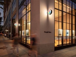
Google Store, USA
The first ever physical Google Store opened in New York this June. Designed by Reddymade Architecture, a complementary, minimal lighting scheme was developed by Reveal Design Group.
The opening of a new retail space for one of the global tech giants always comes with a buzz of excitement – whether it’s the latest Apple store, a new flagship location for Microsoft, or Amazon’s supermarket chains.
This buzz has once again been seen with the opening of Google’s first ever physical retail space in New York this June.
The store, located on the ground floor of Google’s headquarters in Chelsea, Manhattan, was designed by Suchi Reddy, Founder of Reddymade Architecture and Design, with the concept centred on the core principles of Neuroaesthetics – a theme that Reddy explored in A Space for Being, a collaboration with Google and its VP of Hardware Design, Ivy Ross, at Salone del Mobile in Milan.
The architect’s work follows the belief that “form follows feeling”, meaning that the design has been carefully calibrated to the human, and positively influences wellbeing, creativity, and productivity.
The architecture and interiors of the store are a pragmatic, playful expression of this motto, bringing a unique focus to the interplay of good design with human perception. The intention from Reddy was to “re-awaken visitors to the childlike wonder found in the technology and digital innovation on display”.
The architectural lighting for this landmark store was designed by Reveal Design Group and co-founder Levia Lew explained how the firm got involved in the project: “My firm and I are currently working on a large residential/hotel project in Florida, which started in 2017 with Suchi Reddy. Suchi and I found that our creative processes are very compatible; we have a lot of fun designing and problem-solving together. In 2019, she invited me to assist on A Space for Being, the Google partnership for Salone del Mobile. The success and impact of the installation paved the way for the collaboration between Reveal Design Group and Reddymade for the flagship store.”
The overall design for the store is warm and calming, with an abundance of soft, tactile surfaces and natural materials such as cork and wood. Lew explained how this impacted on the brief for the lighting design: “The overarching goal and design vision was focused on sustainability and natural materials to convey a sense of light, openness and possibility, as well as a feeling of ‘home’ given the products and services that Google planned to showcase in the space. The goal of LEED Platinum certification also set very clear boundaries as to what kind of lighting could be used in terms of energy consumption.”
Lew explained that because of the material palette selection and “flow” of the space, the lighting concept was kept deliberately minimalist and restrained. As such, a precise and orderly arrangement of fixtures in the 16ft ceiling, with an aperture size and warmer colour temperature more typically found in hospitality and residential spaces, was used. This, Lew added, served to highlight the dramatic architecture, while simultaneously bringing the visual focus down to the human level to create the sense of home.
Alongside this, moments of intimacy and relaxed ambience were intended through the selective use of integrated lighting, with illuminated display cubes and focused lighting casting a warmth, while visually organising the expansive space into comfortable areas and differentiated zones.
“The goal was to create a sense of differentiation between each ‘room’ as Google wanted them to embody the various experiences of the products and services featured within,” said Lew. “Thus, one area is a homey living room setting, another is a gaming setting, and another a product showcase setting. They all had distinct personalities to be shared.”
One of the key design elements that Lew had to factor in when developing the lighting scheme was the abundance of natural light that fills the store, and how to marry this with artificial lighting. With the lofty, 16ft ceilings and huge, double height windows, daylight, and the ambient brightness of streetlights outside, were prominent influences on the interior of the space.
However, instead of seeing this as a challenge, Lew was eager to create a scheme that would complement the ambient daylighting, while using this as a tool to enhance the natural materials and clean lines of the interior design.
“The space was already naturally lit though the curtain wall with the most powerful source we have: the sun,” she said. “One of my mentors years ago said to me that a space will tell you how it wants to be seen. In this case, the sheer amount of daylight coming in through the windows was a major force that we could not fight, nor did we want to.
“The room, with its light, wide open planes and surfaces that gently reflect the ambient light from the window directed the choice to continue that gesture by gently washing the interior surfaces with light rather than to accent them with dramatic beams.”
Softly diffused and reflected light creates an even ambience with relatively few fixtures; Lew then selectively accented gathering and product showcase areas with direct illumination to create visual contrast to add emphasis on certain zones.
She continued: “Lighting designers often speak about painting a space with light. In this case, I used light like watercolours, to wash and blend surfaces, allowing the crisp lines of the architecture to cut its own path through it. The paintings of Morris Louis and Mark Rothko, as well as the works of James Turrell, were initial inspirations for the design of this project.”
Thanks to a strong pre-existing relationship with architect Reddy, Lew and her team were given the trust and freedom to create a lighting scheme that would sit in harmony with the store’s interior design. She explained: “My team worked closely with Suchi’s team from start to finish. We were in near-constant contact, problem-solving and coordinating field conditions along with the usual challenges that come up during the design and construction process.
“However, once Suchi’s vision was strongly established, we were given the freedom to come up with our own lighting scheme and ideas to communicate the intended feeling within her design. We have an exceptional, open dialogue between our two firms. It is incredibly refreshing and rewarding when ideas flow both ways with such honesty and clarity, allowing for that rare creative freedom and trust.”
This trust meant that, while the approach of “form follows feeling” was an integral facet of the architectural design, Lew could bring her own interpretation of this mantra for the lighting.
“Like many lighting designers in the architectural field, I was trained in the theatre, where I learned to use light to elicit audience emotion based on script and story. My design methodology is inspired by the way something makes us feel, whether it’s a sculpture, space or building. I’m driven to discover and tell a meaningful story, and to evoke an intended feeling.
“However, light is both abstract and technically scientific at the same time. The Google store’s space and architecture made me feel and see specific things, but from a lighting perspective, in order to realise those feelings in reality, hard science and calculations are required to make light behave as we envision.”
Inside the store, the warm lighting and neutral tones guide the eye to one of its main focal points, dubbed the “Imagination Space”. Standing at the entryway to the store, a semi-circular node of extruded glass tubing suspended between the ceiling and the floor refracts light and invites visitors to interact with Google’s products and technologies on an individual level.
Lew explained how a minimal lighting approach helps to bring this key element of the store to life: “Suchi’s vision for the Imagination Space was so elegantly minimalist with its clean, austere lines and magnificent fluted tubes enveloping the visitor in a glass cathedral of light that it seemed vulgar to treat the volume with more than what was necessary to make it sparkle.
“We exploited the physical optics of the vertical fluting by using a simple, uninterrupted circle of light from inside of the column so that the visitor’s kinetic experience changes depending on whether they are inside or outside of the cylindrical space.
“I am always looking for inspiration and had an ‘aha!’ moment one night at home, noticing how light reacts through the crystal strands of my selenite votive when a candle is lit within. It is exactly the same principle at the Imagination Space, only on a much larger scale.”
With the store designed according to the highest standards of sustainable and renewable practices, receiving LEED Platinum certification in the process, Lew was given limited wattage allowances for any fixtures specified for the project. “What that translates into is minimal quantities of lighting fixtures, stringent energy efficiency and functional longevity criteria for those fixtures, and the use of sensors that limit energy consumption,” she explained. To achieve this, she opted for fixtures from USAI, DMF Lighting, Kelvix and ETC, alongside Lutron’s Vive wireless control system.
As the first physical retail space for the tech giants, the Google Store will no doubt be compared to those of its rivals. However, Lew said that such comparisons didn’t factor into her approach to this landmark project. “I try very hard not to get distracted by previous projects and design gestures, since every project has its own DNA and story it wants to tell,” she said.
“In the theatre, we learned early on that as every show is unique, you must approach each production like a blank slate. This also goes back to my belief that every space will tell you how it wants to be seen. What I consider and strive for above all is that each client sees the best possible reflection of themselves and their intentions in the final result.”
This final result is a space that encapsulates the warm yet inspiring aesthetic that both the architects and lighting designers aimed for. And while the environmentally conscious, sustainable interior design is gaining plaudits, Lew feels that the lighting goes a long way to creating a strong impression on visitors.
“Lighting is crucial to creating a subconscious impression that presents itself through an emotional response to the viewer,” she said. “Suchi wanted to create a welcoming feeling of openness and possibility. By taking our cues from her vision and material palette as well as the actual spatial conditions, we were able to create a cohesive layer that ties all interior and architectural elements together.”
Adding this landmark project to the Reveal Design Group portfolio was a singular opportunty and privilege for Lew, yet she says the greatest joy is seeing the pride her team has on completing a winning project.
“It is certainly exciting and gratifying to add such a successful, groundbreaking endeavour to our portfolio,” she said. “However, what I find most rewarding is seeing our team’s pride in a successful project after tirelessly investing tremendous dedication and effort.
“Our Google Store project management team – Josh Klein and Ashton Allin – spent more than two years of hard work and careful coordination to achieve the design and I am incredibly proud of them and their teamwork.”