

Daiwa Roynet Hotels, Japan
In lighting design, the old adage goes that no two projects are the same; that each has its own requirements, its own concepts and its own unique end result.
This was particularly apparent for Akari-Lisa Ishii, Director of I.C.O.N. who has designed the façade lighting for three branches of the Daiwa Roynet Hotel chain across Japan. For these hotels, rather than create a uniform scheme across all sites that would become synonymous with the Daiwa Roynet brand, she instead drew inspiration from each hotel’s context – whether this is geographical, historical, cultural, architectural or temporal context – to create something unique to its location.
The notion of context is something that Ishii believes is integral to effective lighting design, in order to avoid cityscapes from becoming repetitive and boring. “Being bright or colourful is not a problem itself if it is an appropriate concept based on contextual research,” she said. “When you ignore the context, you end up with a similarity all over the world. I love the exciting, dynamic lighting in Times Square, in Shibuya, but if you only have this, it is going to be very boring. So I warn myself not to repeat the same thing everywhere in the world.”
The first hotel that Ishii was asked to illuminate was in Ariake, Tokyo. I.C.O.N. was appointed as the lighting consultant for the hotel by architect Azusa Sekkei, who has worked regularly with the Daiwa Roynet hotel group. “At the first presentation to the client, their president admitted that he always thought lighting was one of the key issues to create a hotel’s image, but he did not know how. Since that day, our close collaboration started, and the journey continues to this day,” Ishii explained.
The Ariake hotel is situated in a new district currently under development in the Tokyo Bay Area – a district that was intended to be one of the core sites for the 2020 Olympic Games (now rescheduled to 2021). The hotel, which is adjoined to a shopping centre, is also at the crossing point of two major railway stations, with a public concourse connecting the two stations. The exterior lighting therefore needed to signify the nocturnal identity of both the hotel and the area, while providing a visual connection between the stations in a unique and interesting way.
“The architectural context is always very important, and the architect came up with an interesting crossing notion of horizontal and vertical design,” Ishii explained. “The lighting design concept that I proposed to the client was of a Light Crossing Point; this was broken down into the urban crossing point, the vista crossing point, daily crossing point, feeling, green and time crossing point.
“The geographical position is very important for this particular project, so it was obvious for me to emphasise the high-rise building with lighting. This is the ‘vista crossing point’. On the other hand, the horizontal dimension was underlined by lighting on the great eave connecting the two buildings of the complex. This is called the ‘urban crossing point’.”
The façade for the high-rise tower was therefore illuminated with a semi-custom type of Stanley Electric’s LEDS Focus. With a beam of just 3°, it is one of the narrowest LED spots, and casts a strip of light halfway up the tower. “There was a space constraint for the façade uplighter,” Ishii explained. “The limit was at 15cm from the front of the façade, and the standard fixture from Stanley Electric was too large. But there is no alternative (equivalent or smaller) with a 3° narrow beam, so I requested the manufacturer to make a smaller version of it, incorporating six LED units instead of nine.”
The “daily crossing point” came in illuminating the corridor that joins the two railway stations. Here, Ishii sought to represent the feeling of the changing seasons via indirect lighting that changes colour each month – cherry blossom pink in April, ocean blue in July, autumnal orange in October, etc. “Those who are passing by every day on this concourse from one station to another, they might be stressed out, going back and forwards from the house to the office every day, so I wanted to help them, to remind them of the passing of time and the changing of seasons,” Ishii added.
On the shopping centre, a large beam was magnified in white to express the continuity of the complex, while in the same way, landscape lighting and exterior circulation spaces reinforce this effect, while complementing Azusa Sekkei’s architectural design.
“I also tried to dramatise the entrance of the hotel with a special lighting treatment, while the green crossing point also became a featuring element, as the surrounding landscape was designed by a famous garden designer. For me, it was interesting here to play with shadows, casting them onto the façade. The architecture is quite geometric and sharp, so to break this harshness with the organic green shadow was quite interesting.”
After successfully illuminating the Ariake Daiwa Roynet hotel, Ishii was asked to come up with another lighting scheme for the brand’s Kyoto branch. Working once again with architect Azusa Sekkei, the hotel features a different architectural design – a conscious effort to differentiate the hotels, and one that Ishii said “was always very inspiring for me”.
The former capital of Japan from the eighth to 19th century, Kyoto is a city very rich in heritage and history, and as such, Ishii wanted to tap into this history for the hotel’s façade.
Situated across from the main rail station of Kyoto, the entrance of the hotel is located at the angle of the corner building. Therefore, instead of emphasising the horizontal and vertical lines, Ishii wanted to bring a dynamic movement to the façade through lighting. “In traditional Japanese paintings, this diagonal composition is very present to give a kind of dynamism to the painting,” she explained.
From here, Ishii drew further inspiration from Kyoto’s heritage. “This was our capital, where the nobles wore very beautiful kimono. From the Middle Ages, the noble women dressed in 12 layers of kimono, and they established very sophisticated colour codes by using different combinations of colours in the kimono to express the seasonal changes. I took this as a specific theme for this project, and I proposed three different modes of lighting, using colours inspired by the kimono combinations.”
The lighting scenarios for the façade give a life to the building, while anchoring it to its location through a slow rise of energy, as light rises diagonally from the corner entrance to the sky. The three different modes proposed by Ishii are all in coherence with the seasons; a discreet alternation between warm and cool white, a soft but colourful ‘daily’ mode with three tones of the same colour, and a ‘festive’ mode with three more vivid colours. All modes will have the same subtle movements, and will be used according to the calendar.
“The concept that I extracted was ‘Vibrant Light Poetry’, using traditional Japanese colours, original movements akin to candlelight, and diagonal composition inspired by local art to emphasise the entrance,” Ishii explained.
After creating the initial lighting concept, Ishii began thinking about how fast or slow the lighting should change. For this, she went to the site and observed the movement of cars and people passing by in front of the hotel. Here, she noticed that the area had a certain rhythm, where people move at a more laid back pace, so she applied this rhythm to the lighting movement.
“It was intention that we didn’t have very speedy changes, because this is a hotel where people come to rest. Instead we have a very subtle change of colours. It takes one minute for a full loop, so if you don’t gaze at the façade, you don’t see that it is moving, but every time you look at the building, it has a different expression, which gives it a richness.”
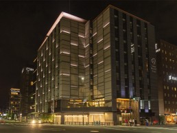
In February 2020, the third collaboration between I.C.O.N. and Daiwa Roynet was officially opened, this time in the Kyobashi neighbourhood of Tokyo. The Kyobashi district is characterised by a grid-like planning, going all the way back to the 16th century, while the architecture surrounding the hotel dates back to European-style modernisation that began in the 19th century. Playing off the square, grid-like vocabulary of the area, the architect came up with a cubic design for both the interior and exterior of the hotel. The exterior lighting was therefore guided by this cubic approach and the grid of window frames that span across the façade.
Each window frame is contoured by light emanating from a discreet fixture – iGuzzini’s Trick – which creates a classy light effect, without light spilling into the rooms. “Trick has a sharp-edged beam thanks to its special optical lens, so I was not worried about light spill into the guestrooms at all. But in order to convince the client, we showed the effect through a mock-up. At a very early stage of the lighting scheme, the architect prepared a window frame mock-up in which the fixture was integrated to present the unique effect to the client. Seeing is believing, and at a glance, they were impressed and convinced,” Ishii explained. She then added a sense of movement to the façade lighting, helping the building to stand out further from its neighbours.
“The concept for this hotel was ‘Light (e)motion in Urban Rhythm’. Learning from our experience in Kyoto, I immediately wanted to talk about urban rhythm in this project,” Ishii said. “This concept contains underlining grids, a classy warm white light, and elegant integration in architecture from the pedestrian perspective.”
Integral to this concept were three different dynamic lighting effects: the first a diagonal movement of light up the building; the second sees the entire light levels dim up and down very softly, like a gentle urban heartbeat; the third is a movement of light from one side to another, moving at typical pedestrian walking speed, which Ishii noticed following some research was faster in this business-oriented district of Tokyo, compared to the more touristic old city of Kyoto.
By taking a unique approach to each hotel, based on their local geography, history, culture and urban composition, Ishii believes that the lighting helps to create a bespoke branding for each location, particularly after dark.
“The lighting creates their identity at night,” she said. “Many of their clients arrive late and only see the hotel by night. When they leave, they don’t look back. When I reminded this fact to the hotel owner, they were astonished, because they never thought that their ‘main face’ was the night view.
“Thanks to the lighting, each hotel’s presence is symbolically connected to its surrounding urban context, thus its nightscape adds a specific character to the neighbourhood while always anchored to its background in some way,” she added.
“The Ariake hotel, since it is in a developing new quarter of Tokyo, became an urban ‘core’ visually, functionally and symbolically at night. Kyoto’s added veritable colours to the area that was previously sober and dim compared to the central part of the city. In Kyobashi, the hotel certainly contributed to bring a modern feel to its prestigious streetscape with the movement of light, while still being in perfect harmony in terms of colour and intensity.”
Since completing these three hotels, Ishii has remained in contact with the Daiwa Roynet hotel group, and is already in talks to illuminate two more hotels that are currently under construction, with many more still in the pipeline.
And she believes that the close collaboration and communication between the lighting designer, architect and client, only helped in creating such a positive end result. She concluded: “It’s a great joy to work with an understanding client and a cooperative architecture firm with whom we can build a solid, mutual and continuous confidence. A good lighting project is surely a fruit of good collaboration.”