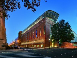
Museum of the Bible, USA
In the heart of Washington D.C, a stone’s throw from the United States Capitol building, designers at SmithGroup have renovated a 1920s era warehouse, transforming it into the new Museum of the Bible.
The museum repurposes the 400,000sqft building with exhibition spaces, a theatre, restaurant and ballroom, while a six-storey atrium and two-storey glass roof addition bring a new, modern element to the original architectural structure.
SmithGroup was responsible for the architecture, alongside the lighting design, and the firm sought to reflect the unusual architectural heritage of the site, as well as the museum’s non-sectarian educational mission, by highlighting some of the traditional elements of the building’s façade, such as the original warehouse loading dock, which was transformed into the main entrance to the building.
Careful to respect the heritage of the building, while still creating something new, the design team looked to the concept of a palimpsest – the idea of adding something new to an existing structure while still retaining trace elements of the original features.
Luke Renwick, Associate Lighting Designer at SmithGroup, explained how the lighting design adhered to this concept: “From a lighting standpoint, we tried to grab hold of accenting elements that remain or are resurrected, no pun intended, from the industrial age with lighting – things like the canopy and the hierarchy of brightness at the entry point, focusing on the entrance, which was the remnant of the loading dock – as well as the glass addition on the roof.”
However, due to the site’s proximity to the Capitol building, SmithGroup had to comply with the ‘urban fabric’ of the city, as Rodrigo Manriquez, Principal at the firm, explained: “The site is a couple of blocks from the Capitol building, and it literally falls into the last block of the jurisdictional review of the Commission of Fine Art, an independent federal agency charged with giving expert advice within the District of Columbia on matters of design and aesthetics, as they affect the federal interest and preserve the dignity of the nation’s capital. The Commission is composed of seven presidentially appointed experts in relevant disciplines including art, architecture, landscape architecture and urban design. It was a challenge for the project to have a lighting design that was sensitive to all things considered.
“There’s a hierarchy of brightness within the district that nothing can be brighter than the Capitol, so the technical aspect, even on the arrival sequence of the building, had to be balanced to meet that criteria.
“Because of that it turns out to be more respectful to the architecture and reverent to the existing components, while the new additions are also very sensitive when it comes to this identity and impact to the urban fabric.”
Because of this “hierarchy of brightness”, the lighting for the external façade remained fairly subtle, as Renwick described, serving to accent the architectural elements of the building, including the huge, 42-foot bronze panels mounted either side of the new entrance at the old loading dock.
“The panels represent the Gutenberg Printing Press, and include Genesis in Latin type face,” Renwick continued. “We used Bega linear ingrades to highlight the entry point and provide texture to the typeface. The housings had to be fairly small to fit into the structural footing detailing.”
Just inside the main entrance portal is a large art glass installation. Developed by artist Larry Kirkland, this component is comprised of a four-layer sandwich of glass, with the backside sandblasted to create an imprint of Psalm 19 in Greek – a replication of a biblical codex exhibited within the museum. This deep sandblasting has been sandwiched with a film in the glass, giving a rich golden brown image, while the front side features sixteen different translations of the Psalm engraved into it.
The number of layers, Renwick explained, serves to draw out the engravings, the translations and the rich texture and colour of the installation, while the dynamic dimming of Lumenpulse’s Lumenfacade inground and graze fixtures, and Philips Color Kinetics’ eW Reach Compact flood lights “activate” the glass for visitors as they enter the museum.
Inside, the firm designed an experiential lighting solution that uses light to guide visitors on a journey of individual discovery. By encouraging movement, reflection and curiosity, the lighting quality is intended to spark a transcendental guest journey that parallels one’s personal journey with the Bible itself – sometimes subtle and ethereal, and other times very explicit.
Although SmithGroup was not involved in the design of the exhibitions themselves, the team wanted to extend the experience of the exhibits into the rest of the site, ensuring a consistency in the conceptual integrity and adding to the experiential nature of the museum.
“If you go to a museum, you enter a pavilion or an exhibit area and you’re immersed in that experience,” said Manriquez. “It’s very controlled, it’s theatrical in its nature, but as soon as you leave that exhibit, you go into a neutral, what we call a negative space or transitional space.
“Our challenge was to take all that negative space and fill it with something that is interesting, without breaking away from the overall experience, framing it in a way that you never left the experience, but you give yourself some time to pause, regroup and reorient yourself within the building.”
A key example of this can be found in the building’s main lobby. The long corridor an avenue of columns clad in Jerusalem stone framing a dramatic digital ceiling installation, created by interactive media designers at Technomedia. This breath-taking space serves to immediately immerse visitors into the museum experience as they enter, as Renwick explained: “The lobby is one of those spaces where you can blur the lines between museum public space and museum exhibit space,” he said.
“We have the digital ceiling, that’s changing out different scenes and is very interactive, but at the human level we focused on the columns and the floor to really engage people and make them part of the experience.”
To do this, the team opted for a bottom up grounding of the columns, not only to ground them conceptually in the space, but also to provide a more pedestrian scale in this otherwise grand space. Philips Color Kinetics Evenbalance fixtures wash the columns in light, creating a subtle, rhythmic impression that, according to Renwick, “helps pull you down the volume of the space.”
Aside from the uplighting of the columns, the main source of light in the lobby comes from the ceiling display, which is reflected in channel glass either side of the installation and the highly polished floor. While the display is an impressive focal point for the lobby, factoring it into their designs initially proved difficult for SmithGroup.
“At first we didn’t know what this essentially giant light fixture was going to be,” said Renwick. “We knew that it would likely be able to illuminate the entire space, but we felt like there were so many interesting elements to the space, that the screen could be visually overwhelming if we didn’t balance it out with other accentuated features.
“We wanted the ceiling to remain prominent, yet give people the ability to interact with it – not to simply be seen from thirty feet above them, but actually have some tangible experience with it. That’s where the floor finish, of all things, comes into play.”
The idea for a ultra-reflective floor surface was initially intended to complement the design team’s concept of lightness building from the lobby up to the atrium stairs, with the visual brightness drawing visitors up the staircase to the exhibit floors and ultimately the glass roof addition.
“We had this idea for the floor tiles to transition from dark to light colour, but we took it a step further and said what about the finish?” said Renwick. “We had this incredible luminous ceiling element, so if we made the floor a high polished finish, especially in some of the dark tile areas, that reflective contrast allows a visitor to look down and engage with the feature element on a personal level – fostering the interaction of the person and the museum, the person and the Bible, and ultimately relating one’s external physical experience to what the Bible is telling you and making you ponder internally.”
Throughout the museum, SmithGroup tried to bring an “ethereal” quality to the lighting design, complementing the site’s subject matter, and this is particularly evident in the six-storey atrium. The main vertical transition in the building, the atrium leads up to the glass rooftop galley, harnessing natural daylight.
Upon joining the project, one of the primary concerns given to SmithGroup by the museum was to open up the floor space of the atrium, getting as much natural light into the building as possible. “When we got involved on the daylighting front, the client wanted this grand stair naturally illuminated by a central skylight. We worked with the team to make the floor openings as big as possible, keeping the staircase out of the way so that it’s not blocking the daylight contribution, and also maximised the north façade fenestration for diffuse light,” Renwick explained.
“From there, it turned into this suspended staircase, which is probably my favourite space in the building – just in the way that the lightness, and this increased ethereal quality that we worked hard to create, was successfully realised. As you climb the staircase there’s this beautiful notion of brightness that increases.”
Careful not to overpower the natural daylight pouring through the rooftop skylight, the artificial lighting solution for the atrium was fairly simple, remaining the same on each level while the daylighting increases. Renwick and the design team considered handrail lighting and integrating lighting into the stairs, but instead opted for simple cove lighting, utilising EcoSense Trov linear LEDs, alongside Lumenpulse downlights on each landing.
The journey through the museum culminates in the newest addition to the building, the two-storey glass rooftop ‘Galley’ that leads to the theatre, ballroom and restaurant. The parametrically designed galley space features an arced rib structure supporting a curtain-like glass wall, offering stunning views of Washington D.C and the U.S. Capitol building.
However, SmithGroup had to be cautious in creating the lighting for this space, considering the site’s standing within the urban fabric of the city. “We had to be very careful about what this looked like from the outside looking in,” said Renwick. “We didn’t want it to be a floating glowing element, so we had to be intentional about which surfaces to illuminate.”
The team specified track lighting from LSI and Soraa along the galley space, while accent lighting was added to the underside of the balcony, gently highlighting the curved ribs of the structure.
Further to these main spaces, the museum also features the grand Gathering Room – initially inspired by the ornate Palace of Versailles, this ballroom is adorned with a modern-day interpretation of Corinthian-style columns and contemporary-styled, custom-made chandeliers from Lasvit.
The Tabernacle, a theatre space inspired by the portable tent structures used as places of worship in biblical times features undulating ribbon panels that enclose the space. A simple RGBW cove lighting system from Traxon behind these panels allows light to peek through. Shifting in colour to evoke the changes in daylight from high noon to sunset, the lighting further complements the inspiration behind the room’s design. “It comes back to this concept of trying to let the lightness connect the different spaces, and be true to the symbolism without being overtly explicit,” Renwick continued.
The restaurant space, the last area to be completed, again channels traditional Middle Eastern structures in its design, this time calling to mind an outdoor souk market with its use of dark wood and a drooping fabric ceiling. This fabric ceiling is backed with tunable white Ribbonlyte LED tape lighting from Acolyte, simulating an open-air feeling in the space despite its enclosed nature and proximity to the overhead cooling tower. Again, this lighting is adjustable, from a natural, daylight-esque lunchtime setting, to a more moody and warm fine-dining evening experience.
The Museum of the Bible is a vast amalgamation of a number of different diverse typologies and spaces, meaning the design team had to work to ensure a conceptual integrity and consistency throughout the site, with a degree of coherency within the lighting. It was a challenge that could have been overwhelming for SmithGroup, but Manriquez is pleased with the end result.
“What gets me about this project is the intent to keep these different spaces looking as if they’re guided by the same principle of design, there’s a consistency. There were some challenges and concessions made at every corner, but we had a good team and a committed client that was willing to see it for what it was, and the integrity of the design remained.”
“Of course you could look at a project of this scale and say we could have done things a little bit differently,” Renwick added, “but the fact that our conceptual goals were completely realised, the fact that our team really executed these challenging solutions, I think shows that we were successful.”
However, while Renwick feels that there are minor elements that could have been improved upon, both he and Manriquez believe that the overall experience of working on the project throughout its seven-year completion period, and the collaborative creative process, helped to make it the success that it has become.
“I think we had a really good design team where everybody gave up some responsibility or pride if you will, or the protectiveness of their craft, and it opened it up to just solving the design challenges at hand,” Renwick said.
“It’s a great story, we learned a bunch about the different media – glass, metal, brick – and the actual tactile nature of lighting relative to each one of those materials,” Manriquez added.
“It might be a cliché, but I think the growth that the team had to be able to weather over a five to seven year period, the partnership attitude of the client to allow us to pull and push where creativity and creative solutions were coming in, made the project a success.
“That to me is the takeaway: the journey together, growing and really understanding each other’s crafts, that’s how we can make the process better for the next one.”