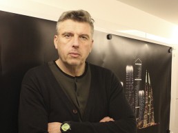
Lawrie Nisbet
Lawrie Nisbet, Managing Director of Lighting Design Partnership International recants his share of ‘accidental’ incidents that shaped a three decade long career, undulating over architecture, design, professional rugby and a specialisation in lighting of the built environment. Nisbet chats with Mrinalini Ghadiok, editor mondo*arc india, about some of his favourite things along the way.
“I would never call myself a lighting designer…” exclaimed Lawrie Nisbet, calmly but pointedly, as I introduced the idea of this interview to him. He went on to complete his sentence, “…I am a lighting architect.”
What could easily be confused as one of the same things, I understood what he meant – as an architect myself, I empathise with his sentiment. He clarifies, “My training is in architecture and urban design, which encompasses what you do and don’t do
with light. It is a critical part of the
larger process.”
For Nisbet, light and lighting are one of the many aspects of design, he just happens to specialise in the field. I guess he also just ‘happens’ to be one of the most sought after designers of light, with projects that range from small boutique hotels to high end residences, posh commercial spaces to institutes and award winning design competitions, of course dotted across the face of the earth.
Nisbet’s story is an interesting one, speckled with various ‘accidents’ as he terms them; these very incidents being what have shaped his journey and exploration in the field of design, with a special interest in light.
“My father was an architect, and a teacher of architecture and Urban Design. So I grew up with it, in that environment. It became a part of my DNA, and I ended up doing architecture… with no particularly great desire to do so.” This was one of the first accidents that plunged Nisbet into the conundrum of design. Having completed his studies at the Edinburgh College of Art, Nisbet took his father’s advice to travel.
On his return, he was faced with another ‘accident’. He found himself knocking on the doors of Lighting Design Partnership (LDP), recently founded by none other than the daring duo – Jonathan Speirs and Andre Tammes. While one hailed from architecture, the other brought the drama of theatre to the table. And Nisbet, fresh out of school, with the world at his feet was standing before them, ready to be plunged into the gruelling waters. Probably the third or fourth employee at LDP, he was exposed to projects that one would seldom get an opportunity to experience at that age, or stage of their career. He was put to task on international works, dealing closely with highly experienced and renowned architects, and some extremely coveted sites.
However, the ride lasted only a few years. “I moved to France to play professional rugby for a while,” he says nonchalantly. And as casually as his previous statement, he goes on to tell me that when he returned to Edinburgh, work just as easily fell his way.
“People started to ask me to look at this project, or that. And by accident, I again got into lighting and design work. I started with doing bits and pieces, then went on to doing more work, and eventually ended up establishing LDPi.”
Lighting Design Partnership International (LDPi) was founded in 2000 with a former colleague who also worked at LDP – Douglas Hamilton. Accredited by the RIBA, the Scottish practice was offered a vast range of works world over, including many masterplans. They completed the largest urban masterplan project for Putrajaya in 2001.
“Our background in design, and understanding of architecture and urban design was very unique. To be able to fully comprehend the environment, psychology of human behaviours, the process of urban design, what people do and how they live, and apply that to the design of light, was unique. We were speaking the same language as architects, and therefore we could explain thoughts better, and integrate ideas better. Knowing the process, and understanding it made it simple for us to work with others.”
This is the underlying philosophy that even today runs LDPi. All senior leadership is born from an architecture or design background. As Nisbet says, “Design is the most important aspect. Technology is something that can be built upon, and anyone can crunch numbers. It is design that not everyone can do.”
As an architect, it is difficult to refrain from expressing ourselves and limiting our views only to what we are asked. I know I face that, so I ask Nisbet if he ever finds himself offering unwanted advice. Back comes the answer, “All the time”! “When people understand that you have more to offer than just lighting, the discussion becomes more interesting. There are more aspects to design than just the world of lighting. In fact, during most design discussions, we don’t even talk about light.” Nisbet credits a healthy design discourse with architects from the world over that sets them apart, and enables LDPi to extend themselves to exciting work.
LDPi approaches each project in its individual environment. Although all design conceptualisation emerges from the head office in Edinburgh, they find themselves illuminating spaces and buildings from East Asia, to India, to the Middle East, all the way to the UK and Europe. Different markets of course pose their own challenges, but they most enjoy an international perspective.
I probe Nisbet into revealing some of his personal favourites. After a momentary consideration he says, “The Barr Al Jissah Resort in Muscat has to be one of our most demanding, yet rewarding projects. We were brought into the process at an early stage and spent a lot of time on it. We worked seamlessly with the whole team, developer and client included. It has now been operating for around fourteen years and still looks as good as then.”
Nisbet describes the architecture as ‘crafted’, and beautifully so. With total control over the site, the lighting architects had the freedom to explore and experiment. With 80% of the arrivals being international and 80% of them arriving at night, light played a crucial role in establishing a first impression, as well as setting the tone for their experience at the 50 hectare, super luxurious property. LDPi’s lighting strategy not only visually tied the three hotels and landscape together, but also addressed concerns for a delicate turtle breeding sanctuary in close proximity. Given that turtles are extremely sensitive to light, the team worked with turtle specialists to devise a scheme wherein the breeding process continued unhindered. “Years later, the turtle ecology continues to thrive. This is one of the biggest signs of our success,” says Nisbet happily.
Other exciting works include the Bahrain World Trade Centre, a major landmark building, which received many accolades for its dramatic lighting scheme; Oxford University, where the structure was left un-lit from the outside, but glowed from within instead; the Kempinski Hotel in Prague, which demanded a particularly sensitive approach to its historic building structure; and many others.
We venture east as our conversation takes us to Nisbet’s initial interactions with design in India. He claims it was another ‘accident’! He was introduced to Sonali and Manit Rastogi of Morphogenesis, with whom LDPi completed their first project and went on to do many others in the country. “Morphogenesis is all about design. They practice an architecture we like, they follow a design style that we like; it is contemporary with a grain of Indian culture. Some of our influences and references are the same, be it Le Corbusier or Geoffrey Bawa. So it has always been a seamless integration.”
Of the first project being a high end residence in the posh neighbourhood of Golf Links in New Delhi, Nisbet says, “The house was an art piece. It was an interesting design exploration which formed the beginning of our understanding of India, and its culture.”
As people who are passionate about different cultures and environments, and with years of global experience behind them, LDPi embraced India gracefully. While Nisbet strongly believes that design is universal, the cultural variations stem not so much from the design process, but in how you deliver it.
“Managing cultural differences becomes natural. If we know how the process will be, we know what will go wrong and how to react. If we know the market, we can do it very quickly. It is not just about lighting, but one needs to understand the products that are available, where they come from, and who will support you locally. If you are open to design, you pick up on these things very quickly,” explains Nisbet.
He goes onto describe that while there are no technical differences here as opposed to elsewhere, the biggest challenge of working in India, besides the time, skill and commercials, lies in the process of delivery. This is aggravated with the commercial desires of developers, as can be seen in any emerging market. “Developers are the same world over, reference points are the same, aspirations are not any different, but the process definitely is.”
Having worked here for almost a decade, Nisbet is clear to state that, “I don’t think this will change, this is just the way developers work.” However, he also defines a cycle for development, a cycle that all markets and economies must traverse. For Nisbet, the next step will be refinement, and he is ready to face that as well. “We learn from our experience; be it good or bad, it is a learning process. We will never say it is too hard; hard or not, we will always be there. We put our back into the work, and we understand that the emerging design is fantastic.”
He is optimistic about design and lighting in India. I suppose that is why LDPi can be seen as putting their name on a number of projects. They have been working on the Michael Schumacher World Tower in Gurugram with London based architects UHA, for Homestead. Designed to emulate the aerodynamic modeling of a racing car, the highrise is wrapped in a metallic ribbon reminiscent of the curves of a race track. LDPi’s concept mimics the architectural intent in strong graphic lines, bold moves and dynamic lighting.
Other projects in India include numerous corporate offices, high end residences, commercial towers and super luxury mega structures scattered over New Delhi, Gurugram, Mumbai and even Kolkata. Each project presents its own demands, and each demand is catered to with utmost care and precision.
Nisbet says plainly, “The reality is that you need very little light. However, cultural variations of the colour of light and the quality of light can be addressed only through an understanding of the culture and the client’s requirements. At the end of the day, design is all about people.”
Nisbet follows this philosophy unquestioningly, and it takes him full circle, bringing LDPi back to Oman. Having recently won an international competition with COX Architecture from Australia for the Oman Museum: Across Ages, the lighting architects are back in the Middle East facing their biggest design challenge so far. The legacy project is conceived in contemporary architecture but steeped in cultural values of Oman.
Driving inspiration from how sunlight reacts to the open areas, mountains and landscape, with varying colour temperatures juxtaposed against local hues, they are currently discovering expectations, regional nuances, and looking at a story to tell.
“If there is a story to tell about the architecture and design, there should be a story to tell about the lighting.” And so LDPi embarks on weaving their own tale. Mapping the journey of a visitor’s arrival to the desolate site, the designers are charting the way to the resort, choreographing the entire sequence through light, and bringing the visitor to an impressive vantage of illuminated mountains. I am curious to know how they intend to light the mountains. “We actually went up the slopes and put light fixtures into the landscape,” Nisbet says with a glint in his voice.
I was familiar with LDPi’s work and Nisbet’s passion, but this conversation is opening chapters that leave me intrigued about how a small office (all of fifteen people), of which the principals are mostly traveling from country to country, manages to pull out of their hat one stunning project after another across the globe. More than that, they have in their kitty some of the most compelling works. Who would have thought the biggest boat in the world requires the magic wand of a lighting architect, or that perhaps the most expensive residence in London is being illuminated by a Scottish firm, or that LDPi is in cohorts with lighting a football club!
Nisbet can not be more cursory in his explanation, “People work with us because they like us as people. We are very confidential about how we work, and that is appreciated.”
I cannot wait to ask, “When do we see LDPi take a more permanent position in India?” I am met with an impish smile, “Yes, we are expanding. How we will do that, we don’t know! With respect to an Indian office, I will never close that as an option, but the spark will always be in Edinburgh.”
He continues, “We are not the biggest in terms of numbers, we do not want to take over the world of lighting design. We want to work with interesting people on interesting projects, and run a commercial business. It is about being able to steer the ship in the right direction at the right time. That too is an art, specially when you are not trying to be the biggest.”
Pic: Courtesy LDPi Team
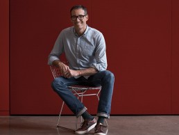
Daniel Stromborg
From furniture designer to creator of the latest version of the Zumtobel Mellow Light, Daniel Stromborg is now hooked on lighting and we should all be thankful. Paul James caught up with the Gensler man on the London leg of his world tour to promote Zumtobel’s first ever global luminaire launch.
Catching up with Daniel Stromborg on the UK leg of his global tour promoting the worldwide launch of the new version of the Mellow Light from Zumtobel, it’s hard not to be impressed by the passion and drive the Gensler designer has for his debut lighting product. The sixth generation of Mellow Light is the first Zumtobel luminaire to be launched directly with an international platform and Stromborg is fully behind the concept.
His commitment to the product means he will be taking in China and Australia (as well as the US circuit) in quick succession to talk about the challenge of redesigning such an iconic product as the Mellow Light, the previous incarnation of which was created by the genius of James Irvine.
“Designers get involved in product design but then they can drag their feet to the product launches,” Stromborg says. “The process that they took part of is very much part of the story and it’s good to hear that story as part of the marketing strategy.”
Stromborg’s career is influenced by a crucial crossroads in his academic life. Having begun studying pre-med at the University of Montana, Stromborg decided it wasn’t for him. “I wanted to be a doctor at seventeen but it dawned on me that I would be studying until I was 30, which didn’t appeal, so I got a degree in literature and subsequently joined a climbing magazine (a hobby of Stromborg’s) in Aspen, Colorado. After putting together a gear guide for the magazine I realised that I was more interested in designing products than writing about them.”
From there he briefly studied Interior Architecture at The School of the Art Institute of Chicago, before moving to Los Angeles to study Environmental Design at The ArtCenter College of Design.
After graduation he had stints with digital-imaging pioneer April Greiman and furniture designer Richard Holbrook, then Stromborg worked with designer Don Chadwick (“One of the most ubiquitous, anonymous designers we have today.”) where he was first introduced to Knoll when he worked as lead designer on Chadwick’s Spark Series. Stromborg left Chadwick’s studio to pursue his own projects with his studio, The Creative Common Good, and launched the Stromborg Table collection with Knoll in 2012.
Following an approach from a friend who worked for Gensler, Stromborg joined the firm in 2014 as the Southwest Region’s Director of Product Design after being attracted by the opportunities of working for a large company whilst being given the freedom to work on projects of his choice.
“Interestingly working for Gensler after working for myself has been liberating,” explains Stromborg. “I had gleaned a lot of information and experience from people like April and Don, which I used when working on my own to help develop my own style. But being in a much larger structure means the opportunities I have are wildly diverse, I’m not restricted in the scope of design I found myself in while on my own.”
He is now acting as a global Practice Area Leader for Gensler, having applied his insights and industry experience to inspire design teams to translate Gensler’s voice and vision into tangible products for workplace and lifestyle environments. Partnering with manufacturers, Stromborg and his team help create touch points that expand the experience for which clients rely upon Gensler.
Just a year after joining Gensler, Zumtobel invited Stromborg to the Year of Light celebration at their HQ in Dornbirn, Austria.
At that point the design of a new version of Mellow Light by Zumtobel’s in-house team was already in progress but they had reached a crossraods as to which direction the design should take.
Stromborg was then asked by Wolfgang Egger, Executive Vice President Global Sales North America, if he was interested in developing the Mellow Light further. Of course, the answer was a resounding “Yes!” despite the fact he had no experience in designing light fixtures.
“There were two things I wanted to build upon when I came to Gensler,” comments Stromborg. “One was to do more with the firm on a global scale because, although we are hugely known in the US, we are not so well known internationally. The other objective was to work on something I’d never attempted before. I love my furniture work but a chair is a chair at the end of the day and I was attracted by the thought of stepping out of my comfort zone into something more abstract. I had no idea it would be as complex as it was! The scale and precision that you’re dealing with is completely different to that of, for example, a tilt mechanism of a chair. Light is very much liquid and it is hard to control. And that appeals to me.”
Wasn’t he daunted by the task of redesigning such an iconic fixture?
“When I got involved, I looked at what Zumtobel had done thus far in order to get a feel for what direction might be the best way to head and we looked at this idea of heritage and progression. The Mellow Light 4 had historically done incredibly well and there was feedback that the end-user, as well as the sales team, loved it for a couple of reasons. Those reasons were compelling from a form standpoint, and because of them, I decided to lean more towards the heritage end of things. It became much more about an evolution of form, rather than doing something radically different. My analogy on this is the Porsche 911. The 911 has gone through more than 50 years of evolution at this point in time, and it’s a form factor that I would say almost everybody in the developed world is aware of. You can put two 911’s next to one another that were developed 50 years apart and you will understand that there is a common form language that’s evolved over time, each still bearing a certain resemblance to one another. So I asked the development team to look at what was successful in previous versions and use that form language to dictate what happens in the new Mellow Light.”
Eighteen months on from getting involved, the sixth generation of this office lighting icon sets new standards when it comes to adapting lighting to suit the specific needs of users, drawing on extensive Zumtobel knowledge about how light affects humans on a visual, biological and emotional level.
Immediately recognisable yet slimmer and more elegant, the form supports the state-of-the-art lighting technology that helps this design icon adapt perfectly to the constantly changing requirements of the contemporary office.
Both the look and the vision of Mellow Light are unmistakable, with these two aspects combining to deliver high quality light that is as close as possible to natural daylight. To achieve this difficult feat, Mellow Light has been extensively developed and is now available in two versions: Mellow Light evolution and Mellow Light infinity. Both versions are available with the ‘tunableWhite’ technology by Zumtobel, allowing the light intensity and colour temperature to be independently and seamlessly adjusted between 3000 and 6000K. Both versions can therefore be used for the implementation of the ‘Active Light’ concept developed by Zumtobel, which imitates the dynamics of daylight that are so important for humans.
Mellow Light infinity goes one step further, as the outer wings and the central segment can now be controlled independently of each other. In line with the results of a Zumtobel user study into perceived light quality in the office, which revealed that many people find the standard 500 lux insufficient, Mellow Light infinity enables the individual and flexible adaptation of the light to reflect different needs, preferences and situations. The two light wings create a pleasant basic brightness of 300-400 lux, which gives the room a welcoming atmosphere, while work surfaces can be perfectly illuminated with an additional 400 lux from the central segment.
Looking at the sleek lines of the Mellow Light, there is a familiarity with previous versions that Stromborg was keen to develop.
“One of the key components of the Mellow Light 4 was the idea of a third dimension that we wanted to keep. It had a narrow light engine compared to Mellow Light 5 designed by James Irvine, and the significant middle grill that was very popular. Even though people loved the grid, there were issues with it in terms of light performance, but we wanted to reference back to the grid with a very high performance looking crystal optic. Unfortunately we couldn’t go with that much of a small grid because of its effect on the performance, but you can see the tie in. Irvine had done an incredible job with what I refer to as layered patterning in the Mellow Light 5 because it breaks up a rather mundane big object. Another key takeaway from Irvine’s work was what I call the ‘Irvine Step’ (the small step between the wing and the actual light source). This is something that I really wanted to keep, as a kind of homage to Irvine and his development team. But with regards to the wings, we went more into the organic so that we were still satisfying the request of people that were asking for a more organic cross section. So this goes back to Mellow Light 4 and how there was more of that soft feel in terms of the reflector that was casting the characteristic mellow light onto the wings. We did address the progressive end by integrating the optics Zumtobel had applied in their original concept with very beautiful water clear, crystal lenses.”
Combining Mellow Light infinity with the Litecom lighting management system and the innovative ATIVO contrast sensor means that the light atmosphere can be automatically adjusted to reflect not only the amount of available daylight, but also the number of people present and their location in the room. ATIVO recognises the way a space is being used and automatically selects the appropriate lighting mood, paving the way for Activity Based Lighting.
The Mellow Light portfolio encompasses a comprehensive range of rectangular and square luminaires in a wide variety of designs for ceiling-recessed or surface-mounted installation. As a surface-mounted fitting, a series of optional colours helps the luminaire adapt to the individual needs of the interior architecture. While the white luminaire can be discreetly integrated into drywall ceilings, the silver version creates a flexible transition between the product and the exposed concrete. If highlights are required, additional versions in brown, black and naturally anodised aluminium can be specified.
So what was the biggest challenge in working with technical lighting for an ‘outsider designer’?
“The Zumtobel team were incredibly open to new ideas. The biggest challenge for me was the technical detail - literally working out how light works. Design and lighting is about emotion but high performance task lighting is also about science. High performance lighting has to be engineering driven. There were unavoidable technical issues that I wish we could have overcome but there were other solutions that the engineers developed such as improved light distribution from the recessed version. Designing decorative lighting is based on opinion, there’s no right or wrong. This isn’t the case with technical lighting, it’s based on performance and that’s where the design is most satisfying - how we designed the crystal optics, for example. Every designer has an ego but you have to tone it down for technical lighting. The key to being an ‘outside designer’ is to forgo the ego. I love the look of the Mellow Light but you can’t have a ceiling full of ‘It’ objects. They would be fighting with other and it would look horrible.”
So will there be more lighting products to come from Stromborg?
“Yes, I’m now designing more product for Zumtobel and I’ve just completed a product called REVO, a Direct/Indirect pendant for a Canadian manufacturer called Lumenwerx as well as ZEDGE, an LED step light for Targetti, which will be launched at Euroluce. I’ve definitely caught the lighting bug!”
Well hurrah for that! A continuing passion for, and bringing fesh ideas to, technical illumination from the furniture designer can only be a good thing for the lighting design profession.
Yizheng Experience Centre, China
In pursuit of creating a corporate brand experience that intrigues its visitors, United Design Practice has delivered a visual spectacle at Yizheng Stationery’s new Zhejiang Province experience centre that utilises experimental lighting design from Light Collab to achieve impressive results.
Yizheng Stationery is a market leader in children’s erasers in China. Its new Zhejiang Province experience centre is situated in Yizheng’s factory so that the experience becomes a part of the entire sales journey. In doing so, it allows business partners to understand the company’s diversified product range.
With this project, the aim was to bring the brand to life, making it relevant to both partners and consumers. Traditionally, corporate brand experience centres are targeted at business partners with many exhibition boards and lengthy paragraphs talking about manufacturing prowess and production capabilities. This type of execution is often uninteresting, and delivers the brands messaging on the wrong level.
Interior designers United Design Practice’s approach was to deliver a visual spectacle and to impress and intrigue, leaving visitors wanting to know more.
The practice’s branding concept of ‘things that can be erased and things that cannot be erased’ is reminiscent of good and bad memories we all share from our childhood. As we grow older, the bad ones tend to fade, leaving the good ones behind. This is the empowering message behind the idea.
The start of the brand experience centre leads visitors into a concept tunnel. The five key posters developed by United Design Practice, have been placed along the tunnel walls at a 15° angle (consistent with the incline in the logo). A line that shifts from black to shining white cuts the posters in half, emphasising the two sides of the same story. This line is the spatial embodiment of the idea of what is erased away and what is not. Turning the corner the line ends at opposite sides of the tunnel, cutting across a black painting and a white painting. Looking forward and backward in the tunnel is like looking into the future and back at the past. With the right encouragement, visitors walk towards the white painting, and see the growth they have attained, only to turn back to realise they have overcome the obstacles that are on the black painting. Light Collab illuminated the concept tunnel while highlighting the posters and keeping the light levels low, as the experience was to condition visitors to enter a different zone, which will then set the mood entering the main experience zone.
Entering the experience zone, the guests will arrive at the acrylic product wall, where the impressive range of products that Yizheng has produced are featured.
Visitors will also have a chance to experience the Scent Library, where scented erasers made of food shapes are placed in jars, inviting guests to open them and smell.
In addition to the overall illumination of the experience centre, Light Collab was given the challenge to investigate the uniqueness of the eraser products and their possible interaction with light as a major experiential and branding element. The design process started with a series of investigations, in which Light Collab tested the reflectivity, refraction quality and translucency of the rubber with light. It took about two months of rigorous experiments before a conclusion was made. One outcome was ‘Rubber Pendant Light + Podium’ – where tests with translucency of the rubber material in both black and white colours were used to make bespoke pendants to complete the podiums below. It took a while to get the right mix of both rigidity and translucency in the white and black rubber tubes. The team found that when the rubber material increases in transparency, it also becomes too soft and unable to stay in its square profile. It should have the right translucency, so that the internal light source will not be seen while the light can filter out from the rubber material. The black version also proved tricky as when it becomes too transparent, it will not be solid black but will appear to be more grey.
Three sets of these rubber pendants were conceived, which were configured differently on the side view. In addition, when looked at from the bottom, the pendants spell the Chinese characters of Yizheng, a mirror image of the wooden blocks of the podium below.
More experiments were conducted to investigate the further potential of the erasers and their interaction with light. As a result, two more bespoke lighting fixtures were created for the experience centre, both of which were dramatised by the before and after effect of storytelling with light.
Firstly, ‘Footsteps of Light’, made of white rubber blocks that protrude from the wall in a seemingly random fashion were created. With this fixture, only when the light is turned on, are the Yizheng chinese characters revealed. These experiments started with a series of small pieces of eraser from the factory. Finding the right dimensions of the solid blocks of rubber/erasers in relation to the distance and angle of light was key in achieving the correct shadow. In the end, the size of the final installation was magnified to the actual proportions of the space.
Secondly was the use of reflected light from coloured rubber blocks to compose a painting with light called ‘Speckles’. This installation was inspired by the beauty of the translucent jelly erasers that are manufactured and sold by the client. This sparked the thoughts of showing off the beauty of the coloured jelly erasers using reflected light. Thus, United Design Practice made the inner sides of the blocks using specially customised pieces of coloured erasers, while the exterior side of the blocks were left white, so that people appreciate the simplicity of the white blocks when the lights are off, and are surprised by the other side of the erasers that create the reflections.
United Design Practice has delivered a visual spectacle at Yizheng Stationery’s new Zhejiang Province experience centre that utilises experimental lighting design from Light Collab to achieve impressive results.
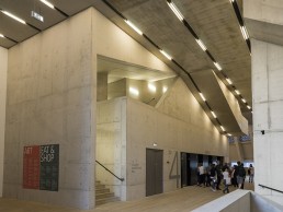
Tate Modern Switch House, UK
Following on from its previous design for the original musuem in 2000, Arup’s considered lighting scheme ensures that, while the Switch House’s multitude of spaces express a variety of forms and functions, the old and new parts of the Tate Modern are still perceived as one collective organism.
Tate Modern has changed London since it opened. The impact it has had on urban design and the development of the South Bank and Southwark, has been as substantial as its influence on the city’s artistic, cultural and social life. It was not long after the opening of the Tate Modern in 2000, for which Arup designed the lighting, that thoughts turned to expansion of the museum. Unoccupied parts of the iconic Bankside Power Station were considered as new spaces so Tate made plans to augment the building further. Retaining the original Tate Modern architects, Herzog & de Meuron, for the extension, Tate felt that Arup’s experience working with the architect, lighting the original building, would be of benefit to the new project and thus appointed them to develop all lighting design for the extension – daylight, interior and exterior lighting.
The new Switch House extension provides 60% more space and includes a wide variety of learning, outreach and social spaces for visitors, as well as new office space for Tate staff. The project comprised various parts: integration with the original Tate Modern via the Turbine Hall space; building the new gallery spaces within the existing ‘Switch House’, to the south of the Turbine Hall; converting the underground former oil tanks into exhibition spaces; and the new ten-storey tower above these, housing the learning, social and office space.
The client wanted to ensure that, while these different elements of the building are expressed, the old and new parts are still perceived as one Tate Modern. Therefore, a key challenge for the internal lighting design was to develop a scheme that integrated with and accentuated the architecture of the new spaces, whilst maintaining a consistency with the existing building. The other challenge that Arup was set was to ensure that the building used 20% less energy than a typical museum, and would attain industry recognition for sustainability in the form of a BREEAM ‘Very Good’ rating. The lighting clearly plays a key role in achieving this goal.
For the new extension, Herzog & de Meuron developed a ten-storey tower with a pyramidal form generated from the combined geometries of the site context and the existing building. While the original Tate Modern is largely horizontal in orientation, the tower creates a vertical orientation, with a generous public circulation route that rises through the building.
Reacting to this context and to the client requirements, the lighting scheme for the public concourse and circulation areas comprises mainly bare fluorescent lamps slotting between precast concrete panels. These both complement the form of the space and are orientated to help draw people through the vertical building towards the galleries and other public areas. Linear fluorescent lighting is an energy efficient light source that fits the architecture and references similar lighting in the original building to continue the consistency.
This lighting is closely integrated with the structure and other services, minimising visual clutter and creating a scheme that is a considered part of the fabric rather than an afterthought. The lighting is mounted onto cable trunking installed between precast concrete ceiling panels, in a slot shared with sensors, smoke detectors, loudspeakers, sprinklers and CCTV.
This integrated approach is used in all public spaces of the new building, which is largely characterised by exposed concrete structure. The concourse lighting scheme is adapted in each of the adjacent functional spaces in the tower, which all have similar exposed precast concrete ceilings.
Arup’s approach takes into account the lighting requirements for the wide variety of social and educational areas for patrons, whilst providing a consistent feel.
The learning spaces on Levels 5 and 6 are bathed with generous ambient light, using a similar system of linear fluorescent lighting, for maximum flexibility of use for these areas. The office spaces on the south side of Levels 3, 4, 5 and 6 use a tubular luminaire, selected to look similar to the bare fluorescent tubes whilst providing glare control for the working environment. LED cast-glass pendants, suspended from the same trunking between the pre-cast concrete panels, add character and sparkle to the dining areas – the Level 8 Members’ Room and Level 9 Restaurant – without distracting from their spectacular views over London.
Glass pendants are also utilised in the Bar on Level 1, hinting at the dining spaces above with the same lighting and mirroring the Café at ground level in the existing Tate Modern, which also gains its character from distinctive pendant lighting.
The Switch House includes a variety of new and diverse gallery spaces. The galleries on Level 3 are more intimate spaces than the others, with a lower ceiling height. The lighting of these galleries is also more intimate, using track and spotlights only to focus light on the walls and artworks. The lighting track is located between the beams in the ribbed ceilings. Spotlights mount into this track on an elongated stem designed to avoid ‘hot spots’ on the sides of the beams, whilst minimising visual clutter by having the spotlights partially concealed by the beams.
The larger galleries on Levels 2 and 4 are both provided with homogenous ambient light, as well as track and spotlights for flexibility. High colour rendering linear fluorescent lighting is mounted on suspended lighting track on Level 2. This track follows the rhythm of the structural grid of the building, and forms a visual datum beneath the exposed ductwork and other services above.
Uniform backlit ceilings give a calmer feel to the large gallery spaces on Level 4. These connect the new galleries stylistically to existing ones, accessible via a nearby bridge over the Turbine Hall. The amount and colour of light in these spaces is selected to enhance each exhibition, whilst meeting strict conservation and display standards.
Half of the Level 4 gallery space also allows generous but controlled levels of daylight through a system of skylights above the diffuse ceiling. Direct sunlight is blocked by a grid of ‘egg-crate’ louvers on the roof, above the skylight glazing, designed to block the sun at all times whilst optimising the amount of daylight that can pass through the sky vault. The incoming daylight is diffused by both the skylight glazing and the stretched fabric ceiling to the gallery space, to create a comfortable art viewing environment. Daylight levels in the gallery have been optimised through this skylight design, to ensure that the levels are within an acceptable range for gallery conservation standards for most types of exhibition.
The other new gallery and public spaces are the converted Oil Tanks and adjacent spaces on Level 0, under the new tower. These spaces, initially temporarily opened in 2012, are architecturally treated as raw, ‘as-found’ spaces – there was minimal intervention to bring the internal environment to an appropriate standard, leaving the form and finishes as they were as much as possible.
The Level 0 lobby space is a juxtaposition between the existing concrete structure and the new foundations for the tower, which cuts through. The space is unified by a grid of simple, suspended trunking, carrying track and bare linear fluorescent lamps, creating a consistent datum with simpler lighting and an industrial feel. The adjacent Transformer Galleries, space that used to house a transformer, have a similar raw form, and simple suspended lighting track allows appropriate display lighting with a minimal intervention, barely visible above the artworks, which are the real focus of these spaces. The two Oil Tanks – the east tank devoted to media art, and south tank for performance art and events – each have similarly minimal interventions for lighting. Small lengths of surface-mounted lighting track are strategically dotted around the soffit of the east Tank, in a layout coordinated with the other required ceiling services. The south tank is illuminated by lights hung from a suspended theatrical scaffold-bar grid.
The LED spotlights used in all gallery spaces emit light barely distinguishable in quality and appearance from traditional halogen lighting. 42W Xicato Artist Series LED spotlights, manufactured by DAL, were used, more than halving the gallery’s typical energy demand from halogen spotlights. The final specification of the spotlights was left late in the construction programme – to ensure that the most up-to-date technology could be used. This careful specification of LED spotlights is a significant contributor to minimising the energy use overall.
The lighting control system also plays a significant role in minimising energy use. Daylight filters through the perforated brick façade and clear façade glazing throughout the new building, and the distribution of daylight was carefully analysed, assisting in developing the electric lighting scheme. Daylight- and/or occupancy-linked lighting control is extensively employed, ensuring that only as much light as required is used where and when it is needed.
Arup also designed the external lighting for the landscape to the south and west of the building. From the beginning, the strategy for this was ‘less is more’ to keep energy use low, and to provide only as much lighting as required on the routes where it is needed. The approach is kept deliberately simple and uncluttered, using mainly multi-head lighting columns (mostly six-metres in height) with projectors positioned and aimed to direct light precisely, creating a comfortable environment that minimises light pollution and considers ecological requirements. The use of shorter columns in an irregular layout is a nod to the taller, regimented columns on the river-facing north side of the building, but also simultaneously creates a lower level scheme with a more ‘local’ feel.
For the night-time view of the façade of the new tower, Arup carried out a number of design studies, testing various options. This led to a strategic decision being made to not add more feature illumination to the building façade. Consistent with the existing Tate Modern, the only lighting accentuating the building form is the expression of the carefully designed internal lighting, glowing through the façades. This approach links the function and activity of the interior with the appearance on the skyline of the exterior, and helps to integrate the old and new parts of the building. This also makes a visual statement on sustainability; no superfluous lighting was needed on this new landmark building.
In addition to areas discussed, UXUS was tasked with developing the design for the Tate’s new shop. Launched in June last year, the store is housed at the base of the gallery’s distinctive pyramid extension. The store is conceived by UXUS as occupying the crossroads of culture and commerce by inviting visitors to explore the world of art through the museum’s retail expression. Part shopping destination, part cultural hangout, it is designed as a ‘permanently temporary’ space with the flexibility to respond to the gallery’s fast-changing exhibition and project schedule.
A bespoke system of stackable furniture modules allows for regular reconfiguration to keep the displays fresh and exciting for visitors, as well as accommodating seating for browsing and events such as book readings and talks.
Following with the permanently temporary theme, the lighting is provided through a flexible track system, allowing for the store to be reorganised as often as necessary.
‘‘We have integrated LED lighting in the jewellery case area, mid floor shelving units, and within the postcard wall to highlight products,” explained Oliver Michell, Chief Creative Officer, Architect and Co-founder of UXUS.
Additionally, Herzog & de Meuron designed bespoke pendant lights that punctuate the jewellery and reading areas. These lamps are also featured in the adjacent ground floor café, creating a visual link between the two spaces.
At high level, there is a series of light boxes running along the perimeter of the shop to display graphics. The graphics are intended to change regularly, and will affect the overall look of the store from season to season.
Shop windows also have dedicated lighting, both at floor level and overhead in tracks embedded into façade beams, to showcase visual merchandising.
FLOS UT track spot luminaires were used, with 29.3w Xicato XTM 3,000k modules and a DALI dimming driver, utilising 16º, 22º, and 32º optics. This fitting has been developed with a deep set LED to help minimise the glare and discomfort whilst allowing for complete control of the light within its environment. The selection of the optics were based on creating layers of light to the point of sale whilst trying to avoid direct light onto the circulation space to help define product in application.
The store was commissioned to help direct the light in the right orientation and to prevent as much glare as possible from being visible to the customer.
One thing that is apparent for both the Tate Modern and its Switch House extension is consistency. From Herzog & de Meuron’s skill in combining elements of old and new to Arup’s strategic and considerate scheme, which fit seamlessly into the London landmark’s many spaces. Using lighting as vehicle for such design, the Switch House is an extension that combines with the original to form a single organism.
Pic: Gavriil Papadiotis
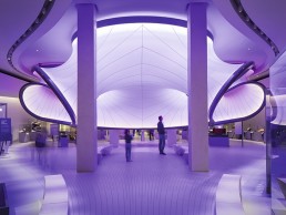
Mathematics: The Winton Gallery, UK
Arup’s lighting scheme for Zaha Hadid Architects’ Mathematics: The Winton Gallery combines dynamic and static lighting to showcase the mathematical significance of the 1929 Handley Page Gugnunc aircraft, connecting complex mathematical ideas to every day experience with a striking visual clarity.
On 8 December 2016 the Science Museum opened an inspirational new mathematics gallery, designed by Zaha Hadid Architects (ZHA). Mathematics: The Winton Gallery exhibits more than 100 treasures from the Science Museum’s world-class science, technology, engineering and mathematics collections, which have been selected to tell powerful stories about how mathematics has shaped, and been shaped by, some of our most fundamental human concerns – from trade and travel to war, peace, life, death, form and beauty.
Curator Dr David Rooney said: “At its heart this gallery reveals a rich cultural story of human endeavour that has helped transform the world over the last 400 years. Mathematical practice underpins so many aspects of our lives and work, and we hope that bringing together these remarkable stories, people and exhibits will inspire visitors to think about the role of mathematics in a new light.”
Positioned at the centre of the gallery is the Handley Page ‘Gugnunc’ aeroplane, built in 1929 for a competition to construct safe aircraft. Ground-breaking aerodynamic research influenced the wing design of this experimental aeroplane, helping to shift public opinion about the safety of flying and to secure the future of the aviation industry. This aeroplane encapsulates the gallery’s overarching theme, illustrating how mathematical practice has helped solve real-world problems and in this instance paved the way for the safe passenger flights that we rely on today.
Mathematics also defines ZHA’s enlightening design for the gallery. Inspired by the Handley Page aircraft, the design is driven by equations of airflow used in the aviation industry. The layout and lines of the gallery represent the air that would have flowed around this historic aircraft in flight, from the positioning of the showcases and benches to the three-dimensional curved surfaces of the central pod structure.
Mathematics: The Winton Gallery is the first permanent public museum exhibition designed by ZHA anywhere in the world. The gallery is also the first of ZHA’s projects to open in the UK since Dame Zaha Hadid’s sudden death in March 2016. The late Dame Hadid first became interested in geometry while studying mathematics at university. Mathematics and geometry have a strong connection with architecture and she continued to examine these relationships throughout each of her projects; with mathematics always central to her work. As Hadid said: “When I was growing up in Iraq, math was an everyday part of life. We would play with math problems just as we would play with pens and paper to draw – math was like sketching.”
Ian Blatchford, Director of the Science Museum Group, said: “We were hugely impressed by the ideas and vision of the late Dame Zaha Hadid and Patrik Schumacher when they first presented their design for the new mathematics gallery over two years ago. It was a terrible shock for us all when Dame Zaha died suddenly this year, but I am sure that this gallery will be a lasting tribute to this world-changing architect and provide inspiration for our millions of visitors for many years to come.”
From a beautiful 17th century Islamic astrolabe that uses ancient mathematical techniques to map the night sky, to an early example of the famous Enigma machine, designed to resist even the most advanced mathematical techniques for code breaking during the Second World War, each historic object within the gallery has an important story to tell. Archive photography and film helps to capture these stories, and introduces the wide range of people who made, used or were impacted by each mathematical device or idea.
Visitors will see a box of glass eyes used by Francis Galton in his 1884 Anthropometric Laboratory to help measure the physical characteristics of the British public and develop statistics to support a wider social and political movement he termed ‘eugenics’. On the other side of the gallery is the pioneering Wisard pattern-recognition machine built in 1981 to attempt to re-create the ‘neural networks’ of the brain. This early Artificial Intelligence machine worked, until 1995, on a variety of projects, from banknote recognition to voice analysis, and from foetal growth monitoring in hospitals to covert surveillance for the Home Office.
In close collaboration with ZHA, Arup developed the lighting for the gallery. Arup also provided structural, mechanical, electrical and public health engineering services to the refurbishment of the gallery.
The architectural and lighting concept for the gallery connects complex mathematical ideas to every day experience with a striking visual clarity. Fluid dynamic lighting was integrated with static lighting to showcase the mathematical significance of the 1929 Handley Page Gugnunc aircraft - a key feature of the gallery.
“The lighting design responds to an architectural concept that uses the aircraft’s aerodynamic field as a geometrical generative element. We arranged the lighting around the aircraft to demonstrate this field, starting from the propeller and ending at the walls of the room,’’ explained Giulio Antonutto-Foi, Lead Lighting Designer, Arup.
Arup applied strategic thinking and experience to the project, and focused on creating a memorable space through the use of light. The result is stunning; the lighting depicts a dramatically rendered wind tunnel. Lighting paints the airflow through the space, from the floor, walls and ceiling, to the central turbulence pod. Linear elements of lighting represent the laminar flow and pods represent turbulence.
‘‘Two ceiling recessed spotlights illuminate the airplane propeller, igniting the flow of light,’’ added Antonutto-Foi. ‘‘A number of fixtures are installed in a ceiling cove to create brushes of light on the floor, along the streamlines. The walls represent the boundary condition and show two curvilinear coves; two lines of light moving though the gallery. The central pod is a complex tri-dimensional envelope derived from an equipotential surface around the plane.’’
Arup approached the project with the aim of achieving the highest possible quality, whilst sensitively balancing strict conservation requirements, cost and the use of the latest lighting technology. The team used their in house LightLab to evaluate lighting equipment and details to ensure they could specify and detail with confidence, as well as experiment with various approaches to object lighting.
‘‘The final touch was selecting the right colour for the central sculptural pod. Lit by linear LED concealed along the frame, within the double layer of translucent skin, the hue is asymmetric, to give an impression of movement. The colour was carefully selected in consultation with the design team, and no bleed is visible on the objects exposed,’’ explained Antonutto-Foi. The large lit surface also does not impact the strict conservation requirements of the adjacent objects, some of which are illuminated to 50 lux.
David Harding, Principal Funder of the gallery and Founder and CEO of Winton added: “Mathematics, whilst difficult for many, is incredibly useful. To those with an aptitude for it, it is also beautiful. I’m delighted that this gallery will be both useful and beautiful.”
The free to visit Mathematics: The Winton Gallery has been made possible through an unprecedented donation from long-standing supporters of science, David and Claudia Harding. It has also received generous support from Samsung as Principal Sponsor, MathWorks as Major Sponsor, with additional support from Adrian and Jacqui Beecroft, Iain and Jane Bratchie, the Keniston-Cooper Charitable Trust, Dr Martin Schoernig, Steve Mobbs and Pauline Thomas.
Pic: Luke Hayes
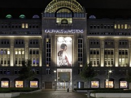
Kaufhaus des Westens, Germany
Licht Kunst Licht has developed lighting concepts for three department stores in the Kaufhaus des Westens (KaDeWe) Group. Working alongside renowned architects, the German lighting design studio has provided bespoke lighting solutions that underline the quality of the sophisticated retail spaces in Berlin, Hamburg and Munich, promoting exclusive shopping experiences.
The department stores Kaufhaus des Westens (KaDeWe) in Berlin, Alsterhaus in Hamburg and Oberpollinger in Munich is being gradually revamped by renowned architects over the coming years. Oberpollinger has already held an opening party for its new concept store ‘The Storey’ last October. With the openings of Berlin and Hamburg’s first redesigned sales areas on November 15 and 16 2016, respectively, the remodelling sequence has finally begun. In all three of the KaDeWe Group’s department stores, Licht Kunst Licht has provided bespoke lighting solutions that underline the quality of the sophisticated retail spaces and promote exclusive shopping experiences.
One of the major challenges for Licht Kunst Licht in designing the lighting scheme for three traditional department stores was to provide a holistic concept that responds to the wide range of retail environments with high-end brands aiming to outdo their competitors and satisfy their customers’ expectation of an appealing and stimulating shopping experience. Furthermore, the lighting solution was required to remain appropriate to the existing store locations and utilise lighting’s most state of the art technologies. All renovations were to be done without affecting store operation hours.
Rem Koolhaas and OMA’s Rotterdam Office has developed an extraordinary concept for the over 100-year-old building that houses KaDeWe Berlin’s new shopping environments. Contrary to the horizontal structure commonly found in department stores, KaDeWe will be organised vertically, dividing each floor into four different quadrants. Each quadrant is distinguished by its own independent interior design. The new building layout serves to facilitate its visitors’ orientation.
Licht Kunst Licht has developed the lighting concepts for two of the newly designed quadrants. The sensible design by Milan based interior designers Storage Associati is underlined by the use of linear lighting systems within the Men’s Shoes and Accessories merchandise areas on the first floor. Spotlights in black recessed ceiling channels allow the merchandise to be precisely illuminated without calling attention to the lighting equipment, while the graphic appearance of linear brass fixtures running perpendicular to the ceiling channels is both bold and memorable.
Iconically designed by French designer India Mahdavi, a graphic ceiling consisting of repeating light coves is the defining element of the second floor’s Women’s Designer Fashion retail area. Linear indirect light coves run across the entire ceiling and create a soft general light with a warm light colour. Adjustable fixtures are built into the narrow beams between the coves and cast accent lighting onto the designer goods.
The ten shop windows along Tauentzienstraße were also remodelled, their restored round arches being reminiscent of the building’s original design. The renewed eight-metre tall main entrance completes the picture; here, the lighting design provides the appropriate atmosphere. Track mounted spotlights trace all sides of the shop windows, unobtrusively allowing to flexibly illuminate the mannequins from concealed positions.
Moving on to the Alsterhaus, Hamburg, the new Accessories Hall’s clear interior concept by Kleihues + Kleihues provides the space with a spectacular makeover. The newly designed main entrance at Jungfernstieg welcomes visitors into a spacious lobby that leads to the newly opened Accessories Hall. This double-height space is the heart of the building – here, luxurious bags and accessories are presented on sophisticated furniture which was specially designed for the Alsterhaus by design newcomer Sebastian Herkner.
Powerful, narrow-beam, ceiling recessed spotlights accentuate and sculpt the luxury products from eight metres above and specifically highlight select targets. Narrow lines of light trace the ceiling panels and fill the space with neutral white light. As a third lighting element, light boxes implement stretched fabric to frame the area of the first floor. The eight-metre high shop windows at the Binnenalster were also remodelled and are now presented in a new light. The artist Sarah Illenberger conceptualised a maritime Craft-Art-theme under the motto ‘High Season’. It conveys the fresh breeze of the new Alsterhaus Accessories Hall.
At the Oberpollinger, Munich, the concept intends to open the ground floor luxury boulevard toward the shopping street, to give the overlapping sales areas a new look and moreover, to integrate a concept store for urban wear on the basement level.
In the recently completed first construction stage, the fourth floor Home & Living sales area was redesigned by John Pawson Architects. A concealed linear light illuminates the perimeter walls of the space, contributing both intuitive orientation and a pleasantly open spatial impression. The uncluttered ceiling plan combines accent lighting in clusters and accommodates adjustable fixtures in linear lighting channels.
As a creative partner for ‘The Storey’ on the basement floor, the architectural studio Gonzalez Haase AAS has created an urban atmosphere with a stylish hand. The rough, partly open ceiling design is characteristic. A functional grid of 60cm long lighting track segments consistently spans across the entire retail space, conveying an industrial look. Here, fixtures for general and accent lighting can be accommodated to create a balanced mix of horizontal and vertical illuminance intensities. Different lighting colour temperatures were intentionally chosen to aid in thematically zoning and organise the space.
The lighting solutions for the three department stores provide quantifiable benefits regarding energy efficiency and maintenance. Using state-of-the-art technologies for both general and accent lighting, energy savings of approximately 30-40% and significantly longer maintenance intervals compared with the previously installed lighting equipment have been achieved. Meeting the client’s brief in terms of energy savings and easy maintenance Licht Kunst Licht have developed a high-performance lighting grid and kept the variety of different fixture and lamp types at a minimum.
Moreover, the lighting concept of utilising many small light sources with relatively low power consumption (6-12W per light source) and excellent colour rendering qualities (Ra > 90) provides not only for high visual comfort, but also for adequate artistic quality and brilliance supporting the exclusiveness of the shopping environments.
Pic: The KaDeWe Group
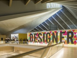
Design Museum, UK
Showcasing the power of interdisciplinary collaboration, London’s new Design Museum is both an example of, and a place for, exceptional contemporary design, of which ChapmanBDSP and Studio ZNA’s lighting schemes play an important role in creating a space to inspire future generations.
On 24 November 2016, the Design Museum opened in its new home on Kensington High Street, west London. Housed in a landmark grade II* listed modernist building from the 1960s that has been sensitively retuned by John Pawson, the project is the culmination of a five-year construction process. The museum has now tripled to 10,000sqm from its previous premises in Shad Thames, south-east London. Following an investment of £83m, the structure has been transformed for its future role as the world’s leading institution dedicated to contemporary design and architecture.
Remodeling the interior, John Pawson has created a series of calm, atmospheric spaces ordered around an oak-lined atrium, incorporating key elements from the original structure. The project has seen some of the world’s leading designers, manufacturers and patrons come together to create a new global hub for contemporary design. With architectural and structural expertise from OMA, Allies and Morrison and Arup, a permanent collection display designed by Studio Myerscough, a restaurant and members’ room by Universal Design Studio, a Centre for Learning made possible by the Swarovski Foundation, flooring by Dinesen, furniture by Vitra, shelving by Vitsoe, lighting by Concord, a visual identity by Studio Fernando Gutierrez and way-finding by Cartlidge Levene, the new Design Museum is an outstanding example of interdisciplinary collaboration.
Founded by Sir Terence Conran, the Design Museum opened in 1989 in a former banana ripening warehouse on Shad Thames, following its successful original incarnation opening in 1983 as the Boilerhouse Project, in the basement of the V&A. Remaining at Shad Thames until 30 June 2016, the Design Museum mounted a host of critically acclaimed exhibitions, including shows dedicated to the work of Lord Richard Rogers, Thomas Heatherwick, Dame Zaha Hadid, Dieter Rams, Ettore Sottsass, Sir Paul Smith, Christian Louboutin and Sir Kenneth Grange.
The new museum sits on Kensington High Street next to the southern entrance to Holland Park and forms the heart of the new Holland Green residential development. In 2010 a partnership formed by Chelsfield and the Ilchester Estate to redevelop the site was granted planning permission by the Royal Borough of Kensington and Chelsea for the construction of three residential buildings and the refurbishment of the Grade II* listed building at the centre of the site.
The complex renovation of the museum saw OMA led by Reinier de Graaf, Allies and Morrison, Arup and John Pawson work together to bring this landmark of post-war British architecture back into use. Using radical engineering techniques, the original concrete floors were removed – a process that entailed propping the roof on a temporary steel structure 20-metres above the ground. The original façade has been replaced with a double glazed skin, significantly improving insulation standards and allowing daylight into the interior. The new exterior has been meticulously detailed to resemble the original blue skin of the building, with matching mullions and a fritted pattern of printed dots. A new public plaza complete with fountains has been installed at the entrance to the museum, within a landscape designed by West 8.
Inside the museum, visitors find themselves in a central atrium with striking views up to the iconic hyperbolic paraboloid roof. The stunning concrete roof spans the length of the building, rising on the two opposing corners to create a manta ray-like structure above. Galleries, learning spaces, a café, an events space and a shop are arranged like an opencast mine around the main atrium, allowing visitors to navigate with ease.
The building has two temporary galleries, one on the ground floor, the other on the museum’s lower level. Both featuring double-height spaces and textured concrete columns, these galleries will display up to seven temporary exhibitions per year. The 200-seat Bakala Auditorium completes the basement and allows the museum to expand its public programme and evening talks.
The ground floor houses the Design Museum’s coffee and juice counter, seating up to 40 people. Located opposite is the Design Museum Shop, featuring Vitsoe shelving units and the building’s original stained glass windows by Keith New.
The oak staircases form the circulatory heart of Pawson's design. Strip LEDs line the handrails and banisters, adding theatre to the experience of moving round the building, as visitors follow the light towards the top floor and the soaring underside of the roof.
A key element of the Pawson vocabulary, a wooden bench with concealed lighting spans one side of the Weston Mezzanine.
Pawson commented: ‘‘There are moments in the building that I relish every time I walk around, but I think it is really the way everything comes together – the new and the old – that gives me the greatest pleasure. I hope the Design Museum shows people that you don’t have to tear down and start from scratch to make exciting new cultural spaces.’’
The main attraction on the museum's top floor is the new permanent collection display, Designer Maker User. For the first time in the museum's history, this exhibition will be free to visit. It will display almost 1,000 objects, viewed from the perspectives of designer, manufacturer and user, as well as a crowd-sourced wall. Generously supported by the Heritage Lottery Fund (HLF), a grant of £4.9m has made a substantial contribution towards the construction of the new building and the realisation of this permanent display. Standout pieces include a 1:1 scale model of the new London tube train, the British road signage system, an AK47 and an interactive digital fashion display.
Studio ZNA were appointed as lighting designers to work with studio Myerscough to design the Designer Maker User display. The main challenges of the space was the gallery’s location on the second floor, sitting underneath the iconic, sloping roof structure. Studio ZNA therefore had no ceilings apart from two small zones which allowed for small-suspended ceilings. For the rest of the gallery the team needed to create a self-supporting structure that could span the 3D build to house its luminaires. So they collaborated with the designers to produce a lightweight bespoke truss system that acted as both structural support for the freestanding display walls and as a light carrier. The frame is used to carry the cabling and recessed bespoke monopoint fittings by Precision Lighting to house its LED Evo spotlights. This accent lighting was supplemented with linear LED by Vexica to provide a soft ambient light to the space. In other areas the studio designed a series of canopies that extended the walls to house small wallwasher Laser Blades by iGuzzini. For lit shelving and showcases lighting LED Light Sheet by Applelec was proposed to achieve a slim profile. Linear lights are concealed in joinery to highlight objects and express form and texture.
Conservation requirements on paper and textiles were adhered to whilst the use of ambient light in the circulation zones countered the effects of lower light levels. A lensed linear luminaire by L&L Luce & Light, was used on the moving info graphic title wall, which invites the public into the exhibition as you enter the museum at ground level. It injects the huge minimalist atrium with an energy and a hint at the creative innovation and invention on display.
The top floor of the building also offers views down to the ground floor and a chance for visitors to come within touching distance of the roof. Parabola, a new restaurant named after the museum’s signature roof, sits on the top floor of the museum and offers unprecedented views of Holland Park. Designed by Universal Design Studio, the space features customised archive furniture by Vitra and Artek, a sculptural polished pewter bar by Benchmark and lighting by Flos.
For the rest of the lighting, beginning in 2014, Concord worked with the Design Museum to supply the new scheme ready for the opening in November 2016. Designed by lighting consultants ChapmanBDSP and installed with LJJ Mechanical & Electrical Contractors, Concord has provided over 2,500 luminaires to light the 10,000sqm space.
The lighting has been designed to blend into the architectural features of the structure, whilst still providing a flexible and easy to manage system. Graham Large, Head of Architectural Lighting Design at ChapmanBDSP, explained: “When we first developed a specification for this project, it incorporated a variety of lighting manufacturers. The Design Museum then asked us to look at working with one supplier and, after a competitive bid process Concord was the partner chosen. We worked with Concord to refine the specification and ensure all the lighting met our initial ideas and goals. We were impressed with the results and found it extremely useful to be dealing with one person on every aspect of the lighting, including all the controls.”
The main exhibition and event spaces on the upper basement, mezzanine and first floor use over 800 Concord Beacon Muse 3,000k White track mounted spotlights to provide flexibility in beam angle control and light levels. Over 200m of Lumiance Lumistrip has also been installed in the exhibition space to provide indirect light above the exhibition panels whilst the entrances have Mini Continuum light lines with integrated spotlights.
Concord worked with Lutron to provide a DALI control system for the project. The system allows for individual dimming and control of all the luminaires throughout the scheme to ensure the required effect is achieved in each space and it will cater for flexible use during both daylight and night time hours.
In total, there are 1,200 Beacon Muse spotlights installed in the building, mounted onto around 1,000 metres of Lytespan 3 track. In the two temporary galleries as well as the educational areas and studios, Concord Beacon Muse luminaires have been installed in combination with Concord Mini Continuum LED to provide a combination of ambient lighting with focused task illumination from the spotlights. Mini Continuum light lines have been used in combination with track mounted versions for the studio areas, pendants for larger areas and Mini Continuum Direct / Indirect through the office spaces, lighting the desks whilst enhancing the working space with indirect light on the ceilings.
Large continued: “The team at the museum was very hands on during the process and knew exactly what they wanted. For instance, the spotlights within the galleries have on-board dimmers so the staff can focus and set light levels themselves, a key requirement for the project.”
The 200 seat Bakala auditorium has a fully controlled lighting system that features both Mini Continuum and black Beacon Muse luminaires to blend into the interior decor.
Across the whole building, the luminaires have been designed to blend into the décor with black trim Concord Ascent 150 downlights, Mini Continuum and Beacon luminaires discreetly lighting the retail spaces by matching the ceiling design, whilst Beacon Muse spotligths on drop rod extensions, have been employed to subtly illuminate the space through a woodened beam ceiling design structure.
The lighting scheme is finished off with specialist luminaires for areas such as the Member’s lounge and Parabola Café & Restaurant, where the 90 Concord Myriad V downlights have been fitted. These luminaires have a colour tuning engine to take the room from 2,700k as an intimate dining space to 4,500k for functional and service use at other times. For the central parabola ceiling, Concord supplied high output surface mounted ArcSource 96 Smart White projectors and floor recessed custom inground ArcPad 48 LED projectors by Anolis, to provide accent light to this feature.
The lighting scheme extends to the back of house with Concord providing IP65 recessed fittings for kitchens, Ascent downlights for the bathrooms, LED surface mounted panels in the basement and IP65 Sylvania Sylproof LED linear fittings for the plant rooms and loading bays.
Expected to attract 650,000 visitors in its first year, the Design Museum combines architecture, product design, technology, graphics and fashion to investigate the form, function and meaning of the world around us.
Sir Terence Conran, founder of the Design Museum concluded: ‘‘It really does feel like our moment has arrived and that the importance of design to our lives is now truly appreciated. With three times the space and John Pawson's beautiful architectural work I hope we can now educate, inspire and delight future generations for years to come and truly make a difference to the world around us.’’
www.chapmanbdsp.com
www.studiozna.com
Pic: Gareth Gardner
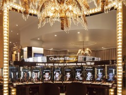
Charlotte Tilbury, UK
Keeping in style with Charlotte Tilbury’s glamourous image, Nulty has provided a lighting solution that incorporates the latest in LED technology in a way that reflects the vibrant and luxurious shopping experience found at the makeup brand’s new London Westfield store.
Located in London, UK, Charlotte Tilbury’s new White City Westfield Store has recently received a glamourous makeover, featuring an imaginative lighting scheme from lighting design practice Nulty to match the iconic brand. Charlotte Tilbury is a world famous makeup artist with a client list including Kate Moss, Cara Delevingne, Naomi Campbell, Penelope Cruz, Amal Clooney and Natalie Portman. Tilbury has been featured in Vogue, Vanity Fair, GQ and many others, with her flagship store being based in London’s Covent Garden.
The Westfield emporium is the luxury makeup brand’s second and largest ever store, which has been designed to completely revolutionise the way people shop. The ‘Beauty Wonderland’ incorporates the latest digital innovations to provide a truly unique, interactive shopping experience, encased in Charlotte’s glamorous and extravagant, ‘Old Hollywood’ inspired interior. This reflects a move towards the blurring of retail and e-tail, which enables smartphones to gather and retain information on a shopper’s previous purchases and alert them with reminders as they walk past specific stores and automatically adjust light to match ambiance depending on what a customer is buying. This is particularly beneficial to the cosmetics industry as it marks a new era when in-store lighting can offer a truer representation of customers’ skin tone, as they buy cosmetics.
Excited about being part of the new Beauty Wonderland, Nulty’s brief was to deliver lighting that reflected the fun, vibrant and luxurious character of the brand while responding to the need for bright, clear and authentic lighting at makeup stations.
Nulty employed its LED light source, called the Beauty Series, which it has recently developed in partnership with specialist light manufacturer, Xicato. The LED light source aims to produce the best balance between beautiful, natural skin tones and colour matching of foundation shades. Used throughout the store and at all makeup stations, the lighting provides customers with an honest and consistent shopping experience.
Taking this one step further, following intensive research conducted with University College London (UCL), Nulty blended two different types of the LED module together – the Xicato 3,000K Artist Series and the Xicato 2,700K Beauty Series – to create a set of sub-environments that provide the same authentic lighting in the appropriate tones for each area.
One particular zone - the ‘Magic Mirror’ podium – includes a fully interactive camera screen that uses virtual makeup to show the customer how they would look when using different products. To ensure the camera could identify customers’ facial features correctly, Nulty used low-level lighting, positioned at face level, and downlights positioned above the head to provide the right facial illumination and ensure the lighting synchronised with the technology.
Throughout the store, carefully positioned Lucent downlights draw focus to the products to make them pop, whilst the visual merchandising displays, with Cabochon lighting that frames the archways to different areas, further emphasises the main points of sale and adds to the Hollywood-style décor.
Claire Hamill, Lighting Designer at Nulty commented: “The Charlotte Tilbury brand is famous for its vibrancy and its high-quality products. Our lighting solution was designed to create a flawless brand experience. We wanted the in-store experience to match customers’ expectations and make sure visitors could engage with the merchandise, discovering the exceptional quality of Charlotte Tilbury.”
The new lighting philosophy ensures that customers shopping in-store can be assured that the lighting is truly reflective of their skin tone and ensures a seamless shopping experience when choosing a product to suit their complexion.
Every lighting designer’s tool-kit comes with various aids that help sculpt and experiment with retail environments. Like a makeup artist, the lighting scheme used in the store was used as medium to create colour, texture and tones, adding depth with unseen dimensions to the scene or space. This enhances the drama in what customers see or, alternatively, gives a feeling of peace and silence when required, ensuring the customer’s journey is enhanced. This is particularly evident in the Charlotte Tilbury store, where each zone was given specific lighting to guide the customer journey.
‘‘When employing innovative design techniques to engage and attract customers in a space, a lighting designer needs to almost be a consumer psychologist directing the moods and emotions of customers to drive behaviour. By engaging early on in the design process, it is possible to achieve the perfect lighting solution to illuminate a space,’’ concluded Hamill.
Trends in Lighting to run parallel to LpS 2017
(Austria) - Seventh annual LED professional Symposium +Expo expected to attract 1,600 visitors from 50 countries.
The seventh annual LED professional Symposium +Expo will be taking place from 26 - 28 September 2017. Every year renowned speakers and experts from the areas of research and the lighting industry meet in Bregenz, Austria for a three-day symposium and exhibition where the newest lighting technologies and innovations are presented and discussed.
The symposium is comprised of a series of lectures, workshops, forums and discussion panels while the exhibition is filled with the newest technologies components and developments presented by international companies and organisations. The LpS focuses on an expert audience from the areas of Design & Engineering, Quality Assurance, Technical Management and authorities from the international lighting industry. This year the organisers are expecting over 1,600 visitors from 50 countries.
In 2017, for the first time, the event Trends in Lighting (TiL), will be running parallel to the LpS. Trends in Lighting is a forum for architects, interior designers, lighting and building planners, lighting designers and lighting consultants. TiL will be looking at the subject of transitions in indoor lighting as well as covering current trends like Human Centric Lighting, Smart Lighting and the Internet of Things.
LpS 2017 - www.LpS2017.com
The motto for the LpS 2017 is “Smart Technologies for Lighting Innovations” which will be structured around the subject areas of Strategy, Design & Development and Applications & Solutions over three days. The entire event program includes the Opening Ceremony with a Keynote from Dr. Wu Chou, CTO at Huawei, for the conference, the Opening Ceremony for the exhibition, subject oriented lectures, workshops, discussion panels, press conference - which will include product launches - and an evening event aboard the MS Vorarlberg. The exhibition associated with the conference will present the newest products, capital goods and services. The LpS Expo offers comprehensive views of everything from components to modules, measuring devices to production machines, and research facilities to test laboratories. Companies like auer Lighting, Arrow, AT&S, Bartenbach, Dow Corning, Instrument Systems, Konica Minolta, MEGAMAN, Merck, Nichia, Plessey, Samsung, Seoul Semiconductor, SwitchTech, TUEV SUED, Vossloh-Schwabe, Wacker Chemie and WAGO will be presenting their market innovations in Bregenz.
Trends in Lighting - TiL 2017 - www.trends.lighting
Digitalization, communication and new lifestyles change the way we deal with light. These changes necessitate adaptations and improvements to existing light systems and lighting solutions. Completely new concepts are needed due to the rapid developments of LED and OLED technologies and altered implementation profiles. Trends in Lighting is a forum for architects, interior designers, light planners, lighting designers and IT/IoT system integrators, that looks at the newest trends in the lighting industry and takes place parallel to the LpS. Next to the forum the TiL expo, which will be in the Foyer of the Bregenz Opera House, will be presenting highly innovative lighting systems, luminaries, lamps, control systems and fixtures. The motto of TiL 2017 is “Smart Trends in Indoor Lighting – from HCL to Luminaries to Internet of Things”.
Registration is open for visitors and attendees of both events. Go to the registration pages www.LpS2017.com or www.trends.lighting for more information. If you register before 1 July you will also receive an Early Bird discount. The entry tickets for the exhibition are valid for both events.

Acolyte sales management team expands in Australia/New Zealand
(Australia/New Zealand) - Peter Boyle brings fifteen years’ lighting industry experience to Acolyte’s Business Manager role in Australia/New Zealand region.
Acolyte LED has increase its global sales footprint with the addition of a new Business Manager and sales offices to cover the Australia/New Zealand region.
Peter Boyle joins the team in the Australia/New Zealand region as Business Manager. The expansion is due to the increasing interest in the Acolyte product line and project explosion in the Australia/New Zealand region.
Boyle has over fifteen years of experience in the lighting industry and over 20 years of experience in project management and consulting. He has worked for over seven years for Fagerhult as the Manager of Australia and ten years of experience in Legrand as the National and State Management and Project Management. Peter is IES qualified and a member of ALD.
“As the Acolyte business continues to grow in the global lighting marketplace, we have added Peter to maintain our current client relationships and expand our brand’s reach in the very important Australian and New Zealand market,” said Acolyte President and COO Scott Vontobel.

Acolyte expands in Middle East
(Asia) - Garry James brings wealth of knowledge, experience and diverse client base to Acolyte’s Middle East team.
Acolyte LED has increased its global sales footprint with the addition of a new Vice President of Operations and sales offices to cover Middle East region.
Garry James joins the team in the Middle East region as the Vice President of Operations. The expansion is due to the increasing interest in the Acolyte product line and architectural explosion in Middle East region.
James has been an integral contributor to the GCC lighting industry for over 25 years. His early career saw him pioneer the introduction of fiber optic lighting systems into the region with his brand Fibrepros. James’ passion for the world of LED technology and the Litepros brand soon followed.
He has spent his career in lighting successfully representing and managing international and national brands. He joined Acolyte with a wealth of knowledge, experience and a solid reputation with a diverse client base.
He is a long-term member of the Light House Group, a construction industry charity, based in Dubai. His enthusiasm for travel, regional current affairs and cultural diversity serve him well in the multi-national business community.
“As the Acolyte business continues to grow in the global lighting marketplace, we have added Garry to maintain our current client relationships and expand our brand’s reach in the very important Middle East market,” said Acolyte President and COO Scott Vontobel.
2017 Surface Design Awards winners announced
(UK) - The Broad museum announced as Surface Design Awards 2017 Supreme Winner.
On Thursday 9 February, The Broad was declared the Supreme Winner of the 2017 Surface Design Awards.
The Broad is a new contemporary art museum founded by philanthropists Eli and Edythe Broad on Grand Avenue in downtown Los Angeles. The museum is home to 2,000 works of art in the Broad collection, which is among the most prominent in post-war and contemporary art worldwide. The 120,000sqft building, featuring two floors of gallery space, was designed by Diller Scofidio + Renfro in collaboration with Gensler. Arup provided a range of multi-disciplinary building services, including lighting design and acoustic consulting. The stunning building with its thoughtful approach to design was described by the judges as “environmentally and technically great” and an “awe inspiring space, seamless with a clever use of light and form.”
The Surface Design Awards recognise examples of progressive design and the use of innovative surfaces in projects both in the UK and internationally. 33 projects were named as finalists for the 2017 awards with 45% of shortlisted projects being from overseas.
Each project was judged on a range of criteria including the type of surface, the use of materials and aesthetic design. Thirteen winners were announced from seven different categories with most categories being divided into both an interior and exterior section. The winners span seven different countries with three projects from China.
With project admissions including private residencies, billboards, restaurants and even a car park, the judging panel had a difficult task in selecting the finalists and winners of each category.
The strength of all the projects made for some difficult decisions, however some stand out projects, including The Broad, were unanimously chosen by all. The judging panel was co-chaired by Tina Nordon, Project Director of Conran Partners and Ab Rodgers of Ab Rodgers Design. The judges included Jenny Jones of Studio Jenny Jones, Sacha Leong of Studiolise, Bethan Wood of Studio Wood, Christopher Ash of Project Orange, Arfroditi Krassa of ArfroditiKrassa and Fiona Thompson from Richmond, all of whom are experts in their fields.
Pavlina Akritas, Senior Lighting Designer at Arup, whose project The Broad was declared the supreme winner said: “It’s clear that this is an incredibly special, visually stimulating building and it’s great for it to have been recognised with this award. The airy, honeycomb-like ‘veil’ that envelopes the structure effectively filters natural daylight across the space, which was a unique and exciting challenge for us to work with.’’
Other lighting category winners included:
| Light & Surface Exterior |
| Project Name: Redbridge College, UK Architect / Designer: Ayre Chamberlain Gaunt |
| Light & Surface Interior |
| Project Name: The Broad, USA Lighting Designer/ Architect: ARUP/Diller Scofidio + Renfro in collaboration with Gensler Project Name: Sacred Heart Cathedral of Kericho Diocese, Kenya |
www.surfacedesignshow.com/surface-design-awards