
Dorsett Hotel, UK
The Pavilion is a Grade II listed building dating from 1923. Designed by Frank Verity and originally constructed as a 2,900-seat cinema, the building was awarded the RIBA London Street Architecture Award for the best London façade. After heavy damage caused by a V1 flying bomb during World War II, the building was vacant until 1955 when it was restored and reopened as a bingo hall. Before the recent redevelopment of the building into a hotel, the building had been disused for over a decade and had fallen into a state of disrepair. While the front elevation maintained much of its original design intent, the original interiors had largely been demolished and the rear façade had been extensively added to and adapted over its lifetime.
The idea of converting this dilapidated building into a four star, 300-room hotel presented an ideal opportunity to give a much loved, but neglected building a new lease of life while revitalising and securing the retention of this important heritage asset and landmark on the Shepherds Bush Green. Brought on board by Kosmopolitan, Flanagan Lawrence Architects’ proposal recognised and preserved the Pavilion’s external civic character by retaining the special features of the building while generating new elements from the original architecture.
The design concept was derived from a detailed understanding of the building’s history and context rather than simply forcing a new use to work within the existing shell. The result is an elegant and balanced response designed to complement and refine the original character of the building. The final scheme retains the original award-winning brick façade, with minor alterations to ensure natural light within the hotel rooms behind, and recreates the original roof form using modern materials. The use of glazed ‘shingles’ as opposed to the original use of bitumen roofing for example, allows light within the upper floors of the scheme, which would have previously been un-usable space.
Architect Jason Flanagan explained further: “As the building had been used as a cinema it was effectively a solid brick box so we had to take the façade and roof down which were either solid brick or bitumen for the roof and replace them with materials that would allow light and views in the hotel rooms. We created a number of new openings in the façade but they’re very discreet so they don’t compete with the original architectural features. This was the main challenge - coming up with solutions that would allow for hotel rooms to function behind the façade while keeping the appearance of solidarity – this was the trickiest bit of the whole design.”
The rear of the building, having retained little architectural merit, was replaced with a simplified interpretation of the main front façade, using similar materials however, visibly discernible from the retained façade. From the offset Flanagan and his team were very clear on what should be expected of the design, both in the architecture and the lighting: “What we’ve tried to do with the appearance of the building by day and by night, is to present the original form – but then there’s something very interesting that starts to happen to the building as the sun goes down, you get a very strong sense of the original architecture in how it is washed with light, but then you also get this very subtle layering as the building becomes transparent,” said Flanagan. “So behind the terracotta you see this random pattern of the rooms, which repeats itself behind the glass roof. You get a rich composition through the way the lighting portrays the architecture.”
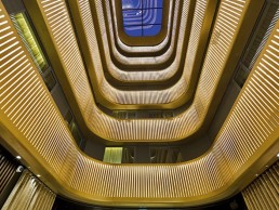
While the hotel’s façades are a balanced composition of old and new, so is its interior. To incorporate the new hotel functions, the interior of the building was mainly removed. However, the new interior architectural sequence is derived from the hierarchy of space in the original design and begins with the triumphal arch, which has been formed as a quarter dome to mirror the form of the corners of the external roof. This leads into a lower foyer, arranged in a similar configuration to the original cinema foyer, including a reference to the original circular floor decoration, which marked the centre of the foyer and entrance to the cinema.
“We tried to take the geometry and form of the outside and bring it indoors,” said Flanagan, “so in particular we utilised the curved form of the arched entrance, curved form of the roof corners and so on. We stumbled across a photograph that featured circular detail on the floor, which we picked up on and recreated. If you look at any of the interiors of the foyer and entrance, there’s this circular feature that we’ve recessed up into the soffits but below that, there’s a repeat of the original feature on the floor and that’s become a real focal point of the foyer.”
The theme of ‘golden age cinema’ is also picked up in a series of art deco inspired curved roof vaults in the foyer space, while vertical circulation to the upper bedroom floors is located in a similar position to the original circulation core at the west end of the tower. The atrium opens off the foyer and rises to the full height of the building creating an impressive focal point for the hotel around which the upper floors are wrapped in a series of golden hoops, mirroring the external roof form.
For Flanagan, the relationship between the Pavilion’s architecture and lighting design is intrinsic, with the two elements working as an integrated solution. Having worked together on previous projects, Flanagan asked Mark Hensman and his team at EQ2 Light to come on board once more for the Dorsett project.
“It’s a question of understanding the layering and hierarchy,” said Flanagan, “working very collaboratively with Mark and his team so that all of the key building features inside and out reflect light. The exterior lighting was a relatively straightforward conversation because we knew what we were dealing with when it came to the external architecture – it was very much about a hierarchy of key features. It’s all about revealing the principle levels and order of the building – allowing the upper levels to be more discreet and light themselves from within, it was a simple elegant piece of townscape lighting.
“The question was then, what do we do inside? In the original planning schemes there were layouts of what the insides were, but this didn’t really evolve until we started working with the Kosmopolitan team. We had to think about what’s important, so the majority of the wall surfaces in the foyer are very dark and recessive because we wanted all the focus to be on the key ceiling features. It was our aim to have a series of recessed ceiling coffers that Mark could uplight. These would be the principle lighting surfaces giving the glow that we were looking for in the foyer.”
It was at this point that the project evolved from an architectural form to an environment made up of gold and dark interior finishes. It was Flanagan’s vision that the building should be comfortable and acoustically pleasing, allowing people to sit and converse without having to raise their voices – meaning acoustic absorption panels were implemented. This in turn, brought about the idea of using lighting behind the panels that would result in a warm glow from within - this is where EQ2 developed the detail.
“There was a very clear view on what was to be created,” said Hensman, “it had to be distinctive and unusual. For the exterior lighting we had to consider that the building is competing with a very bright surrounding ambience so we used cooler colour temperatures to act as a contrast against the warmer colour temperature of the surrounding area.
“When we moved inside, Jason and his team had the basic framework in place and we pushed for dark ceilings and lots of dark furnishings so we could give the hotel an intimate feel. The early brief direction focused on how the shapes and forms of the building would allow this to happen.”
As the Dorsett is a hospitality environment, it was imperative the lighting was beautiful with high quality colour properties. Hensman told mondo*arc how he was looking for controlled shadow play and gentle modelling - all the things that make an environment feel warm and comfortable. “We’re always looking for light sources that have great colour and quality and there’s a precision that we work to,” he said. “The lighting had to be energy efficient and maintenance effective as well, while being discreet and invisible to the general public. And so what you find at Dorsett Shepherds Bush is linear detailing and linear elements in the atrium and public areas and a lot of down lights tucked away in the ceilings.”
Commenting on challenging aspects of the project, Hensman continued: “Dorsett is a very successful hotel brand, especially in south east Asia and they know their market very well. So there was a particular challenge in trying to marry that operational knowledge with the particular way UK and European markets work. This was always an interesting part of the project because we had to work hard to make sure we delivered what would work within the context of the Dorsett brand and European tastes.
“I love the interior design of this building,” he continued. “Shepherds Bush is genuinely different to a lot of other projects we’ve worked on and I think it’s partly related to the fact we had a clear vision from the architect. There aren’t that many hotels that have the depth of darkness to them that Dorsett does – it’s very relaxing.”
According to Hensman, there was a painstaking amount of work that was key to the way the building now presents itself - all related to the lighting and interior design integration, as mentioned before.
The former cinema was and still is the most imposing building on the Shepherds Bush Green. It is a building exhibiting a finite form rather than a mere perimeter building - a careful balance of old and new, acting as a catalyst for the continuing regeneration of the area.

Bridgelux Vero Series
The Bridgelux Vero LED packaged array technology offers new advancements in design flexibility, ease of use, and energy efficiency. It also offers a platform for integrating smart sensors and wireless communication technology for smart building control systems. It can operate from 400 to 16,000 lumens and is available in four different LES configurations with colour temperatures from 2,700K to 5,000K and a variety of CRI options.
WAC Lighting Aether
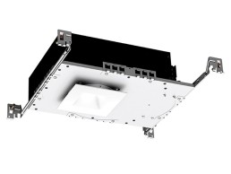
Designed to fit shallow plenums above ceilings in residential and light commercial settings. The new Aether downlight from WAC Lighting is engineered with a low profile 3.5-inch LED shallow housing that fits into ceilings ranging from 0.5 to 1.5-inches thick. The housing is well suited for installation inside buildings with complex HVAC ducts and heating/water pipes that are located between the floors.
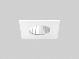
Lumenpulse Lumenalpha Clear Nano
The Lumenalpha Clear Nano is an adjustable (+/- 20° tilt), high-performance LED downlight for commercial, residential or hospitality applications. Delivering up to 2,000 lumens from a 1.75-inch (45mm) optical aperture, the luminaire provides a more durable, flexible alternative to halogen, with a choice of outputs, beam angles, colour rendering options, trim shapes, and accessories. An IP54-rated version for bathrooms and other wet locations is also available. It has a lumen maintenance of 90,000 hours (L70 at 25°C).
Kim Lighting ArcheType X
Available in a flood, wall or site/area luminaires, the ArcheType X has independently adjustable LED emitters—providing limitless lighting distributions and possibilities. It includes the brand’s new LEAR (Light Engine Adjustable Ready) module, bringing flexibility to the lighting industry. Delivering independently adjustable LED emitters, the Type X Distribution allows the fixture to be configured to any standard or custom distribution either at the factory or in the field.
Griven MK2 D
MK2 D uses 192 powerful RGBW, warm, cold or dynamic white LEDs and is available with a choice of optics for maximum lighting design flexibility. Owing to its double cluster configuration, which offers full independent control of each LED bank, this wall washer allows absolute freedom to create matching or divergent effects on formerly prohibitive large-scale facades and remote spots. The combination of RGBW LEDs provides an impressive white light output quality, as well as a variety of intermediate colour hues for a broader range of applications.
Acclaim Dyna Drum HO / QW
Dyna Drum HO / QW are Acclaim Lighting’s newest energy-efficient, IP 66-rated high-powered, quad-colour architectural lighting fixtures with a wireless DMX control option. Well suited to facade and large-scale area flood lighting, they feature an adjustable yoke with onboard 180° flip inverted digital control display for menu selections and addressing. A 100-277-V AC internal power supply consumes just 270W in replacing traditional outdoor 400W discharge fixtures.
Traxon & e:cue Sympholight
Developed with superior usability in mind, e:cue Sympholight is a simple yet powerful lighting control software with an intuitive graphic user interface. Based on advanced timeline programming, Sympholight combines easy fixture and project set-up, content creation, automation and execution control in one single application. With powerful scripting capabilities, automation by triggers and actions, and remote control via any web browser, Sympholight enables simple and fun design experience for sophisticated dynamic lighting and media applications.
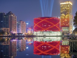
Han Show Theatre, China
Developed in conjunction with Dalian Wanda Group, the Han Show Theatre is the creation of London-based Stufish Entertainment Architects. Having started on the project in 2010, Fisher sadly passed away in 2013 just eighteen months before the project’s completion and as such, the Han Show Theatre was left in the capable hands of the Stufish team to carry out to fruition.
Purpose-built for Franco Dragone’s ‘Han Show’ the theatre’s façade is covered in 18,000 red aluminium LED disks resembling the ancient symbolic Bi Disks from the Han Dynasty. The building, which benefits from a fantastic lakeside site, features a transformable auditorium able to seat 2,000 and one of the world’s largest moveable LED screens, which is mounted on three robot arms fixed to backstage columns.
According to Stufish Architect Jenny Melville, the team knew from the outset that as well as providing an appropriate symbol for the ambitious show within, the building form and façade would need to work on many different levels, i.e. from across the lake as well as from the more intimate plaza approach from the subway station.
The façade’s Chinese paper lantern concept came early on during the design stage but was subject to many changes before the team arrived at the simple looking solution seen today. “It was felt that the lantern idea perfectly symbolised the nature of the building from within,” said Melville. From the outset it was important that the building didn’t feel inward - rather, celebratory and accessible to all.
“The lighting design of the theatre’s façade was absolutely critical to the concept’s success,” continued Melville. “It was important that the ‘lantern’ could be lit up at night – signalling that the theatre is open and the show is taking place.”
In the Stufish version of the Chinese paper lantern, the bamboo superstructure is reinterpreted as eight intersecting tubular steel rings, suspended in orbit around the theatre fly tower. The paper (or silk) surface is suggested through a series of minimal surface cable nets, hung and tensioned within the lattice of trapezoidal voids generated by the intersecting rings. Each of the 18,000 cable net structural nodes supports a Han Dynasty inspired red concave aluminium disk. The lantern light is enabled by a circular array of red LEDs at the centre of each disk that illuminate the dimpled concave surface. The light across each disk is split into four zones, each individually addressable using DMX control. The end lighting result can host a video image of approximately 600 by 120 pixels across its surface.
“As the evening sets in and the performers prepare for the first show, the lantern surface comes to life running video footage reflecting into the lake and onto the facetted façade,” said Melville. “Much of the content on the lantern surface offers abstract previews of themes and key scenes from the show.
“The podium under the lantern further accentuates the concept,” continued Melville. “The public lobby faces the plaza and a colour palette of gold and white has been used to help emphasise the idea that light is pouring out of the bottom of the lantern. In contrast, the auditorium itself is entirely finished in black textures – as a counterbalance to the bright lobby.”
Naturally, all projects come with challenges and for the team at Stufish, the Han Show theatre presented its own unique issues. “Getting the circular LED array within the disk’s central node to light the disk correctly was our biggest challenge,” Melville told mondo*arc.
“Obtaining an acceptable even light across the concave disk surface was also difficult, as there was a tendancy for the light to be too bright in the middle. We went through many prototypes with the local designers in China, trying different louvre / diffusion fascia plate solutions in front of the LED array to distribute the light in a controlled manner. The node itself was further complicated by the fact that it is also the structural support for the disk – so the final design works hard to achieve both the lighting and structural requirements.”
The team at Stufish also went through several versions of decoration on the disks themselves, from ornate figurative patterns to simple geometric ones – as they wanted the lighting (both natural during the day and LED at night) to have some texture to highlight on the disks.
“It was important to find the correct level of detail and texture as the disks are viewed from many different distances,” said Melville, “from across the lake where they become viewed as one, to just metres away from inside the adjacent hotel rooms. We ultimately opted for a dimpled surface which reflects some of the earliest Jade Bi disks.”
Summing up her experience of working on the Han Show theatre, Melville said: “During the concept design stage we had discussed having white LED lights on the back of the disks. These would have been individually programmable and seen through the lobby atrium and glazed roof down to the lobby balcony floor. However, at the time, the structural solution that was to hold up the lantern skin was different and consisted of hundreds of spokes tying it to the theatre drum - the idea with the lighting on the inside of the disks was to highlight this feature.
“It would have been interesting to see how this would have changed the lantern lighting effect from the outside,” continued Melville. “I think it would have altered the apparent transparency of the lantern skin and perhaps made it look more lightweight - although it may have also reduced the simplicity of the impact it currently has.”
American Express Invites Lounge, UK
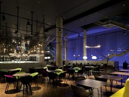
The American Express Invites Lounge (AEIL) recently opened to members following a £2.6m investment. Into, appointed as lighting consultant to work alongside interior design company Platform Group, created a dramatic new look for this VIP venue.
The lighting design brief was to realise the vision of Platform Group and the client for an exclusive venue for VIP members, which truly emulates the theatre and excitement of the green room celebrity experience and after-party atmosphere. The lighting was to be fully flexible to suit any VIP event, allowing for separate zone control of the bar, lounge and restaurant areas. The lighting was to help create intimacy at low level within such a vast venue.
On entering the venue the uplit ten-metre long by seven-metre high feature wall acts as a dramatic backdrop to the space. Stage rigging ropes running vertically floor to ceiling, and a high output lensed RGBW colour-change light trough runs along the length of the wall uplighting the rigging rope and creating an interesting shadow effect. A bespoke honeycomb louvre detail minimises glare when viewed from both ground and first floor levels. The RGB rope wall can be quickly programmed to suit any themed or branded event, be it for a band or corporate private hire.
The venue has varying ceiling heights of up to seven-metres, which made it challenging to create an intimate ambience at low level. Track-mounted AR111 LED spotlights provide the theatrical lighting for the main space along with larger Par64-style LED spotlights clamped onto truss hanging from the overhead walkways. The truss-mounted spotlights were adapted to take Ar111 LED engines and provide the visual aesthetic of large scale stage lighting. The suspension of light fittings at around four-metres along with the use of deep honeycomb louvres and barn doors creates theatrical lighting with low glare, despite the ceiling heights.
Darren Orrow, Director at Into commented: "This was a unique project in terms of scale and brief and allowed us to really go to town on the theatrical lighting effects to ensure we created a high impact backstage feel.”
The central cocktail bar on the ground floor has LED spotlights clamped to a cage above. Suspended halogen lamps hang at varying heights from the cage and create a visual impact together with a warm glow around the feature area. Bar nosing, shelving and back bar details throughout the space have integral lighting details to create an impactful and layered light effect to bar areas. The details utilise warm white LED tape. A number of bespoke feature lights were designed by Into and Platform Group for the venue, including large two-metre diameter aluminium rings with a black finish and 24 E14 incandescent lamps mounted on the inner edge.
Terry Routledge, Creative Director at Platform Group added: “It was great fun working on the VIP lounge. Creating the backstage glamour and excitement while accommodating the practical needs of the lounge and bar area were the key elements of the brief, while at all times ensuring it remained visually an amazing space. VIP’s to The O2 have a treat in store.” On the first floor, fluorescents with colour filter sleeves between each banquette, light up the brick walls with a twin-coloured light wash. LED tape to bar gantry and nosing on this level, and the back of the banquette seating, creates an intimate yet layered light effect. Stairs and all walkway bridges are lit with tight beam downlights and track spotlights to allow ease of passage without over lighting circulation areas.
Rebecca Kane Burton, General Manager at The O2 summed up the project: “With our new look lounge and membership I believe The O2 is taking the VIP experience to a new level. No other venue can provide the best in music, comedy and sport and give VIP’s the feeling that they and their guests are the stars in their own backstage area. The design team understood immediately the need to treat VIP’s as the stars and have created a space which reflects the excitement, entertainment and pure exhilaration that guests experience when coming to The O2.”
Imperial War Museum, UK
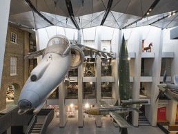
Amid the commemorations of World War I, the Imperial War Museum, London, marked the centenary of the start of the Great War with the opening of its new atrium designed by Fosters + Partners and lit by George Sexton Associates. The atrium, housing the museum’s biggest displays, now has an extra floor floating over it. Part of this floating floor’s job is to mitigate natural light levels but it also provides a surface for carefully focused track and spot lighting to meet the challenge of illuminating displays, including a Battle of Britain Spitfire, a V2 flying bomb and a Russian T-34 tank, that are visible from almost every angle.
“The approach to the atrium, in which we have inserted a new ‘floating’ floor at the top of the space, was designed to bring down the natural light levels," said Foster + Partners senior partner Michael Jones. “They were previously too high from the existing barrel roof for conservation purposes. The new floor acts as a lighting baffle. It has enabled us to open the central space to the adjacent galleries, allowing a broader cross-section of the collection to be displayed alongside, and in curatorial context with, the large objects in the atrium – these light sensitive objects include textiles, works on paper and other objects with organic pigments. This was a fundamental objective of the museum and has allowed for new readings, angles and perspectives on some of the major objects, such as the Spitfire.”
The Imperial War Museum, described by King George V in 1920 as “a lasting memorial of common effort and common sacrifice", opened in 1917 but moved to its home in Southwark in 1936. In 2010, the first phase of a £40m transformation began and today, the whole space has been reconfigured to make moving from one gallery to another logical and intuitive. Foster’s long-term strategy for the museum’s interior is based on three themes: clarity and circulation, chronology, and consolidation. Foster designed the vertical circulation to enable visitors to move through the exhibition floors in chronological order from the new lower floor World War I Galleries up to the first floor World War II exhibits and the post-1945 displays intended for the floor above.
The redesign retained the existing glazed barrel vault over the atrium. “The space was very dramatic and loved by people but restricted what we could display because we were getting thousands of lux and everything we displayed has to be very robust,” said Ann Carter, the museum’s head of exhibitions. “So, as part of the architectural development, we have introduced a new floor high up under the barrel vault that allows the light to flow down, but in a more controlled way. This also gave us more exhibition space and we hire it out.”
The transformation also included opening up views from a new lower ground floor, level zero, which includes a cafe and shop; a new opening into the floor of the central hall provides a visual connection to the different levels and draws in daylight deep into the space below.
“Fundamental to this approach was the opening up of the side walls to reveal galleries and allow views out to the park – this changes the way visitors see the collection and improves the visibility of galleries and objects from the central space,” said Jones. “This move has the effect of drawing visitors to explore all parts of the building and discover the whole collection. Circulation throughout is designed to be intuitive – visitors increasingly want galleries to have the added dimension of relationships with each other and the wider setting, rather than isolated spaces. This makes the experience richer, less overwhelming and more accessible. This also enabled us to open the museum up to the park – for the benefit of both.”
“Daylight has to be a part of the design vocabulary both technically and aesthetically. Fosters is a big proponent of daylight and we agree that it is an important consideration in any architectural project – and any museum setting,” said lighting consultant George Sexton. “Typically we like to do physical modelling of a space but the budget, time constraints and design process did not allow that, so we used design software that that we have had a lot of success with in the past, to create a very detailed computer model.”
“One of the exciting things about the atrium space is that visitors are seeing things from so many perspectives,” he added. “It was very challenging. You rarely get to light objects in 360º, where every aspect is on view, as opposed to theatrical lighting, for example, where the viewer is in one position and has a very specific vantage point.”
Throughout the public space, carefully focused track and spot lighting from ERCO and Flos play a major role in lighting displays, guiding visitors and underpinning the logic of the architecture. LED spotlights, floods and washes provide the bulk of the lighting although the scheme also uses linear fluorescents from Encapsulite and XAL and accent lighting from AlphaLED and Viabizzuno.
"The track lighting is integrated into the folds and reveals of the architecture and we used LEDs from an energy point of view and for low maintenance," said Sexton. The cafe comprises a distinctive waffle ceiling which, while visually impacting, hinders the ease at which an effective and aesthetically pleasing lighting system can be installed. While conventional track is used in the atrium, in the cafe and shop the lighting is on specially designed lattices of cable track, with small luminaires positioned at each of the intersections, custom built by Precision Lighting. The cafe ceiling comprises a matrix of domes - originally, these were to be painted a light colour and up-lit but it was then decided to paint them black. The ceiling is criss-crossed with a web of cable delivering low voltage to 176 customised Precision Lighting PICO LED spotlights, now reversed as downlights.
“The original design created volumetric lighting but when the paint colour was changed, up-lighting a dark ceiling did not make sense,” said Sexton. “But changing to downlighting with same sparkle and comfortable light level was both logical and easy. When you are in a design process you adapt to the optimum conditions of the design and a good infrastructure is adaptable for the long term.”
Ambient lighting in the cafe was provided by the glowing pendant orbs mounted to Precision's lattice of cables, enabling the interspersed Precision spotlights to add an element of brilliance to the scheme.
“All of our lighting is LED-based,” said Carter. “The shop has a network of Precision Lighting EVO spotlights providing downlight and using long snoots to avoid glare. Both areas are lit with a colour temperature of 3,000K. The shop space you want as bright and as desirable as possible. They used the same type of ceiling lattice lighting on level zero and the main seating area in the cafe, supplemented with a range of other suspended lamp fittings. In the serving area, we have suspended and some wall mounted fittings. Plus, we opened up the windows on to the park from the cafe. We have reduced the number of fittings but I don’t think we changed the concept at all.”
The new events level at the top of the building is lit with Remote Controlled Lighting DR8 spotlights attached to the curving metal framework below the glazed dome, using custom mounting brackets. The space has a number of uses and staff can refocus or adjust the lighting using handheld controllers to suit parties, seminars or temporary shows.
The new World War I Gallery designed by Casson Mann has lighting by DHA Designs and this area faced a different challenge. It has some 1,600 exhibits within just 1,050 sq metres of gallery with more than 300 lights due to low ceiling height, mainly Havells Sylvania Beacon Muse spotlights. “That space was particularly problematic, it is a very complicated space with a low ceiling and the services running across make it tricky,” said DHA Designs Director Jonathan Howard.
“Although it seems counterintuitive, the lower the ceiling, the greater number of lighting positions you need because your lighting positions become more critical. You are doing detail work. Particularly when you are dealing with low light objects and you are closer with the light source, the inverse square rule starts fighting against you because every part of the object is a radically different distance from the light source.”
Carter added: “The World War I gallery has cases with internal lighting but in the atrium we have to rely on the track lighting to light almost everything, the space the exhibition and the labelling, providing enough light for visitors to move around safely without lights shining in their eyes. The lighting designers worked very hard to get that right.”
“Although the luminaires are strategically placed to achieve object / glare balance it took constant shifting and trimming. It was a long process,” said Sexton. “But without a flexible system we would not have been able to shift lights on the infrastructure for optimal effect. If the exhibition evolves or displays are rotated or changed, the track is there, so there is no problem refocusing and no additional construction work is needed.”

Eric Carlson
What made you become an architect?
I’ve always loved to draw and ever since I can remember I’ve been cognisant about how places and spaces feel, but it’s hard to really know what architecture is at a young age. When I began to design at university I knew this profession was for me.
How important is lighting to your designs?
Lighting is everything. We can discuss ideas for form, space and materials but none of these exist without lighting. Lighting’s importance cannot be overstated as natural and artificial lighting determines if and how architecture is fundamentally. This applies for all of our work whether it’s a house, museum, office or store.
In our work with luxury brands such as Louis Vuitton and Longchamps we focus on creating unique customised designs that respond to the different contexts and cultures, but it’s often the qualities of lighting such as colour temperature, intensity and distribution that creates the thread of continuity that defines the brand.
About the role lighting plays in the light of the city? How do you contribute to that?
Even at the urban scale of the city, lighting is the principle component in determining it’s atmosphere literally and figuratively. Daylighting from the aubergine skies define Paris as much as the Haussmannian architecture. The fluctuations between the foggy diffused morning daylight with the sharp afternoon sun characterises the perception of San Francisco. The list of cities that are defined by their natural lighting is extensive: London, Rio, New York, New Orleans and so on.
The same is true for the role of artificial lighting in urban environments defining their nighttime personalities. When we designed (along with lighting designer Franck Franjou, Paris) the Tiffany & Co. building in Tokyo’s Ginza district with its dazzling night lighting using a minimum of sources we transformed the building’s facade of brushed stainless steel tracery into a giant architectural flame with a vertical lighting system that began as warm 2,000° kelvin colour temperature wash gradated upwards to a 6,000° kelvin colour temperature.
How do you approach lighting a building through architecture?
At Carbondale our first step when beginning a project is to identify a good lighting specialist with whom to work. Lighting, like acoustics in architecture, remains inexact and having a lighting designer as a creative collaborator who is also technically capable and up-to-date is essential in decreasing the unknown variables. The other indispensable aspect in our approach to designing with light, is prototyping. Whether it’s for the night lighting of a facade, or an interior space or a small display counter we build a portion of each element at full scale with the actual materials and the lighting fixture. From the prototypes there is always learning and changes to be made and it’s only then that we fully understand how the lighting will be.
A good example of our design approach with regards to lighting can be found in our store design for the pearl company, based in Australia. Working with the lighting design firm Mindseye, based in London, we realised that ‘the pearl’ was essentially a spherical mirror that reflects all it’s surroundings especially light sources. After a process of in-depth research and testing we identified the ideal techniques for light and finishes for a pearl in a showcase, but we soon realised that when the jewellery was removed from the showcase the qualitative effect was lost. We then decided to apply the showcase lighting concept to the architecture of the space. So, the lighting design became the driving conceptual direction for the store design.
About the importance of shadows and the balance of darkness and light in your work?
For me lighting is like a material, and like materials, there is no good or bad lighting, only the right lighting for the right situation. The goal is finding the appropriate lighting to reinforce the ideas and intentions. From that perspective there are times when the mystery created by heavily shadowed spaces is the appropriate response such as for our design of the 360° watch museum in Switzerland (with the lighting design practice George Sexton Associates, Washington) where the space seems to evaporate in the darkness and only the shifting sparkles from the watches materialise. In contrast, our design for the BMW George V Paris showroom we created a special VIP area called the ‘White Room’ where diffused natural and artificial lighting combine with the matt whites floor, ceiling and wall surfaces create a shadowless cloud-like atmosphere.
About the best and worst illuminated spaces you have visited?
I live and work in the centre of Paris and I walk through La Cour Carrée of the Louvre in the morning on my way to work and in the evening on my way home. By day the direct sunlight accentuates the heavy relief of the facade’s stonework and by night the artificial lighting is positioned to replace the sun recreating a similar daytime shadowing effect. However, because of the brain’s expectations the daytime lighting effect when seen at night remarkably transforms the facade into a surreal theatrical stage set.
It’s more difficult to give you an example of the worst illuminated spaces as there are so many and when they’re bad. There’s nothing worse.