

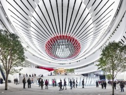
Xiqu Centre, Hong Kong
Located on the eastern edge of Hong Kong’s West Kowloon Cultural District, the Xiqu Centre’s striking design, created by Revery Architecture (formerly Bing Thom Architects) and Ronald Lu & Partners, is inspired by traditional Chinese lanterns and blends classic and contemporary elements to reflect the evolving nature of the art form. Stepping through the main entrance, shaped to resemble parted stage curtains, visitors are led directly into a lively atrium with a raised podium and space for presenting the rich and ancient culture of Chinese traditional theatre.
The eight-storey building covers 28,164sqm and houses a Grand Theatre, a Tea House Theatre, eight professional studios and a seminar hall, all specially designed for different types of functions and activities related to Xiqu (Chinese opera). The design details of each of the facilities have also been created in response to the practical requirements and aesthetic features of the art form. A unique feature of the venue is the location of the Grand Theatre at the top of the building, which allows for a large open atrium below with space for exhibitions, stalls, and Xiqu demonstrations and workshops.
In terms of lighting at the Xiqu Centre, a strong conceptual vision of ‘Qi’ energy flow was fundamental to every decision made, as was the inspiring iconic imagery of the Xiqu art form. As such, lighting design studio HLB used layers of light to reinforce the flow and enhance the juxtaposition of richly textured architectural materials with paper-thin architectural transparencies and pristine white sculptural forms to heighten the experience of motion and discovery.
Brought onto the project by Revery Architecture, HLB harnessed its multifaceted experience of working on performing arts venues around the world and while the results appear effortless at Xiqu Centre, the level of attention to detail required by the entire team was substantial, as Teal Brogden, Senior Principal at HLB, explained: “The concepts were established early-on, yet the selection and refinement of products and strategies to accomplish these goals was a multi-year process. A detailed technical performance specification was established and both local and international products were vetted for quality and performance, which resulted in the following brands being specified: Tokistar, Osram Traxon, AlphaLED, LED Linear, Thorn, Signify Color Kinetics, Whitegoods, MP Lighting, Bega, Lumenpulse, We-ef, Mike Stoane Lighting, Lumascape and Schreder.
“Numerous spreadsheets compared costs and performance metrics to assess relative value and suitability. Once narrowed to a reasonable few, samples were acquired, and mock-ups performed. To enhance decision making, the architect and owner were heavily involved in the process, with conversations continuously returning to the overall project goals and the importance of each product’s long-term performance for this important cultural asset.
“The architect encouraged our team to develop unique concepts for the lighting and we were well aligned from the beginning of the project so that the sculptural layers of the architecture would be revealed and enhanced with light.”
As one of the first projects to accomplish the new Hong Kong Green Building Council’s BEAM Plus Gold rating, HLB’s primary goal was to set a new standard for sustainable lighting design. While many surrounding buildings have a discernible ‘light shadow’ projected into the sky, this isn’t the case at Xiqu Centre.
“As the building is down-washed with light, no direct-beam illumination is presented to the sky,” Clifton Manahan, Senior Associate at HLB, told arc. “At one-tenth of the overall luminance in comparison to its neighbours, the soft glimmer of the façade, coupled with the more intensely illuminated interiors, strikes the perfect balance to sit proudly on the waterfront as a symbol of both the past and future of creative expression.”
As a way of welcoming the public and inspiring engagement, the ground level plaza is considered a public park – open 24 hours with lectures and small performances sprinkled throughout the day. While shade is a valuable commodity in the summer months, the symbolic cluster of trees needed more light than the available daylight could provide, which necessitated grow lights. In addition, the concept of an open-air park suggested a luminous surround - for HLB, these needs fitted well with the desire for a layered sculptural experience.
Inside, the project uses a lot of concealed, linear lighting, creating a glowing impression, while hiding the light sources. According to Manahan this was a conscious decision as the intent was to highlight and complement the architecture without calling attention to the luminaires themselves – this approach was again inspired by the concept of the flow of Qi. As well as this, the unique architectural concept of the building played a part in the decisions made behind the lighting, “with many of the organic curved shapes requiring complicated detail coordination to ensure they were subtly highlighted without causing glare or distracting shadows.”
“General performance and plant grow lighting for the main atrium was limited to the perimeter of the ceiling for architectural integration and maintenance access,” continued Manahan. “This required coordinated architectural detailing and lighting aiming verification and documentation. The luminous lantern panels in the façade – that peek through the curtainwall – have internal office spaces behind them in some cases, permitting filtered daylight into these spaces. The lighting solution here needed to be transparent in the daytime while producing the desired effect at night; as such, strategic areas of 12mm pixel transparent mesh were used to satisfy the multiple requirements.”
While the main atrium is incredibly bright, the theatre space is much darker. Brogden explained how the team used light to complement this contrast between the two spaces: “In theatre, as well as in architecture, the use of contrast creates drama,” she said. “The journey to the theatre – through three levels of bright white architecture – sets the stage for the unexpected and dramatic ‘reveal’ upon entering the performance hall. The architectural materials do most of the work, yet the lighting ties it all together with similar themes of layering and flow – or Qi.”
Despite these contrasts, the building feels like one unified, coherent lighting scheme and as mentioned, this was achieved through carefully crafted cove details that tie all of the public spaces together. “The open spaces utilise diffuse linear indirect cove lights onto curving surfaces to create glow and highlight the organic shapes,” said Manahan. “In the performance spaces, linear direct grazing lights have been used on surfaces to enhance the luxurious textures of the walls, fabrics and curtains.”
The completed project successfully creates an impressive, modern, public gathering space and prestigious performance hall that brings the indigenous Chinese opera art form into the modern age. Subtle references to Chinese culture and art remind Hong Kong of its past, while looking towards the aesthetic of the future. The simple, yet unique façade appearance hints at the activity inside and helps promote tourism and activity as the anchor to the West Kowloon Cultural District.
“The team’s greatest challenge on this project was to maintain design excellence while working with a multinational team,” concluded Brogden. “We had to address a tight budget, aggressive schedules, a complex programme and a unique procurement process. Persistence, advocacy and collaboration accomplished the goal.
“Due to the tight budget constraints, the lighting design team was unable to perform close-out aim-and-focus services that would traditionally provide the important fine tuning for a project this complex. An elaborate system of mark-ups and remote guidance to the architectural team, as well as strong local manufacturer representatives, helped us all work together to bring the project to a successful conclusion.
“I would like to take this opportunity to especially honour two key design team leaders who passed away during the project tenure – Bing Thom, CM, founder of Bing Thom Architects and Francis Yan, Director at Bing Thom Architects, their leadership and fierce commitment to the inspiring possibilities of architecture were our guiding lights.”
Hotel Okura Tokyo, Japan
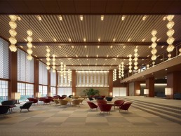
Established in 1962, Hotel Okura Tokyo has become a landmark destination for both Japanese and international VIP visitors for nearly 60 years.
The hotel of the main building closed for redevelopment in 2015, led by architect Yoshio Taniguchi, son of the hotel’s original architect, Yoshiro Taniguchi, reopening in September 2019.
Although the publicly disclosed architectural drawings for the reconstruction outlined a modern design, including a 41-storey office tower – the Okura Prestige Tower, and a 17-storey Okura Heritage Wing, the interior design is a true replica of the original Okura lobby, with the addition of a new entrance lobby, salon, restaurant and banquet hall.
Lighting Planners Associates (LPA), designed the lighting for the hotel, instilling the essence of the original Okura hotel, while incorporating modern technology into the new lighting environment. The concept for the lighting design, according to LPA Director Kentaro Tanaka, was a “fusion of ultimate Japanese style and modern comforts”.
“The ‘ultimate Japanese style’ was to reproduce the soft gradation of the diffused light that enters through the Shoji and Washi paper, which is different from the Western lighting environment,” Tanaka explained.
“On the other hand, ‘modern comfort’ is the adoption of energy-saving LED light sources and the reproduction of illuminance levels that match the living environment of modern people.
“Since the current surrounding environment is different from when it was founded 58 years ago, this transformation and fusion was essential. In particular, with regard to the illuminance level, the illuminance was set to be about seven times as high as it was when the hotel was founded. For example, in the lobby at the time of foundation, levels were at 10-20 lux on average. Now, it’s between 70-140 lux.”
Although the new lighting design raises the illuminance levels within the hotel, Tanaka added that it was important to create a unique balance when it came to brightness. “Without creating a strong contrast of light and shadow in the space, which we often see at modern hotels, we carried out the design with the goal of shifting the lighting environment with a soft tone.”
As such, LED light sources, a dimming system and projector-type LED spotlights were specified to recreate the softly diffused light used in the original wing, while the better-suited lux levels add to the desired gentle balance of light and shadow that was absent in the hotel’s original lighting scheme.
The Okura lobby, on the main entrance floor of the Okura Prestige Tower, was one of the areas that was replicated from the hotel’s original interior design. This recreation extended to its very distinctive Okura lanterns – hanging pendants that wrap the space in a softly diffused light. In its lighting design, LPA was able to retrofit these fixtures with LED sources, recreating their unique lighting effect in the process.
“There were a lot of decorative lighting fixtures that were inherited from the previous building that we reused,” Tanaka continued. “The challenge was to reproduce the lighting effects of those fixtures with modern LED light sources. For that reason, we made many prototypes to make sure that the LED light sources matched. In particular, the LED source had a slightly different colour temperature, depending on the manufacturer, so we selected a number of sources while experimenting.
“The decorative fixtures inherited from the former building were all made in 1962, so the methods of mounting components and measures to prevent falling away were very simple. These problems were rigorously verified and overcome through our system of prototype production.”
However, replicating the original lit effect with new LED sources wasn’t as easy as first thought. Tanaka explained: “LED light sources were adapted in all areas to save energy. But since the LED light source is basically a point light source diffuser covers were essential in order to create a diffused and soft light environment.
“At the time, as with the individual differences of the LED light sources, there were differences in colour temperature that occurred due to the individual differences in the various diffuse covers. So we adjusted these differences with the LED light sources. This checking work was carried out at the same time as checking the prototype fixture design.”
The lighting plan also includes ceiling-embedded downlights with hexagonal lampshades from Yamada Shomei Lighting that complement the hanging pendants, while providing adequate levels of brightness at floor level. By complementing the larger hanging pendants with these smaller downlights, Tanaka feels that LPA has created a subtle yet beautiful lighting effect, providing glare-free and comfortable illumination that makes the light a background element, rather than a key focal point.
“It was important to organise the roles of the decorative lighting fixtures and the modern architectural lighting in order to blend the two together. By organising the main roles and supporting roles in the space, it becomes a light environment that provides guests with a comfortable atmosphere,” he said.
“Previously, there was little difference in illuminance balance, so it was easy to focus only on the shape of the decorative lighting. Now, the decorative lighting is still the main feature, but an open lighting environment is realised, so guests can feel the lit environment as a whole.”
As part of the wider restoration of the hotel, the architects sought to change the layout of the former building, particularly in the lobby, where they wanted to open it out and create a much more inviting space for guests. “In the former building, there was a lounge immediately after entering the lobby, but in the new layout, there is a space to welcome guests with a gold folding screen, beautiful plants and the Okura lanterns in front of the entrance, with check-in counters on the left and the lounge now on the right,” Tanaka continued.
“We had meetings repeatedly, and experimented with the architect to decide how to present the gold folding screen and planting, as well as the Okura lanterns in the welcoming zone in front of the entrance.”
Here, LPA decided with the architect to create a hierarchy of light, arranging the lighting environment to first show the Okura lanterns, before the planting, and finally the gold folding screen is revealed to guests.
Elsewhere, the architects decided to relocate one of the hotel’s original murals to the Heritage Wing lobby. Originally displayed in the Heian Banquet Room of the former building, the Thirty-six Immortals of Poetry mural now greets guests in a space more in tune with a gallery than a hotel lobby. LED projector spotlights, embedded in the wall opposite the mural, softly illuminate each rectangular panel of the art piece.
The Heritage Wing lobby uses daylight, filtered through a Japanese motif screen, throughout the day, filling the space with a natural, diffuse light. This is complemented after dark by LPA’s artificial lighting design. Stairs leading up to the Yamazato Japanese restaurant are delicately illuminated from behind the screen, and from adjustable downlights in the ceiling. This illumination is offset by a grand hanging chandelier, adding to the luxurious, gallery-esque ambience that the designers sought.
Throughout its portfolio, LPA has a rich history of working on hotel projects, from ultra-modern locations to more historic, heritage buildings. The Okura Tokyo merges the two as a celebration of both old and new. Tanaka added that, from a logistical perspective, the Okura also stood out as unique amongst other hotels that LPA has worked on.
“In a normal hotel project, the owner and the operator are different companies, so there are many differences in opinion and blurring in the design decisions,” he said. “But this time, because the owner and operator are the same, it was possible to make decisions efficiently without any blurring.”
The seamless nature of the decision-making process was evidently of benefit to the hotel, as its newly-renovated interior perfectly encapsulates the ambiance of the original 1960s design, while adding a modern touch that brings it firmly into the 21st century.
And for Tanaka, the opportunity to work on such a prestigious landmark within Tokyo was a notable highlight. “It is a great honour for me to be involved in the lighting design of The Okura Tokyo, and to get a first-hand look at the history and changes of Okura.
“Through lighting, we were able to bring back the history of the old building, which opened 58 years ago, to the present day. As a result we realised again that the impression of light that guests expect from a hotel is a very large and important factor.
“Lighting is a very important characteristic in The Okura Tokyo,” he said. Thanks to the work of LPA, it’s a characteristic that shines brightly.
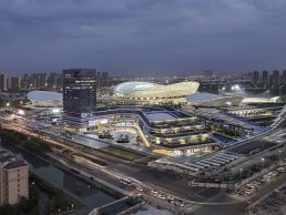
Suzhou Olympic Sports Centre, China
Comprising a 45,000-seat open-air stadium, swimming pool and multi-purpose sports hall, as well as a mixed-use commercial tower complex that houses retail, hospitality and office facilities, the Suzhou Olympic Sports Centre is a vast new development on Suzhou Industrial Park, China.
Spanning approximately 460,000sqm, the site was developed by GMP Architekten, and plays on Suzhou’s long-standing tradition of landscape design, while the three stadiums, each topped with conspicuous, undulating roofs, act as visible landmarks from afar.
Lighting for this expansive site was designed by Lichtvision, which worked in close collaboration with the architects, based on the overall architectural intent.
Given the complexity of the usage of this centre, lighting had to fulfil numerous aesthetic and functional requirements. The goal for Lichtvision was to create a scheme that would support general and special event uses, the aesthetic demands of the architecture, and also the functional orientation and guidance, at both large and small scale, while also considering the environmental impacts to the cityscape and the surrounding nature.
Situated in an open landscaped area, each building within the sports centre is positioned on its own platform that is elevated from the ground in a layered terrace arrangement. When walking through the development, those layers build up to shape the podium buildings’ façades. “The three sports arenas have a unifying design language, using façade lamellas that undulate in terms of height, width and distance to each other,” said Clemens Seipelt, Regional Director of Lichtvision’s Hong Kong studio.
“Together with individual roof designs, they build up the outer skin that ties all the arenas together. Their different functions define what is behind their skin and influences whether the façades appear transparent or solid. The goal for us was to define a lighting scheme to fit all centres, in order to maintain and underline the architectural hierarchy of the volumes within the space.”
The lighting concept therefore creates an individual layer of visible depth by contrasting the unlit arena façades’ lamellas with the inner flow of activity and attraction during events.
The commercial tower façade however, stands out thanks to an individual, dynamic lighting approach featuring a careful integration of visual media into the façade fins, courtesy of Philips Color Kinetics’ eW Accent MX Powercore fixtures.
Although the site features a number of different buildings, each with their own requirements for illumination, Lichtvision sought to create a sense of unity across the site. The design team achieved this by taking a more dynamic approach to the wider public realm and landscape lighting.
Seipelt continued: “Lighting elements on this human scale feature more vivid aesthetics. Handrail lighting at steps, ramp lighting, water features and landscape integrated fixtures [courtesy of fixtures from the likes of Wagner, Wibre, acdc, Schreder, Sill and iGuzzini] comprise a variety of different lighting elements that unify to form one dynamic layer of light, creating those individual focal points.”
When specifying fixtures, Lichtvision had to consider efficiency in terms of both cost and energy, needing a sustainable way to enhance the large architectural volumes throughout the sports centre. As such, the design team took a flood lighting approach for the exterior façades and interior vertical surfaces. This also catered to additional considerations regarding installation time and maintenance. However, from the initial concept stages in 2013, to the project’s eventual completion in 2018, Seipelt explained how the development of lighting technology, and particularly LEDs led to some alterations as the project progressed. “The development of LED and how it influenced and changed fixture design, optics, etc, is especially interesting, because during the design stage we had to base the flood lighting concept on conventional lighting, as at that time, LED could not fulfil our technical and aesthetical requirements.
“However, once it came to the procurement phase some years later, local Chinese manufacturers had become sophisticated enough to be able to deliver good quality LED-based lighting equipment.”
Elsewhere, the smaller-scale lighting elements, which featured integrated fixtures at water features, sculptures, trees, paths and ramps from the likes of Wibre, acdc, and Schreder were considered to be the “human-scaled components” within the overall scheme. “These added a higher level of variety such as light distribution, direction and luminance levels,” said Seipelt.
Meanwhile, a repetitive landscape path lighting system, with pole-mounted fixtures from Sill and Technilum, was considered by Lichtvision as the most appropriate solution to support the people flow management scheme. “These provide a greater sense of security and orientation for wayfinding, with higher uniformity and especially vertical illuminance,” continued Seipelt. “Aesthetics-wise, this repetitive layer of light creates a buffer between the extremely even façade lighting and the more dramatic landscape lighting.”
Suzhou Olympic Sports Centre was one of the first projects of this scale in mainland China for Lichtvision, and as such, Seipelt revealed that there were “some lessons learned along the way”.
“The sheer size of the project was something new for the Asian team at that time, besides the coordination with multiple parties across the globe, onsite coordination, document quality, site workmanship, and so on. This has changed over time though, and the team has now become far more familiar with large-scale projects like these.”
Lichtvision worked closely with the architects throughout the whole development process, with regular discussions through workshops and video conferences on the conceptual options for the lighting design. This “open and constructive team effort, based on skilled communication, led to a great integration of all elements,” Seipelt said. Such a collaborative approach resulted in a project in which the lighting and architecture are well connected, creating a cohesive, harmonious environment. Speipelt concluded: “Lighting adds another architectural layer, and in doing so, both elements work together in great harmony.”
MGM Healthcare, India
Dating back to 300BC, India has a rich history in medical education and sciences, with world-renowned physicians such as Jivaka Kumarabhacca and Charaka showing the world how to treat diseases and illnesses.
At a time when surgeries worldwide were done primitively, well-trained surgeons in India, such as Sushruta, performed the most advanced and complex surgeries, including cataract, plastic and reconstructive. Sushruta was also a great teacher, giving students practical, hands-on experience in surgical skills by getting them to make incisions on the skin of fruit.
Inspired by this glorious past, the Mahatma Gandhi Medical (MGM) College and Research Institute has developed a reputation for medical education in India. The next stage of its evolution was the launch of India’s first USGBC, LEED Platinum-certified hospital in Chennai, Tamil Nadu – MGM Healthcare.
The inspiration for MGM Healthcare came from a “health-caring movement”, which looks to redefine the patient experience across all parameters – through design, expertise, technology and environmental sustainability.
Lighting was recognised as an imperative element in this movement, to support doctors and therapists during treatments and to promote the healing process in patients with an increased sense of wellbeing. The right light at the right time in the right place was considered critical in this movement, characterised by acute cost awareness and savings as a result of lower energy costs.
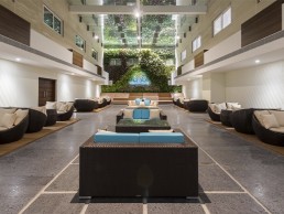
With a built-up area of more than 300,000sqft, this 11-storey, 400-bed hospital has been optimally designed by KGD Architecture to provide the most comforting ambience for healthcare; every aspect of the hospital reflects an ethos of healing and a sense of serenity, from the city’s tallest vertical garden, to the use of music therapy in critical care areas, to thematic art galleries on each floor celebrating the various facets of Tamil Nadu.
These myriad tasks and the vastly different spaces and users demanded a variety of lighting treatments, without compromising on energy efficiency. As such, Dr. Amardeep M. Dugar, Founder and Principal of Lighting Research & Design, was brought in to develop the lighting design for the hospital.
Although utility in terms of wayfinding was non-negotiable, there was a lot of room to experiment in terms of brightness, colour temperature and colour rendering. However, one general principle followed throughout the hospital, which was to make the effect of the 100% solid-state lighting as natural as possible, so as to provide a better sense of wellbeing among patients and staff.
One of the key methods of doing this, Dugar explained, was to move away from the traditionally cold, sterile atmosphere of hospitals and create something warmer, more akin to hospitality lighting.
“The preliminary brief was to provide the functionality and style of a hospitality environment, so as to elicit a certain emotional response from the hospital users,” he said.
This style is evident in the MGM Healthcare lobby, which had to be inviting yet professional, to complement the furnishings and décor in creating an overall appeal. “While a well-lit lobby was essential, care was taken not to flood it with overabundant illumination that might create environments akin to an emergency room,” Dugar explained.
The lobby was divided into entrance, reception and waiting areas, each with its own lighting treatment to provide a different ‘feel’. The reception desk is well-lit, and prominently highlighted with a decorative pendant from Aromas, lit at 3000K, so that patients and visitors know exactly where to go first, and have adequate illumination for reading and signing necessary paperwork.
The lobby space also incorporates a separate VIP Lounge – a waiting area specially allocated for important guests and visitors. The lighting solution here sought to create a relaxed and soothing atmosphere. Abby’s ceiling-mounted cylindrical 3000K downlights with adjustable heads provide accentuated illumination, which can also be used to highlight the paintings on the walls. Decorative floor lamps from LEDS-C4 and wall-mounted up-downlights from Astro Lighting are added next to seating areas, creating a more relaxed atmosphere for guests to relax or socialise. Gold-finish luminaires are specified to match the beige and gold colour scheme used in the entire lobby and lounge areas.
The decision to use the warmer, 3000K colour temperature in all the non-clinical areas of the hospital was integral in creating a more hospitality-like environment, and was the result of a process Dugar refers to as “evidence-based design”.
“Evidence-based design in healthcare is a developing field of study that holds great promise for benefitting key stakeholders,” he said. “It proposes a framework where the built environment is represented by nine design variable categories: audio environment, visual environment, safety enhancement, wayfinding systems, sustainability, patient room, family support spaces, staff support spaces and physician support spaces.
“From its initial focus on reducing patients’ stress, evidence-based design evolved to include patient and staff safety; staff morale and productivity; and environmental sustainability.
“As this was my first foray in evidence-based design in healthcare lighting, I used my personal experience while visiting family and friends who were undergoing treatment at hospitals. The cold and sterile atmosphere tends to exacerbate their anxiety and stress levels. Therefore as a first step, a warm colour temperature of 3000K was used in all the non-clinical areas.”
Dugar opted for a neutral colour temperature of 4000K in the clinical and semi-clinical areas, striking a gentle balance without causing too much contrast. However, some semi-clinical areas, such as corridors and the nurses stations, were illuminated at 3000K with decorative luminaires to create a more balancing effect.
In general, the corridors were illuminated via bespoke, ceiling-recessed, double-asymmetric linear profiles in 4000K. Taking care to avoid glare for patients in stretchers or wheelchairs, these fixtures wash the two walls of the corridors, offering glare-free illumination as well as wayfinding. After dark, these linear profiles can be dimmed using an analogue rotary dimmer mounted on the entry walls of each corridor.
In the executive floor corridors, catering to the high-end suite rooms, circular coves with 3000K LED tape from Ledos provide a soft, warm illumination more akin to a hotel corridor. Bespoke, wall-mounted decorative up-downlights in 3000K provide supplemental illumination in all corridors.
In the doctors’ offices, lighting had to serve multiple functions, as the spaces act as both a regular office and an examination room. Office lighting has to be ergonomically correct and individually adaptable, while examination rooms require high levels of general illumination and good colour rendering to show the true tone of the skin, for example, for visual examination.
However, since the majority of the consultancy in a doctor’s office consists of simply talking with the patient, a soft general illumination was deemed as the best lighting solution. As such, Abby’s Skylight modular panel luminaires in the grid ceiling were deemed the best way of reaching the 500lux average requirement, with a colour temperature of 4000K and high Ra 90 value.
Elsewhere, MGM Healthcare features a number of other areas, both public-facing and back of house, each with their own specific lighting requirements: from administration offices, to the cafeteria and training rooms. The administration office combines direct and indirect lighting with task lighting, to create an optimum working environment for both paper and screen work. Abby’s Circulo and Enso circular pendant luminaires, in different sizes and configurations, create a more intimate, less clinical feel, while the luminaires also match with the exposed ductwork in the ceiling.
When illuminating the cafeteria, bright lighting was used as a means of keeping staff and visitors awake and alert. The use of ambient and punctual lighting elements defines the design and feel of the cafeteria. Large windows let in plenty of natural light during the day, while a rhythmic composition of ‘floating’ 3000K linear profiles integrated between the wooden rafters provide illumination at night.
The training rooms, used by doctors for conducting special training sessions, also double up as an auditorium for major conferences, meaning that they are dynamic environments where people meet, learn, share ideas and collaborate. This called for a flexible lighting strategy that was designed for easy pre-programming and dimming. Ceiling coves with Ledos’ LED tape in 4000K provide ambient illumination to eliminate glare and fill in the shadows on faces. Additional spotlights from Abby, also in 4000K, provide accentuated illumination.
However, the highlight of the hospital though is the vast, living green wall. The largest vertical garden in the city, the green wall brings a welcoming natural feel to the pre-function area outside the training rooms. Although situated under a large skylight that allows for ample natural light, supplemental illumination was required for those sections of the wall not receiving the required illumination. Additionally, the living wall becomes a night-time feature, especially during conferences, which meant that it required special highlighting. Abby’s linear grazers in 4000K were used from the top-downwards and below-upwards, evenly washing the green wall. The rest of the lighting in the pre-function space was kept to a bare minimum, ensuring the focus remained on the green wall.
With all of these myriad areas throughout MGM Healthcare, each with their own lighting requirements, creating a sense of unification was one of the most challenging aspects for Dugar. “Subtle design elements, especially in terms of decorative elements such as similar up-downlights or gold finishes were introduced for visual continuity within the different spaces,” he explained.
“In spaces where it was not possible to include decorative elements, this continuity was maintained through similar cove lighting elements or colour temperatures.”
While the links between good lighting and good health and wellbeing are becoming widely recognised within the lighting design field, when developing lighting for a healthcare facility, its role is much more pertinent. Dugar was therefore on hand to provide some additional consultation to the building staff on how the lighting could be used to boost wellbeing.
“Lighting for health and wellbeing has now become the single selling point for almost all projects, and more so for this project, as it is all about healthcare,” he explained. “As improving the healing process was the prime objective of this project, health and wellbeing were definitely more integral factors here. All key building management personnel were briefed and educated right from the concept design stage itself, in order to bring them onto the same page with respect to lighting.”
The end result is a thoughtful lighting strategy that, while catering to the specific needs of a healthcare establishment, does so in a way that eschews the overlit, cold and clinical environment usually associated with hospitals. Instead, what Dugar has developed creates an environment that is warmer and altogether more welcoming, where lighting becomes a subtle, yet significant element in the overall healing process.
David Morgan Review: Erco Eclipse
David Morgan shifts his attention to Eclipse, Erco’s newest LED spotlight range, inspired by the Mario Bellini modular range of the 1980s.
Erco is one of the most interesting and influential architectural lighting companies. Still family-owned after 86 years and employing 850 staff worldwide, it continues to develop innovative ranges of luminaires and to promote itself as selling ‘light’ rather than luminaires.
The company, originally named Reininghaus and Co, was founded in 1934 by Arnold Reininghaus with two partners, Paul Buschhaus and Karl Reeber, who had all worked together in the electrical industry. Although the German economy was suffering from the worldwide depression, Reininghaus and Co grew into a successful mid-size company in this period and its name was abbreviated to the phonetic Erco. The earliest products were lighting components, including ingenious sprung loaded and balance rise and fall pendant mechanisms for sale to the lighting industry.
As the company grew in the immediate post-war period, the product focus was on mainly decorative and domestic technical luminaires. The change in direction, which led to the architectural lighting company that we are now familiar with, started in the mid 1960s when Reininghaus’ son-in-law, Klaus Maack, took over the running of the company. He realised that the home lighting market was subject to short product life cycles and identified a new approach based on providing sophisticated lighting tools for architects where providing the right quality of light rather than lighting products was the key focus. He felt that investing in complex luminaire systems rather than individual products would yield longer product life and higher margins. He also understood the contribution that design and marketing could make to the transformation of the company.
During this era, Erco worked with many leading industrial designers to produce distinctive and cutting-edge luminaire designs. The distinctive Erco brand identity, designed by Otl Aicher was also developed during this period to encompass all the visual aspects of the brand and the ‘Light Not Luminaires’ campaign won a German marketing award. In recent years, however, the luminaire design style has become more muted and neutral with an overall corporate product design style being applied without input from named external designers.
The latest development from Erco is the new Eclipse spotlight range, which shares the name and some design concepts from the original Mario Bellini designed modular spotlight range from the 1980s.
Many of the design ideas from this icon of 1980s design are still evident in the new range, although the lighting technology is now all LED instead of using halogen and HID sources. The interchangeable reflector modules, designed with an SLR camera lens aesthetic, fitted onto a common body housing a magnetic transformer. The new Eclipse range takes that concept and expands the scope to an amazing extent.
With more than 28,000 options, it is a remarkable design and engineering achievement that took almost four years to complete. It is understood that the product definition and design development was a multi-disciplinary process involving members of the Erco sales, marketing, technical and production teams. The Eclipse development was apparently one of the most extensive and complex development projects in the company’s history.
There are five spotlight sizes in the range, starting with the smallest size at 32mm in diameter, which delivers up to 375 lumens from 3.2W. The largest size at 145mm diameter delivers up to 6,468 lumens from 58.4W. All sizes of spotlight incorporate integral drivers.
The spotlights can be mounted onto three types of track adapter. The three smallest size spotlights are available with an adapter for 48V LV Minirail track. All five spotlight sizes are available with a 230V AC InTrack adapter that fits within the profile of three circuit mains track with DALI conductors to give a fully integrated appearance. The three smallest size spotlights are also available with adapters for standard three circuit track. To complete the mounting options the track adapters on the low voltage spotlights can also be mounted into 230V track with a custom-designed adapter incorporating a 48V DC transformer.
Standard LED light engines include six fixed colour temperatures with a CRI of up to 97, tuneable white and RGBW options. Four add-on filters enable the fixed LED colour temperatures to be fine-tuned on site. A wide variety of glare control accessories including snoots and barn doors are included in the range. Up to three accessories can be attached to each spotlight using the bayonet system.
Probably the most impressive aspect of the Eclipse range is the optics. Each spotlight size incorporates a light engine fitted with primary lens. The light output from the primary lens is then modified with a secondary optic, which attaches to the spotlight with a bayonet fixing designed for single-handed assembly and disassembly. Rotate clockwise to attach and anti-clockwise to remove these lenses. As you would expect, the range of secondary optics is ample; for each size there are three symmetric fixed spot beam angles, two fixed wide symmetric beam angles, two zoom options – one symmetric and the other rectangular, two elliptical distributions, a wall washer and a framing accessory with adjustable shutters. The Darklight wide lenses produce a soft edge beam without any spill light and provide good visual comfort with a 60° cut off angle.
The quality of the light output from the two samples I examined was good with even distributions, no colour over angle issues and only a few slight imperfections in the beam on a couple of the lenses. The elliptical distribution from the 35mm diameter sample produced a remarkably wide thin blade of light.
Dimming control is achieved with a very neat add-on module that plugs into the back of the spotlights. One version provides local manual dimming, the multi-dim module provides DALI, push dim and phase dimming while other modules provide Casambi or Zigbee wireless control. A combination of manual and remote dimming does not seem to be an option at the moment.
The build quality of the samples I tested was generally acceptable, although I found that the moulded lens fixing bayonet ring came loose on one of the 60mm lenses. The lenses on the 60mm sample were rather loosely held and could be pulled off quite easily without rotation. It is possible that the samples I tested were from a pre-production batch and perhaps this would not be an issue with production products.
The overall design of the spotlights was well-executed with no visible screws and the body castings include a perforated pattern that pays a small homage to the earlier Bellini design, which is a nice touch. Some of the design detailing on the mounting-bracket seemed rather idiosyncratic and did not correlate with the body casting design. Apart from these small details, the overall impression and the optical performance of the samples was excellent. Considerable effort has been taken to minimise any stray light leaks.
The Eclipse range is a major development for Erco and is likely to be very successful in its target markets of galleries, museums and premium retail brands.
teamLab
Since its beginnings in 2001, teamLab has grown to become a global art collective, known for its incredibly immersive installations. arc speaks to the group about its quest to transcend the boundaries of perception.
Anyone who has taken even a cursory glance at any design publication or website over the past few years will no doubt be familiar with the work of teamLab. The global art collective has built a reputation since its formation in 2001 for creating breathtaking, immersive art installations that push the boundaries of technology and design, leaving a lasting impression on all who experience them.
Founded in Japan by Toshiyuki Inoko and several of his friends with the goal of creating a “laboratory to experiment in collaborative creation,” the collective has since expanded to become an international, interdisciplinary group of specialists across a wide spectrum of sectors. This includes artists, programmers, engineers, CG animators, mathematicians and architects, whose collaborative practice seeks to “navigate the confluence of art, science, technology and the natural world”.
Since its inception, teamLab has sought to create new experiences through art and, through these experiences, explore what the world is for humans. The collective explained: “teamLab aims to explore the relationship between the self and the world and new perceptions through art.
“In order to understand the world around them, people separate it into independent entities with perceived boundaries between them. teamLab seeks to transcend these boundaries in our perception of the world, of the relationship between the self and the world, and the continuity of time.”
Although the collective now has a worldwide reach, with exhibitions around the globe, it took a long time for teamLab to establish itself within the art and design world. “In the beginning, teamLab had neither the opportunity to present ourselves, nor could we imagine how to economically sustain our art creation,” the collective explained.
“On the other hand, we believed in the power of digital technology and creativity and kept creating something new, no matter what genre it would turn out to be. While we took part in various projects to sustain ourselves, we increased the number of technologists, such as architects, CG animators, painters and hardware engineers.”
As time went on, teamLab was able to gain a passionate, young following but was largely ignored by the art world, until in 2011, when the collective was invited by artist Takashi Murakami to make its debut at the Kaikai Kiki Gallery in Taipei with a series of installations.
From there, teamLab gained opportunities to join major contemporary art exhibitions around the world, such as the Singapore Biennale in 2013, while in 2014 the New York PACE Gallery started to help promote teamLab artworks. Such opportunities allowed teamLab to expand rapidly, culminating in the collective organising its own exhibition in Tokyo in 2015.
“This further accelerated our evolution and gave us opportunities to exhibit internationally in New York, London, Paris, Singapore, Silicon Valley, Beijing, Taipei and Melbourne, among other cities,” the collective added.
Working across a range of different specialisms, teamLab says that its creativity is based on “multidimensionality”, where members with different specialties create together by crossing their boundaries, as well as their “transferrable knowledge” – a type of knowledge that can be shared and reused.
As a result, teamLab generates what it calls “collective creation”, the creation of something of a higher quality by a group, which they feel strengthens the entire team.
“We believe that teamLab is truly an art collective in the sense that our artworks are created from conception to realisation in-house. Our exhibitions are created by a team of hands-on experts through a continuous process of creation and thinking. Although the large concepts are always defined from the start, the project goal tends to remain unclear, so we need the whole team to create and think as we go along.”
Once the wider concept is set, the collective gathers specialised members relating to that particular project, to then fine-tune the plans. For example, its Forest of Flowers and People: Lost, Immersed and Reborn piece, located in the MORI Building DIGITAL ART MUSEUM: teamLab Borderless in Tokyo, was created with a specialist who creates 3D CG flower models and animation, a 3D software programmer, an engineer who designs equipment such as projectors, a software programmer who localises and integrates dozens of projectors within the space, and an architect.
A vital feature within teamLab’s work is the use of light; whether this is through digital projections on pieces such as Drawing on the Water Surface Created by the Dance of Koi and People - Infinity and Universe of Water Particles on a Rock Where People Gather, or a more transformative, immersive effect on installations such as Light Vortex and the Floating Nest, where viewers are placed at the heart of a swirling, colourful light show.
“Light is an essential part of teamLab’s work,” said founder Toshiyuki Inoko. “We use immaterial digital technology, such as light, to create artworks that encourage people to rethink their perception of the world.
“For instance, we exhibited an artwork of lamps that uses traditional Kasane no Irome colours in our annual summer exhibition in Mifuneyama Rakuen – teamLab: A Forest Where Gods Live.
“We decided to use the summer forest of Mifuneyama Rakuen as our colour scheme when making our lamps, but the colour did not look natural and it wound up with the atmosphere of a neon city like Kabukicho [Tokyo’s Red Light District]. When we were thinking about what to do, we remembered that in premodern kimono culture, there was a technique known as Kasane no Irome, in which multiple colours were blended together to create a single new colour.
“Silk was such a thin substance in those times that, for instance, you could make the front side white and the back side red to create something that looked pink. The colour is created by layering materials, so the graduation changes depending on air entry. The Kasane no Irome colours are fixed for each season, and green is often used in summer. So by setting the bright colour to that of summer flowers, then fading to green when the light dims, the neon-likeness disappears and we were able to bring out the naturalness of a summer forest.
“Originally, nature was made up of nothing but graduations, but by creating artificial boundaries, humans created the concept of colours. This work is full of graduations, because each lamp shines with light at different times before slowly fading, making it feel more natural.”
“Digital technology allows artistic expression to be released from the material world, gaining the ability to change form freely,” the collective added. “The environments where viewers and artworks are placed together allow us to decide how to express those changes.
“In art installations with the viewers on one side and interactive artworks on the other, the artworks themselves undergo changes caused by the presence and behaviour of the viewers. This has the effect of blurring the boundary between the two sides. The viewers actually become part of the artworks themselves.”
This interactivity, where viewers are immersed into the alternate reality of the installations, has become a calling card for teamLab, and is something that the collective seeks to instil in each of its exhibitions.
“Video games, smartphones and the internet are all interactive when you involve yourself intentionally. However, what teamLab focuses on is connecting interactivity with art,” explained Inoko. “A type of interactivity we pursue is one in which your presence transforms the work, whether or not you intend to do so. If you find a change caused by someone else to be beautiful, that person’s presence may become beautiful as well.
“Types of art we have seen so far often find the presence of other viewers more of an obstruction. You feel very lucky if you happen to be alone at an exhibition. But what teamLab aims to do is to be able to feel the presence of others as something more beautiful than ever before.”
“Creative expression has existed through static media for most of human history, often using physical objects such as canvas and paint. The advent of digital technology allows human expression to become free from these physical constraints, enabling it to exist independently and evolve freely,” teamLab added.
“No longer limited to physical media, digital technology has made it possible for artworks to expand physically. Since art created using digital technology can easily expand, it provides us with a greater degree of autonomy within the space. We are able to manipulate and use much larger spaces, and viewers are able to experience the artwork more directly.”
While teamLab’s varied portfolio of artworks has seen it exhibit in museums and galleries around the world, the collective cites its first large-scale solo exhibition, teamLab Dance! Art Exhibition and Learn and Play! teamLab Future Park at the National Museum of Emerging Science and Innovation (Mirai-kan) in Tokyo as the moment that really put it into the collective consciousness of the art community. The exhibition marked the first time that teamLab gathered a number of its previously showcased artworks under one roof. Incorporating its art exhibition with Learn and Play! teamLab Future Park, the collective combined both new and old artworks with a unique amusement park, giving visitors the chance to experience the full spectrum of the group’s fascinating collection of work.
The large-scale exhibition, which featured a total of 18 works, was considered a huge success by teamLab, attracting nearly half a million visitors across its six-month tenure from November 2014 to May 2015. This success led to a permanent exhibition at the ArtScience Museum in Singapore, and the annual outdoor summer exhibition at Mifuneyama Rakuen.
It also spawned the creation of teamLab Borderless, the group’s own permanent museum space. Now with two locations – Tokyo, opened in June 2018, and Shanghai, opened in November 2019 – teamLab Borderless is a “group of artworks that form one borderless world. Artworks move out of rooms, communicate with other works, influence and sometimes intermingle with each other with no boundaries.”
Spread across 10,000sqm, the Tokyo museum features around 60 teamLab artworks across five separate “worlds” – Borderless World, comprising the majority of the art installations; Athletics Forest, a “creative physical space that is based on the concept of understanding the world through the body and thinking of the world three-dimensionally”; Future Park, an educational project based on teamLab’s philosophy of collaborative creativity and co-creation; EN TEA HOUSE, which incorporates teamLab’s immersive artwork into a floral tea café; and Forest of Lamps, housing arguably teamLab’s most iconic installation, Forest of Resonating Lamps – One Stroke.
The installation harnesses the Kasane no Irome technique which, combined with a series of Murano glass lamps, creates a vast, never-ending play of light and colour. On entering the installation, one lamp shines brightly, emitting a colour that resonates out. This light acts as a starting point, before spreading to the two nearest lamps, which then transmit the same colour to other lamps, spreading the light out continuously until the entire space shines brightly.
Although seemingly scattered throughout the room randomly, the arrangement of the lamps is mathematically determined, with a number of solutions evaluated so that the variation and distribution in height, direction of the lamp and smoothness of the three-dimensional path was determined. Light travels to the lamp it is physically closest to, giving it a natural feeling, while teamLab believes that the arrangement is “not only beautiful in a static way, but also in a dynamic way when activated by people in the space, and in a continuous way. It demonstrates the space of a new era that adapts and changes due to the movement of people in it.”
teamLab Borderless has, since its opening, become one of the most-visited museums dedicated to works by a single artist in the world, becoming a pilgrimage for art, design and light aficionados. In its first year, teamLab Borderless in Tokyo welcomed 2.3 million visitors from more than 160 different countries, and Communications Director Takashi Kudo believes that it is the experiential epitome of teamLab’s creative ethos.
“Art is something we can’t explain with words, and history will decide whether our output qualifies as art. If we can change people’s minds, then it’s art,” he said.
“We human beings have emotions and we also have something that we can’t explain with words – it’s cool, it’s beautiful and it’s fun. What teamLab Borderless does is underpin the impossibility to ‘have’. None of our visitors can own the artworks. They can’t ‘have’, but they can ‘be’. Today’s society drives us to ‘have’, which imposes limits and division. This simple structure of capitalism bounds us, but the internet and the digital world beyond have no limitations. At the same time, you don’t technically own anything on Google or Facebook, but you’re part of the community. Therefore you can’t ‘have’ but you can ‘be’. Our artwork is shared the same way. We wanted to make something that will reach people’s hearts.”
As teamLab Borderless continues to attract visitors from around the world the collective was due to open its third large-scale permanent exhibition this year – teamLab SuperNature Macao. However, due to Covid-19, this has been postponed until further notice. The concept behind teamLab SuperNature is to create a “single, massive world that aims to explore new perceptions of the world and the continuity between humans and nature”.
Intended to be a “body-immersive” exhibition, it’s centred around a group of works that blur the boundaries between people’s bodies and art. “People immerse their bodies in art with others, influencing and becoming a part of the artworks themselves, and thereby recognising the continuity between the self and the world,” the collective said.
For founder Toshiyuki Inoko, teamLab SuperNature is a culmination of everything that the art collective has been working towards, bridging the gap between art and science, and exploring the deepest realms of human perception and understanding.
“Science raises the resolution of the world. When humans want to know the world, they recognise it by separating things. For example, the universe and the Earth are continuous, however humans recognise the Earth by separating it from the universe. To understand the forest, humans break it down into trees, then cut the tree into cells, and so on,” he said.
“But in the end, no matter how much humans divide things into pieces, they cannot understand the entirety. People try to grasp the entirety by making each thing separate and independent, but the more they separate, the farther they become from the overall perception.
“How can we go beyond the boundaries of recognition? Through art, I wanted to transcend the boundaries of our own recognition. I wanted to transcend human characteristics or tendencies to recognise the continuity.
“Art is a search for what the world is for humans. Art expands and enhances ‘beauty’. Art has changed the way people perceive the world. Groups move by logic, but individuals decide their actions by beauty, their behaviours are determined not by rationality but by aesthetics. In other words, ‘beauty’ is the fundamental root of human behaviour. Art expands this notion of ‘beauty’; art is what changes people’s behaviour.
“It may be the whole world or only a part of the entirety, but it is art that captures and expresses it without dividing it. Art is a process to approach the whole, and by sharing it with others, the way people perceive the world changes. Through the enjoyment of art, the notion of ‘beautiful’ expands and spreads, which in turn changes people’s perceptions of the world.
“Everything exists in a long, fragile yet miraculous continuity over an extremely long period of time. Through our work, teamLab aims to create an experience through which visitors recognise this continuity itself as beautiful, changing and increasing the way we perceive the world.”
Women in Lighting: Isabella Cheung
As part of the release of issue 116, arc worked in closely with the Women in Lighting team and the launch of their interviews in Asia.
Isabella Cheung was interviewed in Hong Kong as part of Light Collective's whirlwind trip across four cities in Asia to document multiple interviews. This video is one of four released, with more scheduled to appear over the next coming weeks.
Video courtesy of Light Collective.

Women in Lighting: Jenna Liu
As part of the release of issue 116, arc worked in closely with the Women in Lighting team and the launch of their interviews in Asia.
Jenna Liu was interviewed in Shanghai as part of Light Collective's whirlwind trip across four cities in Asia to document multiple interviews. This video is one of four released, with more scheduled to appear over the next coming weeks.
Video courtesy of Light Collective.

Women in Lighting: Cheryline Chua
As part of the release of issue 116, arc worked in closely with the Women in Lighting team and the launch of their interviews in Asia.
Cheryline Chua was interviewed in Singapore as part of Light Collective's whirlwind trip across four cities in Asia to document multiple interviews. This video is one of four released, with more scheduled to appear over the next coming weeks.
Video courtesy of Light Collective.
Issue 115
arc Apr/May 2020 – Issue 115
Stay home, stay safe...
And enjoy the latest issue of arc magazine...
As I write this from my spare bedroom/newly-converted home office, I’m struggling to comprehend just how much the world has changed in the two months since we went to print on our last issue. You don’t need me to tell you about Covid-19, or about the devastating impact that it has already had around the world; all I will say is that, on behalf of everyone at [d]arc media, I sincerely hope that you’re all safe, staying well, and keeping in positive spirits in these dark times.
While these are truly unprecedented times, it’s been quite remarkable to see the level of support and solidarity across the lighting industry over the last few weeks - from simple group chats (shout out to The Corner Crew!) to wider support groups and initiatives such as the Light Minded Movement, recently set up by IALD, ILP, SLL and Zumtobel Group, and Designers Mind (Check out this issue’s Briefing for an insightful interview with founding members Kaye Preston and Kael Gillam on page 36). The lighting design world has always felt more like a community to me than anything else, so to see it in action during these times of crisis is very heartening.
With all of this in mind, it feels a little redundant to be talking about the latest issue of arc, but while it’s certainly been a new challenge piecing it all together remotely, we’re really pleased with this issue, and we hope that it will provide you with some light entertainment and welcome distraction from everything going on in the wider world.
Readers of our digital issue will also notice a special second cover featuring a great shot from our own Sarah Cullen of Salford’s Media City, illuminated in blue as part of a UK-wide message of support to the wonderful work of the NHS. A big shout out to Tryka LED for their work in creating this particular tribute.
Finally, I’ve seen a number of motivational quotes shared across social media over the last couple of months to try and boost morale. The most poignant for me was a Murakami quote shared by Foteini Kyriakidou on the latest Women in Lighting newsletter: “And once the storm is over, you won’t remember how you made it through, how you managed to survive. You won’t even be sure whether the storm is really over. But one thing is certain. When you come out of the storm, you won’t be the same person who walked in.”
Stay safe everyone!
Matt Waring
Editor
arc

Women in Lighting: Tippaya Prasertsuk

As part of the release of issue 116, arc worked in closely with the Women in Lighting team and the launch of their interviews in Asia.
Tippaya Prasertsuk was interviewed as part of Light Collective's whirlwind trip across four cities in Asia to document multiple interviews. This video is one of four released, with more scheduled to appear over the next coming weeks.
Video courtesy of Light Collective.
Lights in Alingsås adapts for 2020
(Sweden) - Lights in Alingsås cancels international workshop and creates a paired-down festival for locals.
This year, the festival will focus on light and the local community. Lights in Alingsås will be illuminating the town this October, which will mark a positive re-start for the local community and the residents of Alingsås.
In the current situation, the lighting workshop, which normally involves international designers and students travelling to Alingsås, will not go ahead as usual. This year, the scale of the experimental light installations will be smaller and the focus will be on experiencing the light in the cityscape. There are also hopes that the collaboration with students on the electricity and energy programme at Alströmer Senior High School will continue.
"We do not want to attract crowds, but instead want to attract visitors who come individually or in small groups to see the lights in October, as they have done for the last twenty years," said Jan Olofzon, CEO of Alingsås Energi. "We want to do this with the help of, and for the benefit of, tourism and local business."
This year’s lighting designers, Anuj Gala, Rogier Hengeveld, Craig Spring, Jessica Krometis, Luciana Alanis, Rodrigo Muro, and Sara Ortega have been invited to return as workshop heads next year.
"Just like everyone else in our business, we need to be innovative and think in new ways,” said Event Manager Camilla Boström. "We won’t be arranging guided group visits but instead we will be extending our Lights in Alingsås app, so that people can enjoy a virtual guided tour."
The Lights in Alingsås lighting festival will start on 1 October 2020.