Signify on harnessing the power of networked lighting
Modern lighting design is driven by a combination of energy targets, occupant wellbeing, and the need for more sustainable and adaptable buildings. Today’s spaces are no longer static or single purpose; offices hospitality, retail, and infrastructure environments are increasingly designed to be flexible, multi-use, and responsive to changing demands.
As a result, lighting designers face growing complexity. Efficiency, colour quality, glare control, daylight integration, automation, and sustainability must all be balanced within a single design, often alongside evolving standards and stricter regulatory requirements.
What are Networked Lighting Controls (NLCs)
A standalone occupancy sensor wired to a single fixture is lighting control. A system where every fixture, sensor, and controller in a building communicates over a shared digital network, reports data to a central dashboard, and can be reconfigured from a central or remote location is Networked Lighting Control. The difference is not incremental. It’s exponential and almost dramatic.
A modern networked system can provide local, centralised, and remote lighting control throughout a building or campus. The system can automate changes to brightness and colour across multiple lighting groups to create visually appealing spaces that are tailored to the needs of occupants. Networked sensors and other control devices enable the system to respond intelligently to changing conditions, such as turning off lights in unoccupied spaces to conserve energy or regulating the scenes based on the time of day. This is made possible by utilising open standards to ensure interoperability and compatibility across different devices and systems. In turn, this allows for a more flexible and efficient lighting control solution, especially in commercial settings where energy efficiency and occupant comfort are critical.
Modern NLCs harnesses the power of connectivity to create value beyond illumination. It can collect and share data, adapt intuitively to the evolving needs of users, reduce energy usage, and work together with a range of third-party integrations, including building management and HVAC systems.
Where Networked Lighting Adds Value
Networked lighting control systems offer several advantages over traditional lighting controls, and the use cases are many. For example, NLCs can offer:
- Flexibility to distinct areas whilst creating a consistent aesthetic throughout an Office building.
- Integration with Hotel systems such as PMS, guestroom management, HVAC, AV, and drapery.
- Providing a long-lasting, reliable, and flexible system, where any future upgrades or maintenance could be conducted at minimal cost and without disruption to operations in a Datacentre.
- Or even bringing sustainability to the operations of a Warehouse to conserve energy without compromising the operations and lighting in any space that has paramount importance.
The use cases make NLCs a solution for any kind of application, bringing a range of benefits.
Protocol Challenges
Lighting control protocols are essential for enabling the correct communication between various lighting devices, systems, and software. These protocols ensure compatibility, efficiency, and flexibility in lighting systems across all lighting applications.
Whilstwas the original two-way communications protocol to be deployed in NLCs, and the new DALI-2 additions improve the interoperability with multi-vendor devices, it faces fierce competition from the growing number of Wireless protocols. Each one of these can deliver networks to varying levels of functionality, speed and accuracy, sometimes sacrificing one for the other. This presents the designer with an added layer of complexity and decision making, having to dig deeper into the LED drivers and devices to ensure compatibility and consistency across the entire project. Given all the above, further decisions are then required by the designer on whether to pursue a wired or wireless architecture for the NLCs.
Choosing the right platform
To deliver these outcomes, designers need control platforms that are reliable, interoperable, and capable of scaling with a project over time.
Platforms such as Signify Dynalite is one such platform that is designed to support large complex projects by enabling interoperability of thousands of luminaires, drivers, sensors, and switches to work together, giving designers, specifiers, installers, and end-users the flexibility to design their projects- whether wireless, DALI, Zigbee or hybrid.
‘Design’ can mean different things at different times and in different contexts. In the case of lighting, it could be about improving the quality of a space, changing its use, or using light to make a new space comfortable, inviting and sustainable, while still supporting its function.
In the UK today, lighting design is shaped by a mix of regulation, sustainability goals, human factors, and technological change. Guidance such as the latest Chartered Institution of Building Services Engineers (CIBSE) Lighting Guide LG23 highlights that designers must balance creativity, compliance, and responsibility. Also, lighting designers today are expected to minimise energy use and embodied carbon, reduce waste, and promote reuse and recycling, all while considering whole life carbon impacts.
As a lighting designer or specifier, you understand the importance of flexible, reliable and user-friendly lighting control systems. To offer real benefit to any designer, NLCs need to transform lighting from a static utility into a dynamic, data-driven systems, giving designers creative freedom while delivering efficiency, adaptability, and on consideration, including daylight, sustainability, circularity, safety and security, wellbeing, dark skies, ecology, CDM, maintenance - the list goes on.
In conclusion, NCL systems offer several benefits over traditional lighting controls. Lighting designers play a crucial role in the implementation of NLCs, as they can provide customised solutions that meet the unique requirements of each building. As technology continues to advance and sustainability requirements continue to increase, lighting designs will get more complex and innovative lighting solutions will be part of the solutions to provide enhanced benefits to commercial and residential buildings. For lighting designers and specifiers, understanding how to apply NLC’s effectively is becoming essential to delivering high-performing and human-centred spaces.

David Morgan Review: Fagerhult Wrapped
As luminaire manufacturers seek to implement more sustainable approaches, Fagerhult has launched its new Wrapped range - the world’s first cardboard pendant luminaire. Product expert David Morgan takes a closer look.
Most luminaire design projects start with some questions that eventually lead to the solution of a problem.
When the solution to the problem is a luminaire that looks like a question mark and was the first step in building a company with a turnover of £600 million it takes this process to another level.
The problem that the founder of Fagerhult, Bertil Svensson, solved in 1943 in rural Sweden was to create a luminaire for his mother Elisabeth, who struggled to do needlework in poor light during dark Swedish winters. He made a floor-mounted work lamp as a Christmas present for her, enabling her work to continue in the darkest months of the year. The lamp had a distinctive curved “question mark” shape and became known locally as ‘Lampen’ (‘The Lamp’). When he saw how much easier it made her work, he realised there could be wider demand for all kinds of mass-produced practical task lighting.
His practical experience as an electrician led him to focus on functional lighting, which is still at the core of all Fagerhult lighting brands.
From these small beginnings, the company has grown through a strategy of buying technical lighting companies, starting in the 1970s with the acquisition of Ateljé Lyktan and, most recently, with iGuzzini in 2019, resulting in the creation of a major global group with more than 4,000 employees and 13 brands operating in 27 countries.
Fagerhult is committed to operating sustainably and made a formal commitment in 2022 to meeting net-zero goals by 2045, although the company was a pioneer in 1998 by creating a third-party reviewed environmental report.
In practical terms this means more focus on local manufacturing, reducing luminaire energy consumption, adopting a circular product design approach, designing for repairability and longer product life cycles, while also reducing embodied carbon.
The ‘Wrapped’ pendant is a recent product development by Fagerhult, and a great expression of its sustainable approach. It is understood to be the world’s first cardboard pendant luminaire, and achieves the lowest climate impact of any Fagerhult pendant produced so far at 11.7 kg CO₂e.
The Wrapped range incorporates a variety of material, construction and control details to reduce both embodied carbon, and also the energy consumption in use where 75% of the carbon impact is created.
The use of cardboard instead of aluminium for the body achieves 89% lower climate impact per kilogram than virgin aluminium, so this is the most significant contribution to reducing embodied carbon.
The organic solid board used for the Wrapped body is sourced locally in Sweden and includes 65% recycled material. The outer layers of the 2.25mm thick board are laminated with high quality white material, while the middle layer in the sandwich is made of lower density material. The board supplier stamps the material to the required profile and routs the V shaped grooves, which allows the board to be neatly folded into a 3D shape. At the end of life, the board can be fully recycled as part of the existing waste stream.
With a pleasing neutral appearance, the Wrapped range provides both up- and down-light distributions for use in a wide variety of education, commercial and general lighting applications.
The first Wrapped product to be launched in 2025 was the 900mm size with a 50:50 up/down output ratio. The lighting performance of the 900mm size was designed to match a 1200mm length luminaire, but being smaller, it has a 25% lower embodied carbon rating. The downlight incorporates a nicely detailed double parabolic aluminium louvre combined with an optical diffuser over the light engine to produce a comfortable low glare output. The uplight incorporates a moulded textured lens to achieve a very wide soft output. A PIR sensor module is included as standard: either the Fagerhult wireless Organic Response system or the wired e-Sense BrightSwitch system.
The 1200mm size was introduced this year in response to market demand for a more standard luminaire length, and is available with both aluminium louvre and micro prismatic panel versions, with four distributions: 30/70, 50/50, 70/30 and 100/0.
The driver used is a CLO DALI / phase pulse control type configured to produce a constant lumen output over 100,000 hours of life. A starting wattage of 30W rises to 33W to compensate for the lumen depreciation of the LEDs over time. The 4000K, 80CRI version produces a lumen output of 4800K, an impressive 160lm/W. To achieve the high efficiency, Wrapped light engines incorporate Cree J series flip chip LEDs, which offer improved performance for 90CRI versions in all colour temperatures and a longer working life. Wrapped is available with 3000K and 4000K LEDs in both 80 and 90CRI.
When I first saw the Wrapped sample, my first thought was that layers of cardboard would act as an excellent insulator and that the driver and light engines would run hotter than with an aluminium body luminaire. Based on test figures provided by Fagerhult, it looks as though the temperature levels are within typical operating levels and that life expectancy is not compromised by using cardboard. As LED efficiency rises and the power consumption of luminaires falls, thermal management considerations are likely to become less of an issue.
In a video produced by Fagerhult, two members of the Wrapped design team, Fredrik Beckius and Martin Gustafsson, discuss the challenges of designing with a material that was unfamiliar to them and where traditional screw fixings could not be used. The range incorporates an ingenious series of components made from 100% recycled aluminium and recycled plastic components to hold the components into the two-part cardboard construction. The 100% recycled Polypropylene end caps snap into cut outs in the cardboard body, and the reflector assembly snaps into the inner housing with spring clips. The junction box and driver holding mouldings also snap into details in the cardboard housing. I could only spot three screws in the whole luminaire and, since no adhesives are used, all the components can easily be dissembled at the end of life.
The Wrapped range is an impressive piece of cardboard and sustainable engineering, and while it does need slightly more careful on-site handing than an aluminium luminaire to avoid damage, I think we can look forward to seeing this becoming a more common material in the lighting world.
David Chipperfield Design
David Chipperfield Design provides an inside look at how the studio applies architectural thinking to industrial design and discusses its new collaboration with iGuzzini on the Ribeira outdoor lighting family.
For many architects, the ideal luminaire is one you barely notice. “As an architect, normally you don’t want to see any light fittings,” says Dirk Gschwind Managing Director of David Chipperfield Design. “The less, the better.” Light, in this sense, is not conceived as decoration or spectacle, but as something quieter: a tool for shaping atmosphere, proportion, and the experience of space itself.
Yet despite this instinct towards fewer luminaires, David Chipperfield Design continues to produce lighting objects with an unmistakable physical presence – luminaires that occupy a room with precision without overwhelming it. It is a tension that sits at the centre of the studio’s approach to design.
For Paolo Dell’Elce, Head of Design, this way of thinking begins by rejecting the idea of light as an applied layer altogether. “I don’t see light as something you add,” he explains. “Light is a natural phenomenon that you manipulate. You design around light: you try to control it.”
It is a perspective more commonly heard on the architectural side of the discussion rather than in product design, and perhaps that is precisely the point. Unlike many product studios operating independently from architectural practices, David Chipperfield Design exists as an extension of David Chipperfield Architects itself. Together, they work less as separate disciplines than as part of a shared design culture, carrying the same attention to context, materiality, construction, and experience.
During Milan Design Week, the studio presented an exhibition in collaboration with Italian design magazine Casabella, showcasing a concise selection of David Chipperfield’s designs. Titled Cose Disegnate da Architetti, meaning “Things Designed by Architects”, the exhibition brought together furniture and lighting pieces developed by David Chipperfield Design over the last 35 years. Speaking to Dell’Elce at the exhibition, he explains that the core of the installation was to highlight Chipperfield’s distinct “architectonic” approach to industrial design – one that foregrounds structure, tectonics, and the broader architectural background.
“These objects were conceived from an architectural perspective, not as pure industrial design,” explains Dell’Elce. “Most of these things were designed in connection to a project, so we’re always thinking about the larger scale.”
The distinction is subtle but important. While David Chipperfield Design produces furniture, lighting, and domestic objects, the studio does not approach them as isolated products or exercises in styling. Instead, they emerge from the same methodology that underpins the architectural practice itself, one grounded in context and an understanding of how people inhabit or move through a space.
That relationship between architecture and product design is not theoretical either; it’s embedded in the structures of the studio. “Both Gschwind and I, and the people working at David Chipperfield Design, all work at David Chipperfield Architects too,” says Dell’Elce. “It’s not that we are a separate unit.”
Some members of the team come from architectural backgrounds, others may descend from interior design, and some, of course, from industrial, but the exchange between disciplines remains constant. Gschwind himself started working at the company as an architect for David Chipperfield Architects, long before overseeing David Chipperfield Design. He describes the influence of David Chipperfield less as a rigid house style than a shared way of thinking: “You work together for a long time and, of course, you are influenced,” he says. “Not that you think like David Chipperfield, but there’s a common understanding we must share.”
That shared understanding always begins with context. Whether that’s designing a museum, a chair, or a luminaire, the process starts not with form but with observation and research. In architecture, this means understanding of the city, the public realms or the historical relevance of the building’s surroundings. In product design, the scale changes, but the principles should remain similar. Dell’Elce describes a process rooted equally in behaviour and use – studying how objects are handled, approached and touched during day-to-day life. “We start from the user perspective,” he explains.
Together, these perspectives form the hybrid identity of David Chipperfield Design. Gschwind reiterates throughout the conversation about the architect’s wider social responsibility, the idea that buildings and objects exist not only for the client but within a larger public realm and environment. Dell’Elce, meanwhile, brings a sensitivity towards ergonomics and behavioural experience developed through years of product and retail design. The result is neither architecture reduced to furniture, nor industrial design dressed in architectural language. Instead, David Chipperfield Design’s objects occupy a space somewhere between the two – designed through architectural thinking and refined through the intimacy of use.
That overlap becomes especially visible in the studio’s latest collaboration with iGuzzini on Ribeira, an outdoor lighting family that translates David Chipperfield Design’s architectural sensibility into an industrial product. Developed over a three-year collaborative process between designers, engineers, and technical specialists, the collection reveals how architectural thinking can shape not only the appearance of a luminaire but the philosophy behind how light itself is understood.
As with all David Chipperfield objects, it was born in tandem with a project. Architects at David Chipperfield Architects’ London studio were working on the Rolex Tower in New York. At the time, iGuzzini had already established a relationship with Rolex and created lighting that met the brand’s highly technical and aesthetic standards. The building demanded a particular circular lighting technology, one that could integrate seamlessly into the architecture and become almost invisible.
Together, they collaborated on creating a bespoke technology that reduces fixture height by distributing the light in a circle, maintaining a high level of performance for Rolex’s showrooms. With the success of this sophisticated lighting technology, iGuzzini wanted to take the technical solution further and develop a new product language in the form of an outdoor lighting series.
For David Chipperfield Design, the proposal also represented a rare opportunity to enter a new territory. “We didn’t yet have much experience in outdoor lighting,” Gschwind admits. “But from a technical perspective, we considered iGuzzini to be one of the strongest companies in Europe, so it felt like the right collaboration to begin exploring that world.” Rather than starting from a purely aesthetic brief, the project evolved from a shared interest in translating an architectural lighting technology into a more refined and emotionally resonant object.
The design began with shaping the entire family of luminaires around the existing technology, extending it across wall-mounted, pole, and ceiling applications. While the engineering already existed, Dell’Elce explains that the real challenge was transforming a highly technical system into something softer and more atmospheric. The original optic relied on multiple LED cells and individual lenses, which produced a dotted appearance common in architectural luminaires.
“We wanted to create a more homogeneous, diffused look,” he explains. To tackle this, the team developed a solution that would be known internally as “the no-dot optic” – a custom optical solution that was inspired by automotive lighting technology, particularly LDL (light transmission technology), taking the same phenomenon and technology used in car optics to create a seamless, more diffused projection of light.
“I think the no-dot optic is one of our greatest contributions as designers”, adds Dell’Elce proudly.
Once the technology had been perfected, the next step was refining the form. The team recognised that most outdoor lamps, while functional, lack the aesthetic refinement, and decided to approach the fixture’s design with the same material quality as an emotional quality object, despite its technical outdoor performance. Gschwind notes that many outdoor luminaires succeed in functionality but remain visually cold or overly infrastructural. Ribeira sought something different: an outdoor fixture with the same restraint and composition of domestic architecture.
This ambition becomes most visible in its domed form. Rather than filling the central cavity with additional technical components, the team deliberately preserved it as a void – a nod to something more architectural than industrial. Light is carefully directed back into this hollow centre, producing a faint internal glow that delivers a sense of depth and calmness. “It should also be like a void,” Gschwind explains. “Part of the form itself.”
However, achieving this balance between refinement and performance was never straightforward. As the project progressed, increasing technical requirements began to reshape the object.
The larger fixtures in particular had to address vandal-resistance and waterproofing standards, which called for structural reinforcement and visible fastening systems that shifted the character of the original concept. As Gschwind noted, this inevitably altered the original vision to some extent. In response, the team worked carefully to find a balanced solution: a larger version adopted the necessary protective detailing for public environments, while smaller fixtures remained more refined to suit hospitality and residential applications.
Ribeira’s form also reveals something fundamental about how David Chipperfield Design approaches lighting. During our conversation, Gschwind revealed that light occupies a strangely paradoxical role in architecture. It is essential for how a space is perceived, yet the source of illumination is expected to be hidden at all costs.
According to Gschwind, luminaires are treated as almost necessary intrusions for many architectural environments – technical devices that must support the space without competing with it. “The less is better,” Gschwind adds. Yet Ribeira is not invisible. Rather than dissolving in the architecture, it occupies a quiet middle ground between luminaire and architectural element.
For Dell’Elce, the issue begins with the language used around light itself: “I don’t see light as an added layer. Light is a natural phenomenon that you can manipulate and control.” This distinction is important; to “add” light suggests something supplementary, as though it is a final gesture applied after the architecture is complete. David Chipperfield Design instead sees light as something inseparable from the architecture and part of the emotional and material constructions of a room from the outset.
This sensitivity towards atmosphere and perception is present throughout the conversation, particularly when discussing In Praise of Shadows, the influential 1933 essay by Japanese author Jun’ichirō Tanizaki. Both Gschwind and Dell’Elce reference the text when describing their understanding of light quality and spatial mood.
In the book, Tanizaki reflects on the shadows of traditional Japanese architecture and how objects transform under different cultural conditions of light. For example, a lacquer bowl glowing softly within a dim interior possesses a fundamentally different emotional quality when removed from that environment and placed beneath the brightness of a modern European room. For Dell’Elce, the text became formative during his design studies; for Gschwind, it remains a reminder that light is never neutral but deeply tied to atmosphere and cultural perception. This reference reveals why David Chipperfield Design is resistant to rigid distinctions between “architectural” lighting and “decorative” lighting. “That is just a commercial separation I don’t embrace,” says Dell’Elce.
While the lighting industry often categorises products according to whether the fitting itself is visible or concealed, David Chipperfield Design’s perspective is less binary. A luminaire may quietly disappear into a ceiling or assert itself more clearly within a room; what matters is whether it contributes meaningfully to the experience of the space. Gschwind points towards hospitality environments, restaurants, and domestic interiors as examples where visible lighting objects can enrich the atmosphere without overwhelming architecture. “It’s not black and white,” he says. “There’s a lot of grey in between.”
That nuanced position perhaps explains why Ribeira feels less like a technical outdoor fitting and more like an architectural object scaled down into product form. The goal was never simply to illuminate space efficiently, but to create an outdoor luminaire with the refinement and emotional softness more commonly associated with interior environments.
Attention to detail also went beyond form and optics, and even to the assembly of the Ribeira. From the outset, both David Chipperfield Design and iGuzzini committed to eliminating adhesives and silicone sealing wherever possible, so that it could be fully disassembled.
“It was one of the main goals from the very beginning. We wanted the fixture to be totally recyclable.” However, avoiding glue-based assembly methods made the process considerably more complex, requiring components to be mechanically resolved rather than permanently sealed together. While the adhesive-free system posed challenges during the development, this complexity could not be compromised for the sake of David Chipperfield Design’s methodology and iGuzzini’s broader marketable expectations. “You cannot compete with entry-level products in that way. Companies like iGuzzini need to differentiate themselves through their approach as there are so many silicone-based optics already out there,” says Dell’Elce.
Like architecture itself, Ribeira was conceived not as a closed object, but as something capable of lasting over time. Components can be ultimately recycled or repaired, an approach that prioritises longevity over concealment.
While the adhesive-free system introduced additional challenges during development, both designers view it as inseparable from the project’s broader ambitions. “It makes everything much easier later, and it extends the lifespan of the product impressively,” says Dell’Elce, referring to maintenance and aftercare.
Sustainability is also critically important to David Chipperfield’s practice. Known for challenging today’s “throwaway” culture, David Chipperfield prioritises environmental responsibility through adaptive reuse and repairing of existing structures and favours long-lasting materials over wasteful rapid construction. However, this radical sustainable stance may come at the cost of a contradiction to its design arm.
Dell’Elce speaks about this tension with honest transparency: “Two do something new is already not sustainable,” he says. “We are designing the next lamp, and no one really needs the next lamp.” Rather than avoiding the contradiction, David Chipperfield Design appears acutely conscious of it. Sustainability, in this sense, is not treated as a marketing layer added at the end of a project, but as an ongoing ethical negotiation embedded within the act of designing itself.
When asked how the studio navigates this paradox, Dell’Elce is careful not to offer easy resolutions. Instead, he describes a practice built on selectivity and self-awareness. David Chipperfield Design chooses carefully when developing products for long-term production, ensuring any addition to the market must offer something meaningful beyond stylistic novelty. In Ribeira’s case, that justification emerged through the development of a range of optical solutions, including both the no-dot optic and more technical “dotted” systems. Rather than privileging a single approach, these complementary technologies provide different light effects, allowing the project to move beyond short-term visual consumption and inform future applications.
Equally as important is the desire to produce objects that can resist disposability altogether. Throughout the interview, both designers repeatedly return to the idea of reparability and longevity, so that users don’t feel the desire to replace them. In this sense, Ribeira was first and foremost created as an object that will be endured over years to come.
Ultimately, what emerges from the conversation between Gschwind and Dell’Elce is not simply a story about a lighting product, but a wider architectural attitude towards design itself. Throughout the discussion, lighting is rarely treated as decoration but as an extension of the architecture itself. Ribeira embodies this by sitting between disciplines: it is both technical yet atmospheric, discreet but physically present. In a sense, David Chipperfield Design’s approach feels less concerned with producing novelty and more concerned with producing products that can be endured over time. This is why the exhibition in Milan, Cose Disegnate da Architetti, resonates so truly because it is not a stylistic label but a way of thinking. For them, lighting is not something to be added to architecture but something architecture shapes.

In Focus - Gary Thornton
In March of this year, Nulty announced the appointment of a new Director of Education. Gary Thornton, who has been Director at Nulty since 2023, will assume the role, which will see him oversee professional development, technical excellence, and sustainable working practices across the firm’s global studios. Here, Thornton tells us more about the role and what it will entail.
Why did Nulty create this new role?
Creating a dedicated education role is about us putting our stake in the ground to cement how much we value learning and development.
The lighting design profession is changing. We are now so much more than a single discipline. Rather than sitting between art and science, designers need to understand technology, biology, psychology and physiology, alongside light and design. My role recognises that shift and bridges the gap between training, mentoring and thought leadership to ensure we continue to exceed expectations and deliver great work for our clients.
How did the opportunity arise?
The role developed organically. Education has always been central to our culture, and this is the next step in formalising that commitment. It also responds to the realities of a changing workplace. Junior designers are no longer surrounded by people for 40 hours a week, soaking everything up and learning from the more experienced designers around them. Hybrid working makes it harder to overhear conversations, bounce an idea around or ask a quick question. We want to create more meaningful ways to mentor people and link our studio’s experience with the juniors coming through.
What about the position appealed to you?
I’ve always enjoyed helping to educate people and pass on my knowledge, so it felt like a good fit. While I’ll be based in London, the remit is global, which gives me the opportunity to support teams across all our studios and create greater consistency in how we work and develop talent.
The role also plays to my strengths. I’ve always been a person who enjoys getting into the detail of something, such as an emerging piece of research or a new standard. I hope I can help refine the way we do things by taking that knowledge and distilling it down into something clear and accessible for others.
What will the role entail for you?
I’ll lead both internal team development and external client engagement, covering training, research and CPD programmes, as well as early-career development through the apprenticeship scheme and student internships. The role will also focus on accreditation frameworks, technical standards and developing internal policies around them.
Why is having a Director of Education an important move for the studio?
We have a diverse pool of creative talent and experience across the practice, and our goal is to help everyone reach their full potential. By investing in education internally, we can raise the standard of our work and, in doing so, help raise the standard of our profession. It’s also about driving thought leadership and finding ways to communicate the value of great lighting design across the entire built environment industry.
What are the core pillars of Nulty’s “education movement”?
People are at the heart of Nulty’s educational movement. Internally, it’s about investing in our team and raising standards of excellence; externally, it’s about improving understanding about lighting design with our clients and project collaborators. Lighting design is still very intangible, and we frequently assume everyone speaks the same language when they don’t. By positioning ourselves at the forefront of knowledge and sharing that expertise, we can help address that.
Innovation is another key pillar. We want to build on the work we’ve done around the circular economy and TM66 by expanding into other areas of sustainability, including embodied carbon. This role gives me more time to dig deeper, stay informed and continue pushing us forward.
Is this position solely internal, or will you be working externally too?
Alongside mentoring and training, I’ll be engaging more with the wider industry. I’m already involved with the ILP Architectural Lighting Committee, the SLL and its Get Curious STEAM programme, and working with the team developing the TM66 methodology. It’s important to me that I play a more active role in shaping new ideas and initiatives.
What do you hope the benefits will be for this position, personally, internally at Nulty, and externally?
Externally, the aim is for Nulty to continue pushing boundaries. Ultimately, it’s about how we progress as a practice and design better spaces for people. Personally, I’m looking forward to having more time to lift people up and challenge the base line of what we currently consider great work. I want our team to be engaged, curious, creative, interested and pragmatic about how things are designed and built. If everyone who passes through our doors leaves as a stronger designer and a more informed individual because of the support we gave them, then our education movement has been a success.
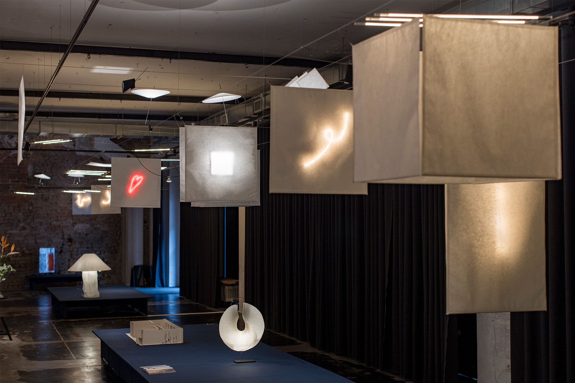
Milan Design Week 2026
Returning this April, Milan Design Week once again saw the Italian city awash with visitors eager to see the latest trends and innovations in design. Ellie Walton, reports back on her findings in an exclusive from Milan.
Milan Design Week is on everyone’s lips come Spring. For me, it’s my favourite event of the year. Ever since experiencing my first show last year, I’ve been counting down the days until my return to the capital of design. My colleagues have spent years singing its praises, and now I completely understand why. The city brims with energy, ideas and creativity; add glorious sunshine and a few well-earned aperitifs, and it hardly feels like work at all.
With Euroluce not taking place this year, I’d imagined a more leisurely pace this edition, wandering between exhibitions, perhaps even squeezing in a little sightseeing. But I couldn’t have been more mistaken. My schedule quickly filled up, back-to-back with exhibitions, interviews, product launches and installations. Factor in a few missteps navigating Milan’s streets with Google Maps, and time seemed to vanish entirely. No rest for the wicked, as they say.
This year, I saw Milan revealed not in brightness, but in glow. I dislike using the word “trends” because I think it carries connotations of being a momentary phase, and, from what I saw in Milan, I believe we are beyond fleeting trends, and focused instead on innovation and creating design that is symbiotic with our evolving lifestyles.
Moving through Milan this year, it became clear that the larger consensus on light is that it is no longer just something to look at or see with; it is an active force in shaping atmosphere, a spatial tool, and a material that can be bent and shaped, taking on a role that extends far beyond simple illumination.
Lighting as Atmosphere
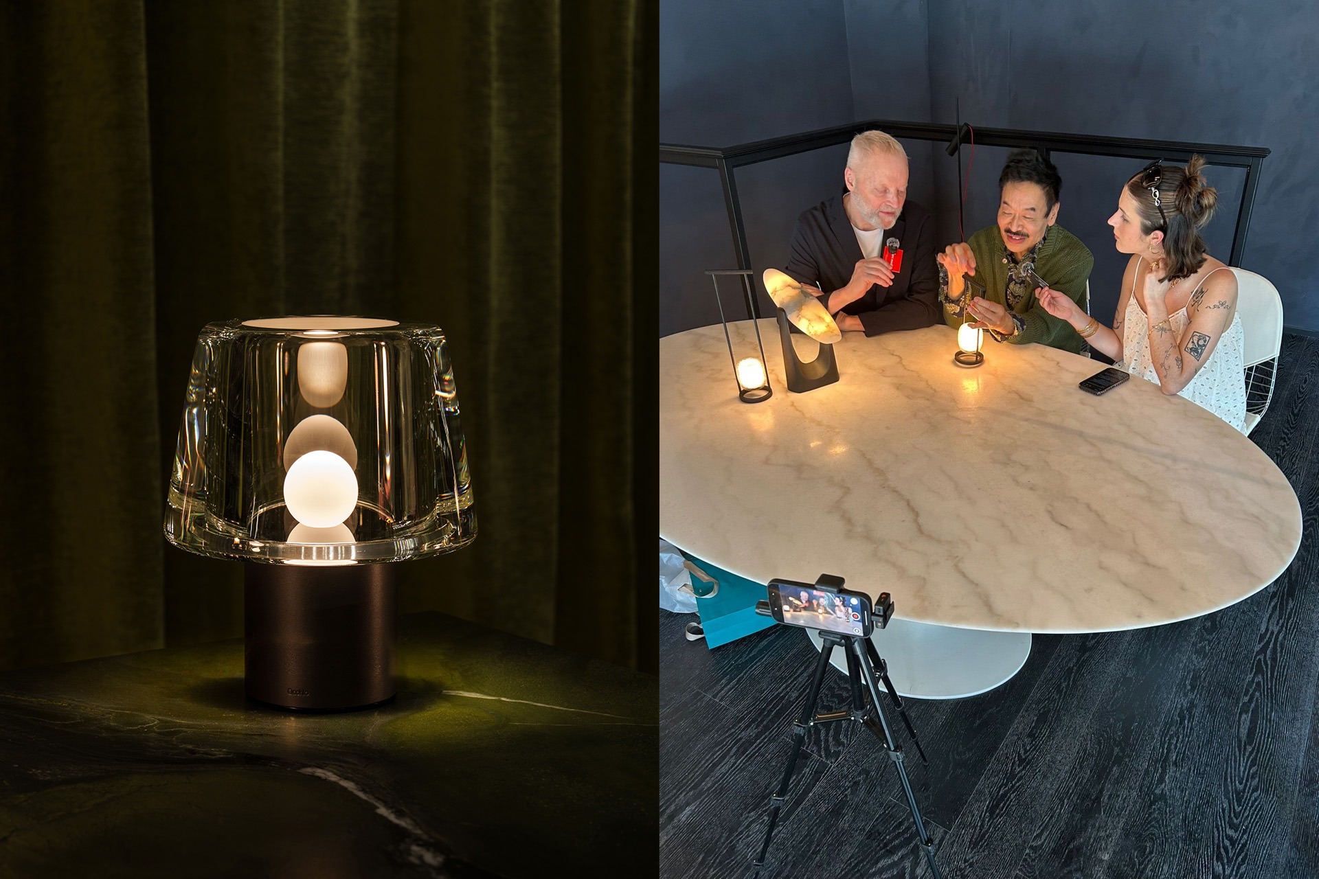
First on my list is that light shouldn’t be framed primarily as a functional tool, but as an atmospheric presence – something ambient, possibly mobile, and often sculptural. In the decorative lighting sphere, an influx of portable and freestanding luminaires has surged in the last year. A demand has clearly been heard from hospitality spaces wanting portable pieces for their tables, as well as residential homes, which now see the benefit of having a mobile source of light to take anywhere with them. Both Occhio’s Era and Moorgen’s latest collaboration with renowned interior design studio, Yabu Pushelberg, released less conventional lamps and more luminous artefacts.
Occhio’s Era premiered in their showroom in the infamous Corso Monteforte area (a hot spot for lighting design) under the title The Art of Reflection. Crafted from a solid block of polished glass and controlled through subtle gesture via motion sensors, Era relies on reflection to produce a warm, enveloping glow. Presented in the showroom on a velvet table, Era was displayed like a jewel – almost like a metaphor for light being something precious and atmospheric, not just simply functional.
A more restrained but equally evocative approach appeared in Yabu Pushelberg’s latest collaboration with the Chinese brand, Moorgen, on Moonbeam. Drawing on the form of the traditional lantern, the table map diffuses light evenly from within, avoiding directional performance altogether. Portable and sculptural, it continues the emotional and poetic idea of light.
“There’s something romantic about how light was understood centuries ago, a sensibility in China and across Asia that, with the invention of electricity and artificial illumination, lost a certain quality. When the light bulb was invented, I’d say it was almost an intrusion into our lives because it wasn’t focused; it simply answered a practical need to help us find our way,” says George Yabu, Co-Founder of Yabu Pushelberg, talking about Moonbeam’s inspiration.
Fellow Co-Founder Glenn Pushelberg adds: “With this piece, there is of course a feeling of being Chinese, but it also feels worldly, which is lovely. As George says, there’s a friendliness and happiness to this lamp, the colour, the glow and the simple form. It’s essentially a double-sided cast glass disc with an LED light source at its core. But when you look at it, it’s like looking at the full moon: not just a perfect flat disc, but something with craters and terrain.”
Meanwhile, further down Corso Monteforte, Flos transformed its professional space into an enigmatic, sci-fi environment to introduce Nocturne, Konstantin Grcic’s latest modular system. Referencing the quiet vastness of 2001: A Space Odyssey, luminous grid panels displaying iconic design pieces extended through space, situating the lamps within an abstract and cinematic landscape. An evolution of Grcic’s Noctambule, Nocturne offered a refined, discreet presence: controlled emission, no glare, and light that travelled through glass to produce calibrated reflections and transparencies.
Together, these projects suggest an importance for sculptural art in the lighting world, rather than ostentatious pieces that demand your attention; these objects allow themselves to be in a space with presence but with softness, rather than a deliberate beam of light.
Lighting as a Spatial Tool
If lighting as atmosphere was about softness and presence, Ingo Maurer’s Here We YaYaHo Again demonstrated lighting as structure and fundamentally spatial. Installed at Via Varese 13, the project revisited the iconic YaYaHo system, which was first introduced in 1984, updating it for contemporary use without losing its original spirit.
The original YaHoHo was designed as a framework rather than a fixed object. Its tension wires allow luminaires to be positioned freely across the space, allowing the user to shape light freely.
Axel Schmid, Head of Design, presented the installation and explained the aim of the new interaction was never to separate the old and the new, but to allow them to coexist by keeping the former structure and updating it with new technologies such as discreet LED lines encased in glass to create a softer, more architectural light. The system can also move further than horizontal, enabling elements to rise and fall, or even use Japanese paper elements that can double up as room dividers. Japanese paper elements also transform light, introducing a diffused look or even ‘draw’ neon signs.
Crucially, the installation encouraged interaction and play, which guests experienced during the Ingo Maurer party while a DJ spun tunes and served YaHoHo-themed cocktails to boot. What’s interesting about the YaHoHo is that components can be refigured, adjusted, and mixed over time – reinforcing the idea that light is something to live with, mould, and reshape rather than a fixed place.
Experimental Materials and Research
Alongside new products and systems, I have always had a keen interest in materials research, ever since starting the materials feature in the magazine. Several presentations moved away from finished products, favouring more open-ended investigations in which process and testing took precedence over immediate commercial outcomes.
The HYLETech installation, Light in Matter: Architectural Variations bridges the ideas of both light as a spatial tool and experimental materials; however, more technologically driven. Appearing at the Triennale Milano, the installation framed light and technology as active components of architecture. Exploring the concept of the “active wall”, the installation proposed architectural surfaces that integrate illumination, energy, and sensory functions into a single plane. Across its wider Milan presence, HYLETech Lab positioned itself less of a supplier and more as a design partner, operating between material research, spatial atmosphere and technical innovation. In contrast to the openness and play of Ingo Maurer’s YaHoHo, HYLEtech Lab suggests a future where light is increasingly absorbed into the architecture as embedded and continuous.
Moreover, Foscarini’s exhibition at the Spazio Monforte, which explored the interaction between light and 3D knitting. Rather than presenting a resolved collection, the showcase framed lighting as an experimental discipline, and examined how textile structures can diffuse light in new ways. The project was led by designers Jozeph Forakis and Lorenzo Palmeri, who worked on two different approaches to the territory of 3D knitting. Forakis, who collaborated with TexTech to generate unusual volumes through adaptations of machines and unconventional yarns, says:
“Traditional diffusers act like walls; they are barriers that light must either fight through or bounce off. A three-dimensional knit creates an entirely different dialogue. Because the material possesses genuine structural depth, varying densities, and deliberate voids, light doesn’t just hit a surface; it inhabits it. The light is gently caught, filtered, and sculpted by the micro-architecture of the stitches. The entire object transforms into a breathing volume, shifting the experience from a functional illumination source into a living, sensory atmosphere that softly redefines the space it occupies.”
Palmeri, meanwhile, worked with MAS Knit Factory and Arman Avetikyan, adapting techniques rooted in fashion craftsmanship. His investigation centred on the ability of flat textile surfaces to generate volume, using traditional tailoring strategies and carefully calibrated cuts to convert fabric into a kind of textile kirigami.
Speaking to Palmeri on his discoveries, he says: “I realised we were not simply creating decorative effects, but an entirely new behaviour of light.
At that point, the project began to open up broader scenarios, not only connected to these specific pieces but also to a possible design language. The interesting aspect was that every variation in yarn, density or structure deeply transformed the luminous atmosphere, almost like working with a living material.
A quieter but equally material-led exploration appeared in Preciosa’s Drifting Lights, presented in an immersive installation at Tempesta Gallery in Brera. Composed of suspended panels of bubbled glass, the work explored how light and colour interact through texture and depth rather than form alone. Using the brand’s 3D patch light effect, the installation transformed the gallery into a slow-moving field of reflections, where light appeared to drift across and within the glass surfaces. Less concerned with spectacle, Drifting Lights reinforced the idea of lighting as a craft-driven and atmospheric medium, one rooted in material behaviour and emotional resonance rather than technological display. (Read more on page 52)
Continuing the exploration of innovation, a notable mention would be formalighting’s installation, ORNAMENTALE, with design studio D’Alesio&Santoro. I encountered the installation during the Women in Lighting event hosted by formalighting’s Director of Operations, Sharon Maghnagi and Giorgia Brusemini, Women in Lighting Amassador for Italy. Designed around the real needs of indoor plants, ORNAMENTALE combined phytostimulating LED spectra with a high colour rendering index, allowing greenery to thrive without compromising the chromatic quality of the surrounding space. Rather than treating plant lighting as a technical add-on, the system positioned it as an integrated architectural layer, adaptable across walls, flowerbeds and vertical installations. Seen alongside the conversations unfolding during the evening, the project underscored how material research and technology were key in Milan’s wider lighting discourse.
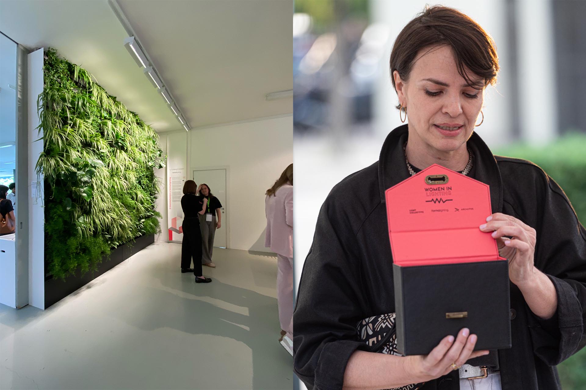
Community
Beyond the installation itself, the Women in Lighting (WIL) gathering foregrounded the social and professional networks that continue to shape the lighting industry. Hosted by Maghnagi and lighting designer and WIL ambassador, Giorgia Brusemini, the event at Ratanà offered a more informal yet meaningful counterpoint to Milan’s dense exhibition schedule. Conversations unfolded around long tables of delicious food and aperitifs rather than display plinths, reinforcing the sense that lighting culture is sustained as much through mentorship and shared experience as through objects and installations. In a week often dominated by spectacle, the evening served as a reminder that progress in lighting design also needs to happen within the social sphere through community and gender equality.
Wrapping up my experience during Milan Design Week 2026, I would suggest there is a move of priorities from designers within the lighting world, one that shifted from atmosphere over assertion, systems over standalone products, and research over immediate solution. To me, interiors are starting to focus on comfort and innovation over spectacle; however, the design isn’t compromised in the process. Whether through nostalgic references, experimental craftsmanship, or sustainable innovations, this year’s Salone del Mobile suggested the future in lighting design lies in balancing technology with warmth and meaning. Milan doesn’t simply present trends, it offers a vision into a more thoughtful experience vision that will exceed 2025.
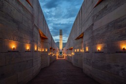
Memorial Brumadinho
Honouring the lives of 272 people who tragically died following a dam collapse, the Memorial Brumadinho creates an atmosphere of sombre reflection, in part thanks to a quietly respectful lighting scheme from Atiaîa Lighting Design
In January of 2019, a tailings dam at the Córrego do Feijão iron ore mine suffered a catastrophic failure. Located 9km east of Brumadinho in Minas Gerais, Brazil, the dam collapsed, releasing a toxic tidal wave of around 12 million cubic metres of tailings. This mudflow engulfed the mine’s headquarters, including its cafeteria, where many of the mine’s employees were enjoying their lunch break, before flowing more than five kilometres downstream towards the Paraopeba River, destroying houses, inns, farms and roads in the process.
The disaster killed 272 people – 250 of which were working in the mine – and affected 26 municipalities in the region, causing extensive damage to the local community, the water supply, and the environment in what stands as Brazil’s biggest workplace tragedy.
Following the disaster, the families of the victims formed an association to pursue justice for what happened. One of the compensations was the creation of a memorial that would commemorate those who lost their lives and honour their memory.
Brazilian architecture studio Gustavo Penna Arquitetos & Associados (GPAA) was chosen to design the memorial, doing so with close collaboration with the families throughout.
Situated on the site of the tragedy, one of the primary ambitions for the memorial was to transform the location into a space for reflection, learning, and transformation.
As well as presenting facts and figures about the day of the dam collapse and the history of mining in the territory, the memorial gives names and faces to the victims and tells their story.
Throughout the memorial, visitors will find an entrance pavilion, which includes a lobby with crystal geodes (a symbol of the “lost jewels”), a meditation space, a café, administrative and support areas, a grove, pathways and outdoor spaces, a reflecting pool, two exhibition halls, and a space dedicated to the dignified safekeeping of the victims’ remains, as well as a vast “rift” – designed to represent and make eternal the rift that caused the dam to collapse – that leads to a sculptured monument.
Across the memorial, light plays an integral role in creating an atmosphere of sombre reflection. Tasked with realising this was Mariana Novaes of Brazilian studio Atiaîa Lighting Design, who wanted to design a scheme that would be quietly respectful, inviting introspection and solemnity.
“I wanted to make people feel, that was the main idea – to feel the space, and feel the absence, but also to feel the presence as well. It was important to create a lighting scheme in which, hopefully, people would develop an emotional connection with the Memorial,” she tells arc.
“The architecture was designed in a way that people would experience different scales, and the contrast of daylight and darkness. The visitor enters from the outside into a small, dark room during the day, and then it opens out again, before entering the rift, which is a sensitive area of the project. Then this sense of different scales repeats during the journey through the rift until you access the Memorial and Testimony rooms. And later it ends in a viewpoint.
“I wanted to create something similar at night, and to balance light and darkness. I believe that when you allow darkness, you invite people to think, to reflect; darkness is a pause where you invite silence and introspection. The light is there to provide information, but through darkness, we stop seeing and we start thinking and feeling.”
Given the tragic story behind the memorial, and the input of the victims’ families, Novaes says that the reality of their pain placed the designers in a position of “profound humility”. “From the beginning, there was no I or we, but they. We were there for them. It was all about the victims and their families. The narrative belongs to those who can no longer speak, and those left immersed in grief. There is no consolation that can materialise in these circumstances. This was therefore our modest effort to honour the memory of those invaluable people whose lives and dreams were abruptly cut short.”
With this in mind, the lighting design is deliberately pared back, with low-level, warm lighting creating a soft, delicate glow where necessary. Each solution was designed to connect the visitor to the impacts of what happened, through a symbolic and sensitive interpretation.
Lighting helps to guide the journey and the experience of the memorial, highlighting planes, emphasising elements and symbols, determining zones of light and darkness, and creating perceptible contrasts across each space, according to what they represent and present; striving not to distort the characteristics and colours of the architectural materials or hide imperfections.
“When the dam collapsed, all I could think about was candlelight,” Novaes explains. “What I wanted was to light a candle for everybody. I had this in my mind because it is the most precious tribute, and it is present in any culture. This was our idea, and the architects came with a lot of messages, symbols, and meanings for the architecture, and we worked together to illuminate these messages.”
The memorial was constructed out of concrete that had been mixed with a pigment extracted from the toxic iron ore waste. The front façade of the memorial was illuminated in a way that would show all of the textures, or “scars” of the material.
The use of concrete throughout presented Novaes, on a technical level, with some difficulties, with regards to placement of lighting fixtures, as one of her main ambitions was for the light to feel “seamless”.
“We had to be very careful, because we didn’t want the fixtures to be present – we didn’t want people to see the luminaires,” she says. “We did a lot of research and tested many products, but the right answer was to use fibre optics, particularly in the rift, as these could be embedded into the walls, and the drivers, etc, would be hidden on the other side. There were also linear and grazing lights, and ellipsoidal projectors – there was a mix of products, but the most difficult part was to make them invisible, but I think we managed to hide them well enough.”
Walking into the memorial, visitors enter a dark lobby space with the date of the tragedy displayed on the wall, and where the only light source present guides them to the crystal geodes.
On the lobby’s ceiling is a small rectangular skylight, perfectly positioned so that on 25 January each year, at exactly 12.28pm – the moment of the disaster – a beam of daylight cuts through the ceiling and strikes the geodes, filling the space with reflected light. These geodes, Novaes explains, are a further tribute to those lost during the disaster. “The families refer to their lost ones as ‘jewels’. This comes from an interview at the time of the tragedy from the President of the mining company, who said that the company is a “jewel to the country”. Everybody thought, ‘you don’t say that. You never say that. The jewels are the ones that we lost, and this could have been avoided’.”
The contrast of the illuminated exterior to the darker interior spaces, Novaes feels, invites the visitor to take some time to adjust not only their vision, but also themselves, so that they can fully take in the different messages presented by the architecture.
From this lobby space, visitors then enter the “rift”, a 230-metre-long channel, in which the names of the 272 victims are displayed, each with an accompanying, illuminated Ipê flower. Through these flowers, the symbolism continues, as Novaes explains.
“272 Ipê-Amarelo (yellow Ipê) trees were planted at the site to honor the victims. It is a tree native to Brazil, and its flower is the symbol of the country. It is associated with resilience and resistance, because it loses all the leaves and blooms exuberantly during the driest and coldest season – it is so beautiful. Despite everything, life goes on.”
The decision to include these illuminated ipê flowers was made during the development of the project, as the authorisation process for including the victims’ names in the rift walls took a long time – some are still not authorised. At the time of the project, some of the victims’ bodies had not yet been found.
“The initial idea was to illuminate the names of the victims, but iIn the end, the architects and the communication designers came up with the idea that, if the names are there or are not there, by illuminating the flowers, we would still have a symbol to honour each person. This was very important so that people could see them and process their losses.
“Interestingly, when you are in the rift and you see the flowers, someone told me that they felt that it was like a procession where you carry a candle.
“This never came to my mind when I was designing it – I was only thinking that every single person is present through light. But when you see all 272 lights together, he felt that he was in a procession.
“But when you are in a procession, the person carrying the candle is the one paying the tribute, but that is not the case in the rift – the lost ones are the light, they are the ones carrying the candle. Symbolically, they are guiding us through this memorial.”
Halfway down the rift are three rooms, each further honouring those that lost their lives in this disaster. In the first space, the Memory room, the families of the victims honour their loved ones; photos and selected objects that represent each person are present in this moving, emotional space.
The second room, Testimonial, presents facts and data from the tragic event that occurred on this site, while also providing some additional information on the territory, and the history of the space, and the mining history at Córrego do Feijão. The third and final room is a sacred space that holds the recovered remains of the victims.
“What happened there is unbelievable – it is really, truly sad. And this room is very important. In this room there is almost no light, and you are not permitted to take pictures, it is a place to pay your respects.”
In the middle of the rift, right after these rooms, stands a tall monument. Designed to appear as an abstract head that “feels and cries”, Novaes says that the architect “had the idea of representing humanity and its failures”.
“When the project originally started, this was a simple white square, from which the tears would come, and then later, a map of Córrego do Feijão was added to the surface, where we could illuminate the territory, the history, and so on. And when this head cries, the tears are also illuminated.”
From the sculpture, water cascades down the remainder of the rift, leading to a viewpoint that is pointed towards the site of the dam collapse, before culminating in a lake that “collects the weeping”.
Novaes continues: “The original architectural proposal didn’t include lighting in the lake, but I felt we needed to add some lights to the lake. The mine lights are still on, and the lake would be in darkness. How do we deal well with darkness? How do we interpret and understand darkness in our culture? Would the darkness and the mine lights being on send a good message to those visiting the site? This is the last area open to visitors at the memorial, and it was our last chance to pay tribute to the victims. In Brazil, there’s a popular expression we use when we can’t explain death: we say someone has become a star in the sky. So, on the surface of the lake, we added 272 ‘stars’.
“As a basis for the design of the points of light, a map of the celestial sphere projected onto the site on January 25, 2019, at 00:01, the date of the dam rupture, was used, once again to represent the victims and convey the message that, even amidst this tragedy, there is a horizon, there is light, there is hope. Let’s think about what we can learn from this.”
Since the memorial opened, it has received widespread acclaim, garnering attention not only for the striking architecture, but also its beautiful, reflective lighting design. The project was recognised at the IALD Awards earlier this year, and was also the recipient of the SPACES Award at the [d]arc awards. However, despite this acclaim, Novaes is more hopeful that the attention the project has received will help to spread the message about the tragic event that occurred at the Córrego do Feijão mine.
“I feel very honored to be a part of this project,” she says. “I’m happy, of course, for the recognition of the work we did, but my motivation for applying for all these awards was how I, as a designer, could further honour these victims and their families, beyond doing the best possible work on the project. I felt that this project and this story needed to be heard, I wasn’t thinking about the results; I was driven by the desire to share the story so that it reached as many people as possible. There is no memory until you know what needs to be remembered. That was my motivation, and when I see the results emerging, I am very happy, because it’s much more than the work itself; it’s the meaning and relevance of the memorial being recognized as well.”
Memorial Brumadinho was intended to be a place to feel, to pause, and remember those lost by this tragic disaster. The combination of its architecture and lighting design creates an atmosphere of collective reflection – far from merely providing wayfinding or displaying information, light brings an additional, atmospheric, intangible quality. It adds presence, highlights symbolism, invites introspection, and, most importantly, honours the victims’ memory.
www.atiaiadesign.com.br
The full interview with Mariana Novaes will be available to view on the [d]arc discussions YouTube channel soon.
The Silhouette Awards Marks Five Years with London Gathering
(UK) - The Silhouette Awards will continue their 5th year with a dedicated industry event taking place on the 4th of June 2026 at BDP in Central London.
Running from 16:30–21:30, the programme will bring together mentors, mentees, sponsors, and leading lighting professionals for an afternoon and evening of talks, dialogue, and exchange focused on mentorship, practice, and the evolving realities of a lighting design career.
Since launching in 2021, through a collaboration between Parrot PR and Marketing and Archifos, the global mentorship programme has established itself as a significant platform supporting emerging lighting design talent through mentorship, creative dialogue, and international collaboration. Now in its fifth year, the programme has reached a milestone of 100 mentor + mentee pairings, reflecting the continued growth and reach of the initiative across the global lighting design community.
Opening the event, Co-Founders Eve Gaut and Katia Kolovea, will reflect on five years of development, international growth, and the expanding influence of mentorship within the profession.
A curated programme of keynote talks, discussions, and video contributions will follow, offering insight into both the opportunities and challenges facing lighting designers today - from early career development through to established practice, and the role mentorship plays in bridging that journey.
The conference programme brings together a cross-section of voices from within the Silhouette Awards network and wider global lighting design community, including opening keynote speaker Michael Grubb (mentor year 1), alongside contributions from Maria Laura Porselli (mentee year 5), Tiago Winer (mentee year 4), Fabiana Nery Pardhanani (mentor year 4), Gary Thornton (mentor year 3), Tiziana Regalado (mentee year 4), Melissa Toasa (mentor year 4) Sacha Abizadeh (mentee year 4), Marcy Song (mentor year 1), Du Xueqi (mentee year 5), and Andra Munro (mentee year 3).
Together, these sessions will highlight, amongst other topics, the realities of building a lighting design career in a rapidly evolving industry, with international perspectives, lived experience, and open dialogue at the core of the programme.
Supported by programme sponsors including Signify, Studio Due, formalighting, and One Eighty One, the evening will close with a networking reception featuring drinks, conversation, and curated surprise entertainment moments designed to extend the experience beyond the afternoon’s formal programme.
The Silhouette Awards event extends a personal invitation to emerging lighting designers, students, and early-career professionals to join the conversation and experience the programme first-hand. Studio leaders and design directors are also encouraged to support attendance by sending team members to engage in the conference and wider industry exchange.
Attendance is also open to the wider lighting and design community, with complimentary places for independent lighting designers, mentors, mentees, students, and invited guests. We also offer a limited allocation of industry support tickets for manufacturers and professionals who want to engage directly with the community at scale.
With the event capacity limited, it is expected to reach full attendance - early registration is strongly advised. For registration and enquiries, contact > info@silhouetteawards.com
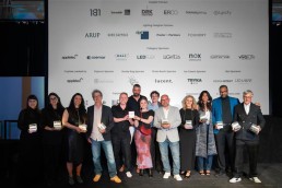
Cologne Cathedral wins big at [d]arc awards
(Worldwide) - Licht Kunst Licht team took home three [d]arc awards on 31 April, winning both the Structures High Budget category with Cologne Cathedral and the Structures Low Category for Doshi Retreat before taking home the coveted Best of the Best award.
The updated exterior lighting of Cologne Cathedral was designed using a “light follows architecture” approach. The concept replaces traditional floodlighting with more targeted illumination intended to highlight architectural details. The system was developed in collaboration with project stakeholders and was publicly unveiled on Easter Sunday 2025.
According to project details, the installation uses LED technology aimed at improving energy efficiency and reducing light pollution. The redesign seeks to provide enhanced visibility of the Gothic structure during night-time and low-light conditions.
The full list of winners, are…
-
Structures Low Budget - Doshi Retreat in Germany by Licht Kunst Licht
-
Structures High Budget - Cologne Cathedral in Germany by Licht Kunst Licht
-
Places Low Budget - Vinyl Room - Ziggo Dome in the Netherlands by Into Lighting
-
Places High Budget - Desert Rock Resort in Saudi Arabia by Delta Lighting Design
-
Spaces - Memorial Brumadinho in Brazil by Atiaîa Lighting Design
-
Art Low Budget - Hidden in the UK by Artin Light
-
Art High Budget - Pau - A Story of Light in France by Quartiers Lumières
-
Art Bespoke - Lightscape Weaver in the USA by Lightexture
-
Event - Nobel Week Lights 2025 in Sweden
-
Interior Lighting Product - Zero Mono Point by formalighting
-
Exterior Lighting Product - Kinno by Lodes
-
Decorative Lighting Product - Closer by Vibia Lighting
-
Technology Product - Revolution Display by Signify Dynalite
The [d]arc awards are supported by a sponsors: Applelec, David Village Lighting (Artemide), DALI Alliance, DRK Lighting, ERCO, formalighting, Huda Lighting, LEDFlex, LED Linear, Lucent Lighting, Nicolaudie Architectural Control, Nox.Obscura, OneEightyOne, Pharos Architectural Controls, Signify, and Vivalyte.
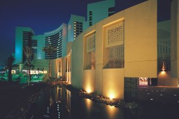
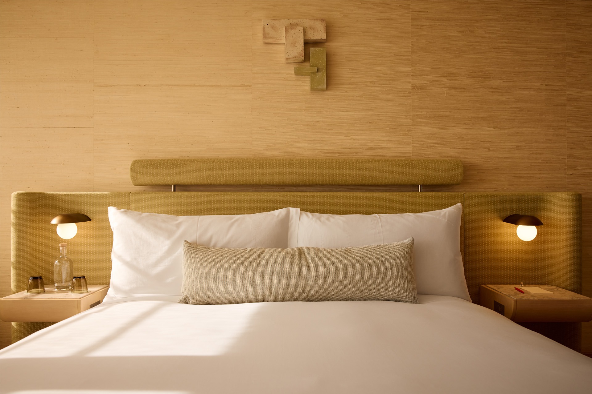
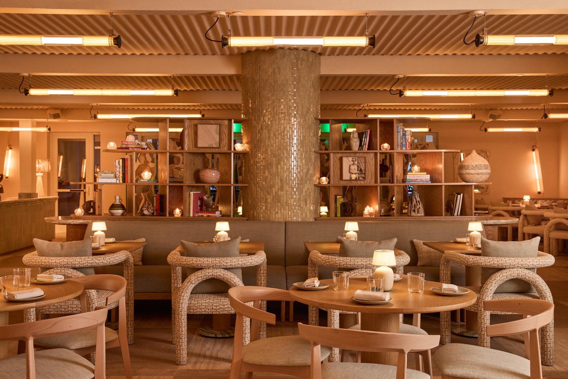
The Shelborne Hotel
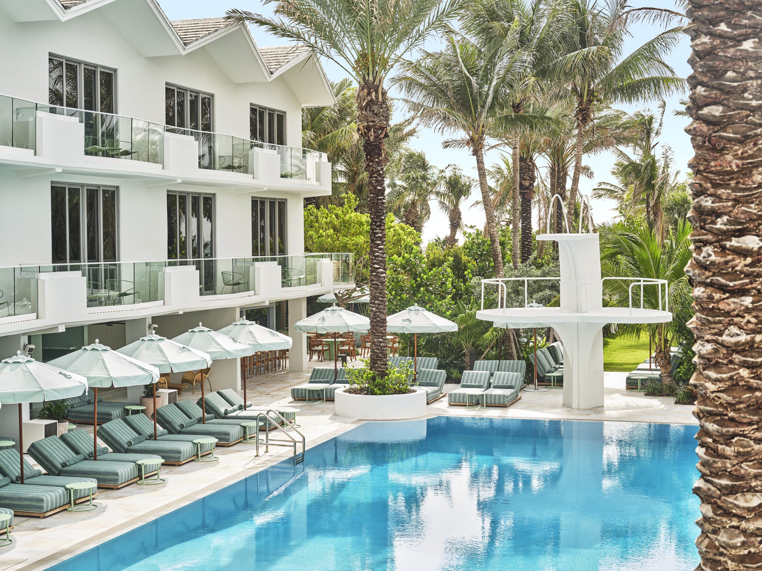
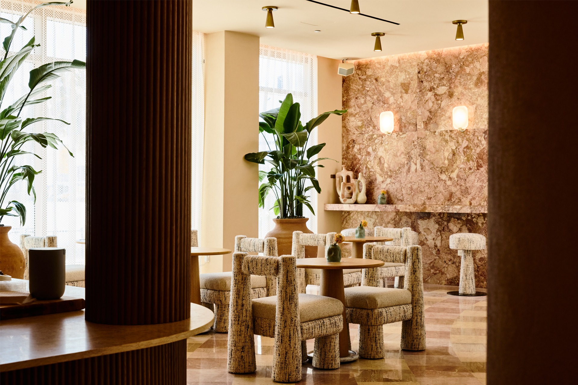
One of Miami’s most iconic hotels, The Shelborne, has been given a new lease of life through its reimagined interiors. Long regarded as a cultural institution, having hosted legends from Frank Sinatra to The Beatles, its walls have borne witness to decades of history. Under the creative direction of ADC Tuneu, The Shelborne enters a new chapter defined by texture, place, and light.
Light plays a dual role: subtly softening the architecture within it or making design statements that nod to Art Deco or 70s nostalgia. Designers Marta Tuneu and Aaron Clarke discuss with arc what it was like to work with such an iconic structure, and how they revitalised its interior while still honouring its ever-enduring place as a home for the stars.
To start with, can you tell us how you became involved in the project, what the client’s initial brief was, and how long it took from start to finish?
Tuneu: The Shelborne’s construction team knew us from Soho House Miami and we were approached. We received the initial clients brief as soon as we got on board. The brief was to create something truly special, but obviously taking into account we were working on a historical building. The Art Deco and South Beach architecture were to be taken into consideration. It took approximately two years to finalise the work.
The project merges inspiration from both Miami’s coastal context and the Art Deco era. Which elements from these influences were most important to you in shaping the design language?
Clarke: For sure, we needed to embrace the historical elements of the building, such as the façade, pool deck and diving board, the pink marble walls at the entrance and build around them. We studied all the patterns, colours, design elements, and furniture of that time and looked to replicate them in a modern way.
How did you approach integrating restored historic features, such as the 1950s pool deck and diving board, with entirely new design elements?
Tuneu: When we have historic or iconic elements, we base our design on them; those elements become the main feature of the space. In the case of the diving board, we coloured all the pool area furniture in aqua, using calm and subdued patterns to make the diving board outstanding.
Lighting seems crucial to the atmosphere. What overarching lighting philosophy guided your work throughout the hotel? And, what role did decorative lighting have within that?
Tuneu: Light is fundamental to creating spaces with a soul. Miami has a lot of natural light, so it was very challenging to adapt all the different lighting scenarios in the project, especially when it is daytime. We used a lot of decorative lighting that recalls Art Deco, with shades of brass, textured crystal, and so forth.
Clarke: Finding the right light temperature is key to creating interiors, and we always work with lighting consultants who help us balance out all the decorative lighting and technical details and ensure the light levels are perfect in every corner in every moment of the day. The hotel also has a lot of interesting shapes, and lighting must be an element to highlight the architecture, not only to decorate.
How does lighting help to emphasise the architectural gestures and material contrasts in the dramatic interplay of curving forms and clean lines in the lobby?
Clarke: As I mentioned before, we want to use light strategically in order to emphasise shapes or key elements and make sure the light levels are right at all times. Shades are important as well to create contrast and emphasise architecture.
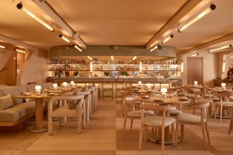
In The Little Torch bar, how did you achieve the club-like, soft-retro evening ambience? Were there specific lighting temperatures, dimming strategies, or fixture types you relied on?
Tuneu: Yes, there are a lot of dimming moments, not only in Little Torch but in every room and every space of the project. In Little Torch, we wanted to create a club-like ambience by incorporating warm light. We did not want to put wall lights in this case; the light comes from above, and little decorative lights were placed on top of the marble tables, so when it is dark, you can use the tables to get your cocktails and appreciate the colours created. Little Torch is sometimes used in the daytime for events, as it has great natural light coming from the glass brick wall. In the afternoon, it gets the orange lights coming from outside - the orange lights are for turtle protection. They happen to look great there and tell part of the story.
What role did both decorative and technical lighting play in shaping character versus function throughout the hotel?
Clarke: They are both important and complementary. Decorative lighting makes a statement, and the technical is required to balance out the light and create the ambience. They work perfectly together in all our projects.
Throughout the space, how did you approach lighting the varied artworks to ensure they remain both visible and protected?
Clarke: The artwork that we used at the Shelborne is very textured; some are woven, others are a plastered finish, etc. We did not use a lot of picture lights, as these kinds of textured artworks speak for themselves. We positioned the art, thinking about how it could work within the space with day and night lights. Therefore, they are all protected from direct light on top of them.
With so many layered textures - travertine, onyx, patterned rugs, pastel marbles, etc. - how did lighting strategies ensure these materials read correctly throughout the day and night?
Clarke: Daylight is very strong in Miami, so the spaces need only a little strategic lighting on key features with decorative lighting. Technical lighting and strategic lighting focal points ensure the visibility of all these materials at night.
What emotional journey did you intend guests to have from the moment they step into the lobby? How does lighting contribute to that sense of arrival?
Tuneu: The arrival at the lobby is very special, very warm, and chicness added by the art and furniture. From here, you can see how the main corridor curves, with light and shadow to create a wonderful atmosphere that gives a unique experience just as you walk in.
How did you approach lighting in the guest rooms to foster comfort without losing design personality?
Clarke: Again, it’s finding the right balance between natural light, decorative light and technical lighting. All lights are dimmable, so you can get different intensities at different times of the day.
Pauline, the restaurant, incorporates geometry, feminine textures, and Latin American vibrancy. How did you tailor the lighting to support this particular narrative and culinary atmosphere?
Tuneu: That space is very particular; it is a bit different from the rest of the hotel. It has a great geometry with its very iconic round windows. We wanted to create a Miami version of fine dining, and therefore some statement decisions were taken in the ceiling and walls. We wanted to emphasise the wavy ceiling that recalls the waves of the sea and the feminine shapes by using repetitive tubular lighting that lights 360°.
Clarke: For the walls, since the space has very beautiful angled structural pillars, we decided to use the same tubular feature to emphasise the angles and recall the architectural bones of the space. There are a few lighting points in the shelf unit that we have in the middle of the space. We wanted to create a focal point for all the Caribbean inspired design elements featured in this section.
Were there particular challenges you faced working within an historic building? Particularly, any issues with lighting integration or electrical constraints?
Tuneu: Yes, as an existing structure, it does not offer the same flexibility as if it were a new building, where you can position any lights in any position. There are places where some lights can’t be anchored. In turn, we had to be creative in making the full elevation work. We had the same approach with the ceilings. In terms of the exterior, there is a strong regulation in order to protect the turtles, the outdoor lighting is orange, and that reflects in the interiors. It just happens to create a beautiful, relaxing lighting atmosphere all around.
Did you work with a lighting designer on this project? If so, what do you feel the benefits are of working with lighting designers, and is this something you do regularly?
Tuneu: We worked with Luciforma; these guys are great at shaping projects, they give a 360 vision for day and night. They are great in helping us find the perfect light intensity in all spaces, considering decorative, technical and natural light in every season, working together. We normally work with lighting consultants because for us it’s crucial to have this kind of collaboration to achieve the best results. In addition, we must be challenged and have a different opinion and perspective on our decisions. We always listen to the experts who help us in every project, as they know their field, and after all, teamwork makes a difference and leads to successful designs.
On reflection, were you pleased with the results? Is there anything you would change if you had the opportunity?
Tuneu: We are very pleased with the result. We are very lucky to work with the best teams on this project, and as a studio, we are very adaptable and look to make a project work perfectly with what we have.
Client: Proper Hotels
Interior Design: ADC Tuneu
Lighting Design: Luciforma
Photography: Courtesy of Proper Hotels
Lighting Specified: DCW Editions, Marset, Hudson Valley, Santa & Cole, plus various antiques and vintage pieces from markets.
40 years of crafting atmospheres David Collins Studio
https://vimeo.com/1186868659?share=copy&fl=sv&fe=ci
Lewis Taylor, Creative Director at David Collins Studio, joins us for another episode of [d]arc discussions, marking the studio’s 40th anniversary. In the conversation, Taylor unpacks the thinking behind the David Collins Studio’s distinctive approach to lighting, reflecting on standout projects and its latest venture: the Gourmet Pavilion at Wynn Palace.