
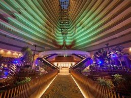
Parkroyal Collection, Marina Bay, Singapore
At Singapore’s Parkroyal Collection Marina Bay, Light Collab has used light to breathe new life into the vast atrium space, creating an energising space both for guests, and for the abundant plant life.
The recently-renovated Parkroyal Collection, Marina Bay (formerly known as Marina Mandarin) in Singapore has seen the remaking of neo-futurist architect John Portman’s spectacular hotel. Originally built in 1987, the existing hotel has been transformed, with its vast atrium now filled with plant life and vibrant light, thanks to a new lighting scheme designed by Light Collab.
On entering the hotel, guests are greeted by an abundance of lush greenery, most notably a 13-metre green wall, and cascading planters that create a scenic, 180º view of a forest. The journey into the hotel also includes entering a glass lift and, on reaching the fourth storey, crossing a gently lit bridge, flanked by more greenery, to the reception desk.
Light Collab became involved in this re-lighting project after the client recognised the need for a lighting designer, due to the complexity of lighting up the newly introduced greenery in a space with little natural light, along with the new interior design scheme.
The challenge for Yah Li Toh, Principal of Light Collab, was to introduce layers of light into the impressive atrium space, working with limited existing lighting points, integrating the new and old elements, as well as effectively illuminating the trees and planting scheme with healthy, biophilic light.
While grow lights are definitely needed to support the growth of the garden, achieving certain technical requirements of photosynthetic active radiation levels, the general concern was how the exposed grow lights would co-exist with the general lighting and impact on the desired ambience for the hotel.
Toh explained further: “The architect had a vision of bringing the garden indoors, so we did a site study and measured the amount of daylight and PPFD (Photosynthetic Photon Flux Density) available at different times of the day, and unfortunately we realised that there was little PPFD that would be able to sustain the life of the plants and trees – the PPFD measured as little as 2-6 µmols/sqm on average in the proposed plant positions, while the botanist recommended levels of a minimum of 150-200 µmols/sqm, after conditioning the plants to require less daylight, in comparison to outdoor conditions of more than 1,000 µmols/sqm. There was also a limited time of exposure to daylight too.
“Although in Singapore, there are examples of green walls with plants and ferns being lit by grow lights, this is the first time that trees were planted in an atrium with very little daylight - as little as 2 µmols/sqm - and where the plants would be very visible to hotel guests from all angles at all times. The higher the output of PPDF, the higher the light intensity naturally. This meant that we needed a strong concept to work with the grow lights – they needed to have very controlled optics, with optimum PPFD output so as not to ruin the ambience of the hotel, focused enough to optimise growth on the trees and shrubs, and also co-exist well, look good, natural, and not give out the purple hue commonly seen in grow lights. We also studied and tested many brands of grow lights available, and the cost and performance differs greatly.”
The overall lighting concept was to enhance and complement the built form with the soft forms of nature. To do this, Light Collab therefore sought to use very controlled optics, the highest PPDF per watt, high R9, colour rendering and tunable white solution of the grow lights; by keeping the colour temperature at 3800K during the day, it creates the feeling of being in a forest in daytime, while in the evening, the temperature reduces down to 3100K, transforming the space into an atmospheric gardenscape. Lighting levels change throughout the day, responding to the natural lighting environment and the needs of the greenery. The grow lights also double up to form part of the overall scenes and ambience of the atrium, which was originally too dark before the renovation, while also supporting plant growth.
Complementing the grow lighting for the plant life, Light Collab also developed the interior architectural lighting for the common spaces of the hotel. This has been designed to enhance and highlight the ambience of the space, as well as elements of the interior architectural features, to create more focus and emphasis on the gardenscape. Light Collab’s lighting design incorporated the overall lighting in the reception, atrium space, as well as the landscape lighting. Lighting in the dining areas was also designed at ambient levels, allowing the greenery to take centre stage.
The key architectural considerations for the new lighting, Toh explained, were to “respect John Portman’s original architecture, and the new interior elements, features by FDAT Architects and the landscape content by Ramboll Studio Dreiseitl”.
Respecting the original architecture meant, for Toh, working around the huge, curving atrium space. Illuminating this vast space proved to be a challenge, but it was one that she relished. “In addition to the complexity of the 360-degree view, the growlights and plants, the upper guestroom corridors still had the original lighting strategy, which was implemented in 1987,” she said. “Some of the features were retained, such as the corridor lighting, which was kept darker so as to not gain too much attention. But the form of the atrium also posed challenges for light mounting options. It was interesting to try and work with the new elements, while respecting and balancing the existing elements.
“For the rest of the hotel, we also tried to balance the focus and bring attention to the atrium and the gardenscape,” she continued. “For example, in the all-day-dining restaurant, there were also special interior design features, but it was also about the view and the connection into the atrium. The interior design heavily used mirrors, reflective materials and curves, which all required careful integration.”
Throughout the project, Light Collab worked closely with the interior designers, along with the rest of the design team, to ensure that the lighting became synonymous with the wider design scheme. “For certain features, the other design consultants had an idea of how it should be lit, but it mostly required a vision to tie the concept together. There was a constant communication back and forth, and we hoped to be able to bring new perspectives to the space that the interior designers may not have thought about.”
Hanging in the centre of the atrium, suspended high above the plentiful plant life, is Orchidea, a sculpture created by American artist Richard Lippold. This sculpture was not previously lit with much consideration, instead just illuminated with some floodlights that had been in place since the 80s. Toh sought to use light as a means to breathe new life into the sculpture and make it the key focal point of the space. “We tried to bring new perspectives on how light can interact and bring life to the sculpture,” she explained. “Being metallic, it presented opportunities to create a shimmering effect.
“We used four narrow beam spotlights to highlight the sculpture, so that when the metallic parts move, they also create an interesting shimmer. We were limited though by the available positions to place fittings in the atrium without being too obtrusive and glaring to the hotel guests from various viewing points.”
In bringing new light to the Orchidea, Toh was presented with the opportunity to transform the sculpture into an integral feature of a light art show, interacting with its metallic forms and bringing extra life to the atrium each evening. The show, which runs hourly from 7-9pm, sees the atrium shift from a gardenscape into a futuristic space of light and sound, bringing out the artistic playfulness of the architectural elements within the atrium space.
The two-and-a-half-minute show has been designed to engage onsite volumes and planes with the Orchidea, enhancing the interaction of light and space with the suspended wires and geometric forms soaring through the atrium and engaging the space as a whole, further bringing out the mood of euphoric futurism and spiritual aspiration.
The combination of the artistic lighting for the Orchidea and the grow lighting for the plant life meant that this was a unique project for Light Collab, with a wide variety of challenges and hurdles that needed to be overcome. However, Toh explained that, with the support of an understanding client, they were able to comfortably overcome these challenges.
“It is the first project that we have completed where grow lights are used on trees in an interior space where there is not much daylight. The challenges are different, as we had to use artificial light to try and ensure the survival of the plants and trees, so my team and I felt a huge responsibility for this,” Toh explained.
“When we first conceived the idea of the various scenes in the atrium changing throughout the day, transforming from a “forest” to a “garden”, we also went further and looked at how we can possibly bring together all the elements in the atrium, together with the setting, the greenery, and the Orchidea sculpture, how we can transform the atrium with special scenes so that in this interior space, there is opportunity for variety, and things to happen. This is even more important, since there is no view out from the enclosed atrium, except for the skylight. Thus we felt it was important to create changes in scenes, to break the monotony at intervals. The client was very supportive with all of our ideas, allowing them to become reality.”
Since the project was completed last year, Toh has seen a swell of positive reaction to the new lighting within the hotel and how it serves to complement the overall space. She said: “We were excited and curious to see how people would react. Overall, we were delighted to see people taking photos and posting on social media, saying that it looks great at every angle, without having to add filters.
“We also noticed that people would come out of their guestrooms, and restaurant-goers would come in to see the Orchidea light show. Guests in the atrium would start becoming curious about the transformation happening.
“Lighting has brought life to the atrium for the people, while also doubling up as survival for the greenery – it is the perfect bridge for both people and plant life.”
Naera Hotel, Spa & Art Gallery, China
Merging art and light to create a beautiful feeling of escapism, Klaasen Lighting Design has helped to turn the Naera Hotel, Spa & Art Gallery in Xitang, China into a picturesque, relaxing retreat.
Born out of a passion for art, organic farming and international luxury travel, the newly-opened Naera Hotel, Spa and Art Gallery in Xitang, China, has been designed with rest and relaxation in mind. The resort, situated just over an hour’s drive from Shanghai, is the realisation of the childhood dream of owner and developer, Zhu Shu Lei of Xitang Zhidi Cultural Development, who, after failing to find an international operator brand that shared the same views and vision for his hotel concept, decided to create his own brand.
The resulting Naera Hotel is part of a wider redevelopment of East Xitang, and has been created to reflect his desire to provide a retreat based on top quality service, spa and wellness treatments, mixed with the beauty of art and the nourishment of organic farm food; around 2,000 different teas have been selected to be made available to guests, providing a different selection of teas in rooms each day.
A destination for escapism, from the moment guests arrive, they are transported into a different world. The drop off point is screened off from the busy main road by a dramatically illuminated wall, and guests enter through a “landscape portal”. From here, they travel through a meandering, uplit screen maze that leads to the reception. The deliberate maze walk is intended to wind people down on the way, centring their minds and spirit in calmness. Art works are also located along this walkway, and throughout the hotel, giving each journey a sense of exploration and discovery.
The Naera Hotel, Spa and Art Gallery has been designed by Shanghai architects Leeko Studio to reflect a typical Chinese garden, with all public spaces located around a central courtyard. Lighting for the resort was designed by Martin Klaasen and Grace Eng of Klaasen Lighting Design, with the intention of being the “glue” that reinforces and brings out the uniqueness of both the architectural design, and the interior design of Horizonal Space Design’s Ju Bin, while also adding to the sense of exploration, showcasing the artwork and creating a peaceful feeling of calmness in the Chinese garden. Throughout the resort, Klaasen and Eng utilised warm colour tones, concealed lighting and controlled light levels, with accent lighting to highlight artworks, in a scheme that adds to the experience for visitors.
“We didn’t have a specific lighting brief, but our approach was implicitly based on my prior collaboration with the interior designer, who loves our approach of concealed lighting, focused accents and controlled lighting levels, bringing into value the key features of the overall architectural and interior design,” explained Klaasen. “Our design style and understanding of the lead consultant’s design philosophy was key.”
The prior relationship that Klaasen shared with both the architect and interior designer Ju Bin is something that he feels helped throughout the process, as there was an immediate, implicit understanding between their goals and ambitions for the project. “When Ju Bin was approached for this project, he insisted to the client that he wanted us to be appointed as part of the team as well,” Klaasen continued.
“The close collaboration that we had was key to the success of this project, but more than that, it was the mutual trust and respect, and the ensuing friendship between the owner and his consultants that created the base for the success. When each expertise is valued, respect and understanding is shown for each other, the results generally surpass expectations, as was the case in this project. It also makes the collaboration a joy and motivates each member of the team to put in the extra mile.”
The harmonious relationship that Klaasen has with Ju Bin helped to create a space in which the lighting is seamlessly integrated within the wider architectural and interior design. Light serves as a tool to enhance the interiors and bring extra focus on the smaller details within each area, whether this is one of the art exhibits on display, or the materials used by the interior design team.
“Lighting is often called the glue that gels everything together, so the identity is created by the architect and interior designer, mostly. The lighting designer’s role is to create the appropriate lighting effects, moods, accentuation and dynamics that reinforce this,” Klaasen continued.
This is particularly evident in the entrance walkway, where the lighting is kept very minimal – there is no signage or downlighting, light is only used to illuminate the panelling that lines the corridor, with additional spots on the pieces of artwork on display. This minimalistic approach is something that was key to Klaasen’s lighting design, adding to the sense of intrigue and discovery for guests. “It was a deliberate choice, and one that came after close consultation with the design team and the owners to make sure that we were all on the same page,” he said. “As a general rule, lighting should have a supporting role, not a dominant or overpowering role. It’s about the space, and the experience of the space, not about the lighting itself.
“The intrigue and exploration of what the hotel has to offer is brought to life by the lighting, and by carefully choosing the lighting effect, the angles of impact and the moment of visibility as you move around. As the guest journeys around the hotel, the task of the lighting designer is to reveal the spaces, their architectural features, and art as a visual experience. It is planned, and it is timed.”
On practically every corner of every area throughout the resort, there are pieces of artwork – from guest rooms to the corridors, restaurants and even the washrooms. Klaasen Lighting Design therefore added focused spots of light to showcase each individual piece. However, this was not without its challenges, as Klaasen explained that going into the project, they didn’t realise quite how much artwork there would be. “We always knew that there would be art and artworks, but we never knew to what extent, how big, what shape, what size,” he said. “It was only in the last few months before the opening that we started to get a feel for what this fantastic art was going to be.
“We had to challenge ourselves to find solutions, because we had provisional lighting put in place, but it was without really knowing what was going to be put where, and I think even the artist only decided on some of the artworks once he was here. That meant that the infrastructure for lighting was there, but it was not perfect. We had to improvise along the way to bring in some additional lighting, move some lighting, maybe add in some conversion lenses or spread lenses – find ways to adapt to the situation that we had with the lighting that was already in place.”
The willingness and ability to adapt is something that proved beneficial for the entire design team throughout the project, as Klaasen explained that there were some instances where the interior designers would have suggestions for the lighting, while conversely, on other occasions, Klaasen posed alternatives for the interior design that would allow lighting to be better integrated.
Such examples can be found in the cove lighting, which required several adjustments to get just right, and in the recessed step lighting as well. However, despite these various challenges, Klaasen believes the strong sense of communication helped them through: “Like in all projects, your design is as good as the end result, so communication, supervision and site assistance to the contractors implementing your design are crucial to its success. Explaining and educating all parties involved in the realisation of your lighting design of the installation requirements and the intended lighting effects to be achieved is crucial.
“The challenges become even bigger if there are language barriers, but luckily our team was able to communicate our design intents in detail, and supervised to see the intended effects achieved.”
The desire to create a sense of wonder and discovery through lighting extended to the outside areas of the resort as well. The hotel is built around a central courtyard; inspired by typical Chinese gardens, this courtyard consists of a large body of water, punctuated with islands of trees and a central pavilion. The lighting here sought to utilise the reflections of the water to create a magical feeling of peace and calm.
This feeling was enhanced by the deliberate decision by Klaasen to avoid using any façade lighting on the hotel’s exterior. Instead, light emanates from within the building, where people are seen as silhouettes moving through the connecting corridors and walkways – it was a design decision that transforms the courtyard completely after dark. “During the day, the natural light lights up the building, you can see the architecture, you wonder what’s inside. After dark, it’s exactly the opposite,” he explained. “At night, the effects are practically reversed, with light radiating out from the interiors.”
This design decision meant that the lighting designers had to work hard to ensure that all outward facing areas had balanced lighting, with brightness kept at a level so that overall, it looked consistent and uniform – a difficult task when these areas, including the restaurant, bar, tea house, lobby and library, all had different lighting requirements. This was achieved though, through clever positioning of the lights and carefully managed dimming levels.
Because of the enclosed nature of the central courtyard, Klaasen had the opportunity to use the outward facing areas as elements in a special, colourful light show that can be viewed from all around the hotel. Playing at the top of each hour, sometimes with increased frequency, the show consists of carefully selected colours that slowly move or change. The play of colours has been designed to be non-intrusive, so that it does not interfere with the normal operations or public activities of the hotel, but instead creates a relaxing experience for guests to enjoy.
Since the hotel was completed, it has received a great deal of praise, from the staff at the resort who claim that the lighting design is some of the best that they have seen, to the interior designers who feel that Klaasen has truly captured the “Oriental” style of lighting. The client has also said that the lighting adds the “finishing touch to the hotel”, and Klaasen believes that the approach of the client was integral to the success of the project. “An understanding and respectful client that validates and trusts your expertise, mixed with a great vision and understanding of design and the design process, made a great difference,” he said.
“As a designer, a happy client is all you can wish for. It means you have more than satisfied their expectation, you validated their trust in you. If, as part of that, you also feel \you have fulfilled all your own design visions and expectations, you have realised a project close to perfection, something that does not happen often.”
He concluded: “The great collaboration, respect and understanding between the client and the design team has created a result beyond everyone’s expectation, myself included. It seamlessly integrates lighting, architecture, interiors and landscape as one overall experience.”
Crown Sydney, Australia
The newly opened Crown Sydney is the latest landmark on the Australian city’s iconic harbour. Lighting design from both FPOV and NDYLIGHT help bring this landmark to life.
Opened at the end of 2020, the towering Crown Sydney resort is a marvel of modern design that brings bespoke luxury to the heart of the city’s harbour.
Located in Barangaroo, Crown Sydney brings together a luxury hotel, apartments, restaurants, spa, retail and gaming under one roof in a new, world-class venue.
Designed by Wilkinson Eyre architects, Crown Sydney has been constructed not just to frame the views of Sydney Harbour’s icons, but to stand alongside them as a defining landmark of the city. The concept takes its inspiration from nature; composed of an elegant, curved geometry, the tower’s form is reminiscent of three petals that intertwine together towards the sky, and its sculptural shape maximises the opportunity for accommodation to make the most of the views of Sydney’s famous bridge and harbour.
Standing at 271.3-metres tall and spanning 72 storeys, it is the city’s tallest inhabited building, with only Sydney Tower, an observation tower, reaching higher at 305-metres. The curving geometry of the tower was derived using parametric 3D modelling and accommodates a 60º twist in the outer skin, with helical columns on the perimeter while maintaining a vertical core structure.
The curving façade is accentuated further by a series of tall, slender, curved elements pinned as an overlay to the glass and solid structure behind, known as ‘The Veil’. The original architectural concept for the resort included a lighting concept study, prepared by Speirs Major, that addressed intentions for the Veil façade at the lower levels of the development.
Having previously worked successfully with Speirs Major, lighting design studio NDYLIGHT was appointed by Crown Sydney to execute the design in 2015, a commission that not only included the Veil, but also guiding the whole authority lighting approvals process for the exterior lighting, which included aviation obstacle lighting and bringing together input from other consultants on external deck and signage elements to present authorities with consolidated approvals documents.
Steve Brown, Director of NDYLIGHT, explained further: “Not only did the Veil have to look great, but the lighting of it had to comply with AS4282 in terms of spill light, which was especially critical to both the residential developments across the road to the east, and to the nearby Sydney Observatory, with which significant discussions were held.”
With its slender, curving features, the Veil is almost whalebone-like in its colouration and structure, and its curvature made the modelling of the design, and the eventual illumination, an interesting challenge. Brown continued: “The conceptual design included a bit of a journey looking at whether we could affix luminaires to the Veil itself – which was quickly discounted – and studies whether some form of linear lighting solution at the base of the Veil would work; this was also discounted.
“After a serious amount of modelling, we decided that close offset individual luminaires with a significant amount of cross-lighting was the answer. As much as anything, this was driven by the available mounting locations: narrow canopies on the eastern and northern sides, and the glazed roof of the outdoor dining terrace on the harbour side.”
As the Veil is gently overhanging, it was possible for the lighting designers to employ uplighting from the canopies below, yet still terminate the beams of light in the structure by narrow lensing and tight focus, eliminating unwanted light spill.
Brown explained that it was never the intention that the Veil be evenly lit “as if it were a billboard”. But rather, it was felt that the lighting should support the organic semblance of its structure. “From concept through to execution, the goal was always to modulate the light to bring out the three-dimensional curvature of the Veil elements, and try to get some shadow play here and there,” he said. “In essence, the same as a lighting designer would try to do with a three-dimensional object on a theatre set.”
During the process of illuminating the Veil, NDYLIGHT worked with Illumination Physics, who approached the project at the time of tender with an alternative luminaire option that, Brown explained, “seemed to meet all the technical requirements needed for the successful execution”.
The luminaire option was its Circular Wash Series, fitted with asymmetric, Quattro lenses and glare shield accessories. However, as the designers sought to control unwanted light, Illumination Physics needed to design an elaborate anti-glare device. The design of the glare shield was complicated by the optics used, which produce a 60º beam in the long axis of the symmetric lens – honeycomb louvres cannot be used with wide-angle optics, and a standard snoot was also unsuitable as it too would interfere with the lighting effect.
Illumination Physics therefore designed a custom solution based on a full snoot with cut-outs to allow the 60º axis to function. Longitudinal louvres were also added in the same orientation, further reducing any view of the light source.
Brown continued: “The biggest issue was how to mount the luminaires above the canopies with a system that allowed the luminaires to achieve the requisite pan and tilt to ensure effective cross-lighting. A site mock-up was held, which confirmed both that the mounting would work, and the effect was ‘as expected’ – always an important milestone!”
The final installation of the Veil lighting was commissioned in December 2020, with the outcome looking “remarkably like the modelled version”. All the Veil lighting is dimmed, and runs at pre-curfew levels before 11pm, with a lower curfew level after 11pm to comply with light spill requirements.
Stepping inside the vast, curving tower, lighting designers at FPOV were tasked with designing the interior illumination. The studio has a long-standing relationship with Crown Resorts, dating back to its work on the City of Dreams project in Macau in 2005, and it has since worked on projects in Crown Melbourne, City of Dreams in Manila, and provided advice on projects in the UK and Sri Lanka.
In this instance, FPOV was asked to work with a team of various designers from around the world to make this flagship location “a benchmark project for the region”.
Mark Elliott, Global Creative Director at FPOV explained the interior lighting concept further: “Key to the client’s expectation was a feeling of drama, light and shade, all those tag words that we use in the description of what we deliver, but with a well-educated client, they really meant it and expected it to be delivered, and understood what was needed to deliver that.
“With a client like Crown Resorts, they are so knowledgeable about what the best in the hospitality industry are offering globally, why venues are successful and why some are not, that there is no hiding behind jargon or baffling with technology; you are pushed to deliver the best, anything less is unacceptable.”
Given that the project spanned five years from concept to completion, Elliott added that FPOV had to be careful in the initial design stage that what they were proposing would still be forward thinking when the project was complete and that “any of the innovations of iconic selections that were made would still be individual and not mainstream in the future”. As such, customised solutions for decorative equipment were fundamental, with a background of architectural lighting to support. Architectural lighting in this instance predominately came from IBL’s Lightkit, with additional fixtures from unonovesette and Intra Lighting complementing the statement decorative pieces throughout.
With the resort including a hotel, apartments and a spa, as well as a number of bars and restaurants, FPOV had the mammoth task of providing the lighting design for all client-facing spaces. However, while for some, such scope could be quite daunting, the FPOV team instead relished the additional challenges that a project of this size brings. “It was great because it meant that we were in control of the whole client journey from one space to the next, so we could create both harmony and contrast between spaces where appropriate,” Elliott said.
“The key challenge on a project of this scale is not necessarily the design, but the project management and the other 50% of what being a lighting consultant is about, a part of our job that is not only equally, but sometimes more important than the design: the consulting.
“The client takes many aspects of what we offer when selecting the right consultant, and sometimes the experience of ease of collaboration and coordination with a consultant can carry a heavy influence.”
The need for collaboration and coordination was intensified by the multiple design teams involved across the many aspects of the project. Elliott continued: “As with any large project, it’s a collection of smaller projects held together by the interconnecting transition areas, and there’s where the consistency comes in. The majority of our coordination was between Meyer Davis out of New York, which did the hotel and apartments, together with the MICE and some F&B spaces. Bates Smart worked through the gaming spaces and associated F&B venues, and then beyond that a series of specialist F&B design teams did the various venues across the tower.
“We were very lucky that we had worked with Bates Smart consistently on previous projects, and so there was a level of confidence in us that enabled us to make the suggestions we felt appropriate. They had specific ideas around what they wanted to achieve, especially in the decorative lighting arena, but we worked with them during mock-ups and samples.
“Meyer Davis were also a great team to work with, very calm and accepting of suggestions and input from other consultants. Their design is very personalised and far from a corporate approach to hospitality: layers of details, purposeful selection of materials for all applications, creating an accessible, luxury design aesthetic.
“They were both very collaborative and we all had to be that way on a project like this to ensure that we provided a fully integrated solution.”
Working with such a wide range of designers on the project could have created a series of headaches for FPOV as they sought to create a harmonious lighting scheme throughout the resort. But for the lighting designers, the challenge was working out when to create harmony, and when to do something different. Elliott continued: “With the plethora of interior designers on the project, and the variations in their styles, we needed to ensure that the lighting enhanced their aesthetic, while creating harmony throughout the project.
“We had to take prompts from the usage of the various spaces, together with the overall design aesthetic. An example of this would be in the Italian restaurant and the Nobu restaurant – the lighting techniques are generally the same, but there was a heavier focus on decorative lighting in the Italian restaurant to create a soft, warm ambiance, whereas in the Nobu restaurant, there was a much higher contrast, and it was more architectural.”
Integral to the building’s design is its twisting, curved form; while this is architecturally incredibly impressive from the outside, such a shape caused further complications for the interior design.
Elliott explained: “The building is effectively a twisting, irregular-shaped cone, so all the external walls tapered either in or out. Each of the hundreds of guest rooms were therefore not only a different size, but also a different shape, which meant that every room needed individual consideration. This is an epic task, given that in a typical hotel you would have a handful of room types, but here we had many.”
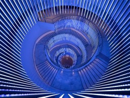
Alongside the many contrasting guest rooms, an integral architectural feature within the hotel is the vast, swirling podium spiral staircase, which forms a key focal point for the main entry. Although the staircase doesn’t extend into the lobby, visitors have a clear view through the void from the lobby space. Accentuating this iconic statement, FPOV used light to enhance both the form and volume of the staircase, while providing an additional layer of luxury that “only a hotel resort provides”.
“I’m particularly proud of the solutions we used for the focal staircase,” Elliott said. “Wilkinson Eyre created the space, form, volume and flow of the staircase through the 3-4 floors it transitioned as an architectural statement at the heart of the building, but a hotel resort demands some sparkle and luxury extravagance; so we designed what I would term as an “architectural chandelier”, fused into the structure of the balustrade so that the form wasn’t impacted, but the visual impact was definitely there when you needed it through the opportunity to create dynamic and colour changing solutions for special occasions.”
Following the hotel’s opening in December 2020, Elliott reflected on how this project, and in particular its sheer scale, compared to others that he has worked on in the past. “Years ago, during my time at Isometrix, I worked on the Hotel Puerta America in Madrid, which had a multi-faceted team of interior designers on a single project, but it didn’t quite have the scale of areas this project had.
“Subsequently, I have worked on a number of large hospitality projects, but this would be the first that brought the two challenges together on this scale.
“One thing that held this project apart from others, for me, was the quantity of custom-designed feature elements, driven by the need for individuality, that were always designed via a collaborative process between my team and the interior designers and clients – sometimes led by the interior design team, sometimes by our team, and sometimes by the client.”
The strong collaborative nature of the project is something that has stuck with Elliott since its completion and is one of the defining aspects of large-scale projects such as the Crown Sydney, maybe even more so than the design itself. “On a project of this scale, one that challenges you over a number of years, you can expect to form relationships with other consultants that will endure. And hopefully the design we delivered, and the process of our consultation and collaboration has formed these relationships to take forward to other challenges,” Elliott reflected.
“It’s an exercise in design, but also a journey to improve on your weaknesses and expand and take advantage of your strengths. At the end of a project like this, there is a feeling of relief, but also pride and gratitude that you have learnt something new in the process.”
While the strong sense of collaboration is one of the crowning achievements for Elliott, he and his team at FPOV have created a lighting design that beautifully complements the wider design of the Crown Sydney and its myriad areas.
Looking back at the overall lighting design, Elliott concluded: “As with any project that is appropriately illuminated, lighting brings the project to life, enhances materiality and form, encourages clients to move through the spaces, to enjoy the venues in an environment conducive to a luxury experience and provides a multi-dimensioned, day-to-night, tailored and bespoke destination.
“You can tell very early on when a project is going to be one to remember, I have a few key projects that I think define my career, and this is now certainly in the fold.”
Brasserie Astoria, Sweden
Drawing inspiration from its cinematic past, the Brasserie Astoria in Sweden seamlessly blends lighting design from Paloma Design Studio with Joyn Studio’s rich interior design scheme to create a dramatic space.
The Brasserie Astoria has been located in one of Stockholm’s ‘it spots’ from the early 20th century. Originally built as a cinema, the now restaurant, which is part of the Frantzén group, has undergone a design overhaul with lighting design by Paloma Design Studio and interior design by Joyn Studio.
arc caught up with Jenny Loqvist and Sofie Bamberg, two of three partners of Stockholm-based Paloma Design Studio, to find out more about their design journey and process for this project.
“During 2016-17 we worked with the client Frantzén Group on their flagship restaurant Frantzén,” Bamberg explained. “This restaurant went on to win both the Swedish Lighting Design award and also received three Michelin stars in 2018. Thanks to that successful collaboration, we got the opportunity to get involved with this new venture with them.
“Overall, it’s been a process of two and a half years from concept to a finished restaurant where we worked closely with Joyn Studio the entire way.
“We got involved in the project early on when the first design concept was set by the client and the interior designers. The venue is an old cinema originally built in the 1920s, so to create a cinematic feel was a natural starting point,” Bamberg added.
Taking direct inspiration from the building’s history, the team was able to create a design scheme that played on contrasts, combining themes of “rustic elegance”, “relaxed but cheerful”, and “elegant but permissive”.
Spreading over two floors, the 1500sqm restaurant contains several spaces that allowed the interior design team to explore different moods and experiment with varied experiences, all whilst maintaining a common theme throughout.
Loqvist explained how the lighting concept was incorporated into these spaces and what they hoped to achieve: “Our idea was to create scenographic lighting where you would clearly experience different moods depending on the room you were in. Both the interior and the food offer the customer varying sensations and pace. The idea was that you should be able to dance in a shimmering and pulsating bar environment, but in the room next door be able to sit down for an intimate dinner for two and enjoy a candle-lit environment and a world-class meal. Our job was to enhance this and bring these ideas to life through light.
“Throughout the whole process we worked very closely with the interior designers, who in turn have worked closely with the client. In the original concept, from the interior design team and the client, there was an overarching idea of what the lighting should feel like. We were, however, given full freedom in how that feeling was translated into actual solutions and executed in the end. A continuous part throughout the collaboration was to ensure that the lighting highlighted all the materials and functions that were crucial for the interior design.”
Starting out, the team created detailed concepts with sketches and reference images early on that were verified against the interior design concept. Once both interiors and lighting landed on the same page, physical testing was carried out against various materials and colours selected by Joyn Studio’s team.
Furthermore, taking advantage of the pre-existing space, the team was able to complete onsite testing against real daylight conditions and room volumes. Nevertheless, working in a historic building also came with its challenges. “Working with a heritage building almost always means antiquarian restrictions to adhere to. In this case, this included some existing walls and architectural details that were to be preserved. So, the lighting in these areas had to be installed without interfering with the original structure.”
Further adding, in reference to the architectural considerations for the lighting, Loqvist said: “Then, we have the functionality of the space, which needs to work for both guests and staff. How do you create an inspiring light environment that also allows for the chefs to do a good job? This is always a fine line to walk, but we believe we have found a good balance here.”
The Brasserie, much like many hospitality spaces, incorporates a nice balance of architectural fixtures from XAL, Global trac, iGuzzini, Maxel, Delta Light, LED Linear, Ifö Elektriska, Flux Belysning, Flos and Orluna and decorative lighting throughout. Not only was it important for the overall design for pieces to cohesively fit, it was also integral for the light quality and form to feel consistent.
“Early on, we developed a train of thought as to how the decorative lighting should be implemented in the various rooms,” explained Bamberg. “We started with the functions we wanted the decorative lighting to have in order to best complement the technical lighting, for example ominous glittering light, shielded directed light, and so on. We always work with lighting in layers when we shape a room, and for us the technical lighting is always our focus and the decorative lighting is subordinate to this.
“The process of identifying the exact decorative lighting is one we always do together with the interior designers, since form and material are very important factors to take into consideration. Our main task in this stage is to assist with choosing the light sources that meet the quality specifications and to ensure they dim well with the given lighting control system. This always proves to be a challenge since decorative light sources are light-years behind the technology used in technical lighting.”
When it came to selecting fixtures that accentuated and complemented the restaurant’s bright and vibrant interior design, Bamberg said their focus was to ensure the lighting complemented the architecture and interior scheme by “using space, materials, colours and textures” as their starting point. “From this we decided what type of lighting principles should be used, which fixture is needed, what colour temperatures are the most advantageous and which beam angle would achieve the best result,” she continued. “Throughout the project we have continuously tested our lighting principles against materials and colours to ensure we stay on track to achieve the common vision.”
Upon completion during 2020, the team were fortunate to have not been heavily impacted by the effects of Covid-19; they only experienced minor delays to the opening date due to lockdown restrictions. “Moving forward, it will temporarily impact the number of guests and opening hours. Initially, it also means no dancing on the tables but hopefully this curfew will lift soon enough,” said Loqvist.
“We are thrilled to have contributed to creating a type of restaurant like this in the absolute centre of Stockholm. This is a big happening and a unique restaurant in the way that it has so much to offer purely in terms of experience,” she reflected. “It offers an experience that can last all the way from lunchtime into the wee hours of the night. In addition to this, they not only offer some of Sweden’s top chefs but also the opportunity to grab a drink and a spin on the dance floor in a really inspiring bar environment. We are hoping that this will be a well-visited place even for international guests once Covid-19 decides to leave us be.”
And, upon reflection of the completed project, Loqvist added: “We are very happy with the final result and most of all very proud that we got so close to the initial ideas and concept.
“The lighting really adds to the warmth and atmosphere throughout the whole venue. In many places the lighting is well integrated and hidden in the woodwork, and these elements create small pieces of jewellery and eye catching objects that really enhance the interior. Some examples of these are the glassware cabinets and the central staircase, and almost all fixtures have been painted in the same colour as the ceiling, which adds to a strong cohesive feeling and a calm and ordered sensation. This is quite a simple addition in the process but one that adds a lot to the overall feeling of the place.”
www.palomadesignstudio.se
www.joynstudio.se

Qistina Ahmad Ali
arc sits down with young lighting designer Qistina Ahmad Ali to discover more about her passion for lighting and her experiences of being a female designer in the New Zealand design community.
Qistina Ahmad Ali is a New Zealand-based lighting designer full of passion and enthusiasm for her profession. The ignition for this passion was triggered in 2014 when she attended the Light Show exhibition at the Auckland Art Museum. “My life changed after that,” Ahmad Ali told arc. “The exhibition was well balanced on the different lighting techniques ranging from the play of lighting intensities, colours and lighting scenes, which conjure aspects of the natural world. I felt an excitement that was new but hard to contain. It was like electricity running through my veins and I knew I needed to know more about lighting. At the end of the exhibition, I continued my newfound journey by watching a screening of a film called Impossible Light. It was a documentary about the design team behind the iconic lighting installation at San Francisco-Oakland Bay Bridge. The film was an adventure - full of creativity and innovation that wasn’t stifled from the design team. The process of how the installation came to fruition entranced me.
“I knew then and there I wanted to be involved in the process of lighting installations. I needed to learn about lighting as a subject on its own. How there are different lighting techniques that can change the experience and mood of a space and how lighting affects people.”
Since moving to New Zealand at the age of seven, Ahmad Ali has been brought up to believe that education is extremely important in order to become successful later in life.
“My parents brought us up to believe that staying at school, getting good grades and getting a degree would lead to a well-paying job. [However], I did not receive advice on how to choose a career path that fits with who I am. I did not have any sort of direction on what I intended to do once I left university.”
Ahmad Ali went on to study Electrical Engineering at the University of Auckland. She explains her degree choice further and how it led to her path in lighting design: “I did an engineering degree because I enjoyed practical science and it gave me the best possible opportunities to apply my problem-solving skills. I tried a variety of subjects in electrical engineering, but nothing sparked that fire in me until the lighting exhibition in the summer of 2014. That day was the start of my journey to pursue lighting design and to see where that led me.
“I was afraid of my lack of understanding of what I should do to be a lighting designer. But my passion for lighting was much bigger than my fear of the unknown. In my last year of university, I applied for job positions in the hopes that someone would see the depth of my feelings about lighting. [Then], someone did recognise the depth of my passion and offered me a position at my current employer, BECA.”
During her time working at BECA, an engineering consultancy with offices in the Asia-Pacific region, Ahmad Ali completed her IESANZ approved course in lighting design at Massey University in Auckland and graduated in 2019.
“My projects started off with road lighting and industrial lighting designs, which were highly technical projects. It requires great communication skills and patience to convey technical lighting results and terminology into layman’s terms for clients who do not understand lighting. We started winning our own lighting design work in building services and urban design, which I thoroughly enjoy. I learnt to draw up lighting integration details to assist architects, communicate how the design team could achieve the lighting outcome they intend, while being mindful of what is available in the New Zealand lighting market.
“Above all, I learnt how to create layers of lighting in a space and maintain balance. This last lesson has been something I have truly wanted to learn since I started my career, and I am happy to say I am a better lighting designer today than I was yesterday!”
When asked about her goals when she first started a career in lighting design, Ahmad Ali explained that it was fundamentally a desire to create beautiful lighting experiences. “My purpose as a lighting designer is to create truly beautiful lighting experiences for everyone to enjoy. In saying that, I am constantly thinking of new approaches to illuminate a space. This ensures that I am always striving for excellence in my design, as well as making sure that the design team is happy with my work. This is an ongoing learning process for me, because fundamentally I want to be a responsible and thoughtful lighting designer.”
Achieving this drive to become a responsible lighting designer, Ahmad Ali is continuously striving to learn the newest technology and knowledge within the industry. “I am a TechIES member of the IESANZ organisation, which gives me access to lighting training events and symposiums. I work hard to keep up to date with new lighting research and lighting technology in my own personal time,” she said. “I yearn to learn what I do not know and embrace every opportunity I can to improve myself to be an even better lighting designer.”
Despite being relatively new in the industry, Ahmad Ali has already made a huge impression on the New Zealand lighting community and is consistently receiving positive feedback from her projects. Some of her most notable projects that put her ‘on the map’ include her most recently completed DLA Piper, Minter Ellison Rudd Watts and PricewaterhouseCoopers, which are all fitout projects in the new Commercial Bay Tower in Auckland’s central business district.
“Lighting design projects in the building services and urban design sector take roughly two to three years to see a project from a concept, to be fully realised in construction. The projects that I have recently finished are my proudest achievements thus far,” she commented.
“I have received glowing feedback about how beautiful they are from clients and people who have visited these places. Each fitout had its own unique take on what an enriching work environment looks like, while still being true to the company’s identity. I am grateful that the people we have worked with continue to talk about the amazing work we do when looking for lighting designers for future work.”
It is evident her rapid success has been achieved through a dedication to her role, both professionally in terms of the technical aspects of the project, but also her attention to detail when it comes to understanding the ins and outs of a project and a client’s desires. “Every space that requires lighting has a story to tell. It is my responsibility to understand this story and do my utmost best to convey it with lighting,” she explained. “With each project, I take the time to understand the space from the architects’ concept report, which includes a pretext on the location, the client’s identity and drivers, proposed architectural finishes and desired lighting effect. I translate my understanding of these key components and bring up possible solutions to the design team. Being a good listener, understanding the project narrative and proactively suggesting possible solutions to each space is a lighting design philosophy I bring to the table. If I am not actively listening, I cannot do my best to make the client and architect’s story shine.
“Lighting can energise us or disrupt our mood. I feel it is important to understand the positive and negative effects lighting has on living things and use lighting well and responsibly. The considerations I take when planning lighting for any project are: What are we lighting and why? Have we minimised unwanted spill and ensured that the lighting is not obtrusive to neighbouring properties? Are the light levels we have designed to the lowest as practically possible for the application?
“I feel that when I take the time to think about these questions at the start and end of the project, I produce a much better and carefully considered lighting design solution.”
When comparing the New Zealand lighting community to the international market, Ahmad Ali observes it is a small, tight-knit group.
“When compared to our neighbouring country Australia, New Zealand’s lighting design market is quite small. There are a handful of lighting design studios and engineering consultancies that offer lighting design services. These are mostly found in the metropolitan cities.
“Lighting design is a well-established but niche profession in New Zealand. It is recognised as a separate profession from architecture and interior design. We work alongside architects and interior designers to achieve their vision of the lighting aesthetic, the mood of the space and ensuring that we are not compromising on lighting levels specified in relevant standards.
“There is only one approved lighting design course in New Zealand, which is not on the same calibre of education as you would find in the UK or other European countries. Lighting in these countries has been well established for much longer and the lighting community is a lot larger. There is a wider pool of lighting individuals to contribute resources into lighting research. This provides a better-quality education for people who want to become future lighting designers.
“I feel that if we focus on improving the quality of education in a tertiary course to be on par with what is available overseas, and successfully market the pathway to become a lighting designer, we can significantly boost the profile of lighting designers in New Zealand.”
Further highlighting the small lighting community in New Zealand, Ahmad Ali notes that since the beginning of her career, she has had a very limited exposure to other female lighting designers. And, as with many things, the 2020 global pandemic hindered her opportunities to broaden her network and meet fellow female designers at international lighting events. As such, she has played an active role with the Women in Lighting virtual events to push herself into making new connections with like-minded designers.
“I was adamant to meet new people as I (like many people in the world) was having difficulty dealing with the aftermath of the pandemic in both my work and personal life. Participating in the Women in Lighting Social Roulette last year was an eye-opener for what is going on outside of New Zealand and brought a huge awareness to the brilliant women in lighting. After each social roulette networking event, I felt like the weight of 2020 had been momentarily lifted and that I had an opportunity to heal when I talked about the challenges we have all had to overcome.
“I am still in contact with these amazing women and being able to talk about how much we love lighting and how we work in our respective fields in different parts of the world made me feel included in a much bigger community. These women have been a positive and supportive force that has made me feel hopeful for what is to come in the upcoming year.”
Ahmad Ali continued, expressing her experiences of being a female in the lighting world in her home country: “I feel that being a lighting designer is not an easy profession - let alone a woman working in lighting. In my career I have heard people say to me that it is ‘easy to be a lighting designer’ and that ‘any electrical engineer can do my job.’ The short answer to any of those statements is that it is not true, and it breaks my heart hearing people say this. Everything I have done up to this point in my career has been a product of hard work and perseverance.
“When I decided at university to become a lighting designer, I did not sit idly waiting for that opportunity to fall on my lap. I spent my time learning to use lighting software, reading books on lighting in architecture, finding images on the internet of beautiful buildings and outdoor spaces and evaluating where the lighting sources were hidden to achieve incredible results. My passion for lighting grew exponentially in my current position as I studied part time while working and attended lighting training seminars outside of work hours. I went to lighting supplier stores during my time-off to understand what new luminaires were in the market and where they stand price wise with their competitors. At work, I put my hand up to prepare and present to my colleagues about lighting and how we could improve our skills to deliver better lighting design solutions. I do all of this out of my sheer passion for lighting and being grateful that I can live a portion of my dream as a lighting designer.
“I have never had a lighting hero. I was intrigued and entranced by the process of what lighting designers can do and I wanted to be one. I have always been a big believer of marching to the beat of my own drum and that meant being true to myself as a creative and being the best version of myself as a lighting designer. I have had a lot of love and support from my husband, my family and my mentors who have helped me continue to blaze my own path regardless of how challenging it can be. With their love and support I can become a better lighting designer today than I can ever imagine when I first started down this path five years ago.”
International media often reports about the successes achieved by the New Zealand Prime Minister Jacinda Ardern. We asked Ahmad Ali whether having such a successful female leader has had or will have a positive impact on female empowerment across the country and how important it is to have a female role model like that. “I feel that Jacinda’s role as a leader and the journey she took to get to where she is today will resonate with a lot of women who aspire to be leaders in their desired industry,” she commented. “When you see other women achieve and overcome adversity, it makes you believe that you have the courage and resilience to step into the unknown. If these women can achieve their dreams, it is tangible for you to achieve yours.
“As a mentor for the University of Auckland Women in Engineering Network, I have met some incredible women who are about to embark on their next phase in their journey - their professional work life. I have felt worry and anxiety from them about how overwhelming it can be to attain a graduate role, given the continued effects of Covid-19 on the economy. I try to provide confidence and advice that they should not stop pursuing their dreams because of this difficult but temporary setback from Covid-19. If you keep putting in the hard work towards your career aspirations and are open to new opportunities, it is possible to achieve your dreams. I am living proof of that.”
Looking ahead, Ahmad Ali continues to fulfil current projects that were temporarily put on hold during the pandemic. She is also looking forward to sharing these lighting experiences she has created with her new network and the lighting community as well as working hard to put forward a project for the IESANZ lighting awards this year. “My future plan would be to become a Senior Lighting Designer and manage my own team of lighting designers. I want to be able to mentor the next generation of lighting designers with everything I have learnt thus far and to help fulfil their dreams and aspirations to be their best self.”
www.beca.com
womeninlighting.com
@qistina.ahmadali

GreenLight Alliance: The Greater Good
In May 2018, LVMH Lighting and Temeloy created ‘Lighting for Good’ (LfG), an eco-design Think Tank, enlisting collaboration from more than 25 lighting suppliers. Its aim is to evolve innovation, services and reliability towards sustainability in the lighting industry. Lucent Lighting was one of these suppliers.
Acknowledging the energy saving contribution of LEDs to the overall environmental impact of lighting, LfG aims to usher in a new phase of luminaire design concerned with a circular economy. An economy where efficiency in material usage, easier maintenance and plastics removal are the major headings. A LfG charter was written to judge eco-design credentials, with exacting requirements that often exceed the parameters of existing regulations. The principal partner in the writing of this charter was CIRAIG—The International Centre for Life Cycle of Products, Services and Systems. This research group is the centre of expertise on sustainability and life cycle thinking. It brings together the expertise of two universities in Montreal, Canada – Polytechnique Montreal and UQÀM, as well as two universities in Sion, Switzerland – HES-SO and EPFL.
The environmental impact indicators used in the LfG charter are inventoried into a Life Cycle Analysis, a method that quantifies the exchanges between the activities included in a product’s life cycle and the environment, related to the amount of service provided by a luminaire in terms of light output and lifetime. The Ecoinvent v3.6 Lifecycle Inventory Database, released in 2019, was used to generate the trade inventory for a typical fixture. To interpret this inventory, it is converted into environmental indicators, taking into account the potential of each substance concerned to generate an environmental impact. The IMPACT World + method, published in 2019, was used. It involves the calculation of four indicators:
• Human health (considering the effects of climate change, the use of water, and toxic substances that cause respiratory problems, ionising radiation and depletion of the ozone layer)
• Quality ecosystems (effects on biodiversity of climate change, marine acidification, water and land use, ecotoxic substances and resultant terrestrial and aquatic acidification, fresh water and marine eutrophication)
• Fossil and nuclear energies (use of natural gas, petroleum, coal, uranium)
• Mineral resources (use of non-renewable mineral resources)
The packaging criteria were considered mandatory and were not included in the LCA.
The individual criterion weight is calculated as the average of the percent reduction for the four environmental indicator scores between the baseline LED fixture system (having the worst value for
the criterion indicated in the charter) and the improved system (having the best value for the criterion), divided by the sum of the individual reductions for all criteria for each indicator. The system modelling considers the whole life cycle of the LED fixture, and a global grid mix for the electricity used during the use stage.
“As a designer I find this new approach to design very interesting. It is not about the technology available, it’s about us changing our habits, our way of thinking, in this process there is a new paradigm possible,” said Treins.
“Lucent Lighting is proud to have been one of the founding participants in Lighting for Good,” added Morris-Jones. “Originally our involvement was based around our ongoing relationship with the LVMH Group and the network developed by Nicolas Martin (Martin is the Sustainable Store Planning Manager for LVMH; a key role in LVMH sustainable policy. He originated the initiative Lighting for Good). However, over the last three years our participation has turned into something far more significant.
The initiative has allowed us to use a measured framework based on technical attributes, which provide discipline for our designers, engineers and assembly staff: this has indeed been a company- wide effort. It has resulted in new product designs. We decided to test our progress by entering our newly enhanced MiniTRIM Round in the 2019 ‘Lighting For Good’ Awards.
Having made this decision we organised several design workshops with Tiphaine and decided to address three main topics: efficiency, materials and packaging. We applied for each of these different award categories. The design team, under Gary Parsons, Lucent’s Design Director, started extensive research to find the most efficient COB on the market (with a CRI 90+). Once we found it, we began to see that the design process would not increase our costs but it was an efficient way to analyse each component in our downlight. We simplified the design to be plastic free (except COB) and decided to use a ceramic connector. In doing this we managed to reduce the weight of materials from 310grs to 200grs.
The ‘Lighting For Good’ judging panel recognised the efforts made and we won the Award for ‘Best Materials’. However, the packaging part was one of the areas where we had to change the most. We were encouraged to be plastic-free, including tape, and to use bio-ink.
We are lucky to have a great relationship with our packaging supplier who was also investigating more sustainable materials to respond to the world’s growing demands. This enabled us to quickly respond and we changed not just the packaging but the whole process. We discovered that our normal practice of using two boxes to protect our fixtures was unnecessary with the new paper packing materials and different box sizes: less materials and less time to pack.
In 2020, most of the LfG Think Tank’s onging research was about modularity to encourage thinking about circular economy. So, for the LfG Awards in 2020 we decided to submit a prototype based on our TubeLed Mini spotlight series. We developed a ‘plug and play’ LED module with an easy-to-install system. This provided the first steps to creating more modularity and allowing the possibility to re-use or upgrade the light sources in different ranges of fixtures. For this we were rewarded with the 2020 ‘Lighting For Good’ Best Efficacy Award, which provides an efficacy of 117lm/W using only 5.6W of power.
For us this is a key moment in our design process. We are shifting towards implementing further modularity and designing parts that can be used in different fixture types. We now have the understanding that you do not have to compromise the aesthetics in order to incorporate sustainability and environmental awareness.
In conclusion, thanks to Lighting For Good and its Think Tank, we have been able to be innovative while reducing the environmental impacts of our fittings.
This year, Lucent is looking forward to the Think Tank’s next tranche of work: the financial model.”
Treins picks up on this theme: “LfG knows that there is an ‘Elephant in the room’ that needs to be addressed. If the fittings can be upgraded or re-used, it is essential to find a new economic model that allows suppliers to continue to grow their business. We already know that it is not a leasing model but more B2B services. The scope of services proposed will probably vary from one client to another. This approach will allow suppliers to create a long-term relationship and adjust to the specific needs of their clients, focusing on reducing their environmental impacts. This new model, to be efficient, will need clients/designers/architects/suppliers to work together toward a remarkable transformation of our production systems and our design and construction process.
Wrapping up, the aim of Lighting For Good and our Think Tank has been to foster innovation whist at the same time reducing the environmental impacts of luminaires. We are seeing that proposing luminaires with LfG ratings in tenders is adding value and driving towards our goal.”
www.lightingforgood.org
www.temeloy.com
www.lucent-lighting.com
Reaction from GreenLight Alliance Members
Mark Ridler, BDP:
"Lighting for Good has much to commend it and its simplicity in output (fair, good, best) makes it something that you could envisage incorporation into other environmental schemes like BREEAM, LEED and WELL and it is great to see the balance between energy, other circular criteria, and quality. There is a danger that it will drive product into a regression toward the mean, for instance, certain beam angles are intrinsically less efficient and yet designers will continue to require a variety of tools in the box. LfG will not be alone in it being more easy to achieve in downlights and spotlights versus linear luminaries for instance, but it certainly challenges product design in a very positive fashion and its good to hear Lucent’s assertion that cost and aesthetics need not be compromised. To maintain a project’s ability to innovate and still keep to circular principles in the majority – it might be an evolution to give a project certification based upon a percentage of LfG product credits.
"To encourage designers to invest the time (and fee) in assessing LfG on a project, we will certainly need manufacturers to engage and readily provide the accreditation information, and so it will become imperative for LfG to grow outside the stable of the 25 early adopters. The LfG charter is open for all manufacturers to use and it will need more to engage if it is to have impact.
"There are questions too about verification and unscrupulous competition diluting impact, but again this is not unique to LfG. This is a live debate about rigour versus cost of entry and adoption.
"No walk in the park, “fair” is hard, and “best” is very aspirational. Just as BREEAM evolves its criteria and pegs its “excellent” against a year – so too LfG may need to adopt this to keep the challenge achievable."
Kevan Shaw, EFLA | Kevan Shaw Lighting Design
"It is encouraging to see initiatives like Lighting for Good emerging especially with both manufacturer and designer-oriented tools. Better still at Think Tank level, I feel there should be more lighting designer involvement as well as manufacturers.
"LfG is a scientific assessment of the different environmental impacts of luminaires. As a designer I want to go further and make a judgement not only on the thoughtful use of materials and energy consumption to make a new product, but on the real durability and options for end of first use. I think we need to get answers to questions such as the design life of a lighting product, how long the manufacturer will provide spare parts and any repair and refurbishment service offered beyond the guarantee period. If a refurbishment service is offered what will be the warranty for the refurbished product? Hopefully LfG will manage not only to capture the environmental impacts of a luminaire but also assess the benefit of circular design. It will require cross-industry input to engage this discussion to develop creative approaches not bound by existing business models and practices.
"I would echo Mark’s comments about a focus on energy use (45.5% of the rating) driving towards a mean that will disadvantage some more useful products, where necessary optical inefficiencies or phosphor inefficiencies such as those that come with warmer colour temperatures, lower the score of a lighting product.
"LfG have boldly launched their charter before other regulations have been published on the quantification of environmental impacts in products. In future it will need to keep a weather eye on or preferably be in correspondence with the emerging thinking in the Directorate of Energy in the EU and BEIS in the UK. Circular economy factors will be included in the next round of lighting regulations, therefore a degree of coherence is required across all systems and metrics in this area to provide clarity to the market on the importance of specific factors and rating systems. The different organisations must coordinate with each other and ensure there is no chance that a product rates well on one and fails another."

Three Principles for Healthy Living with Light and Lighting
Amidst the growing awareness of the importance of light and darkness for human health, Asst. Prof. Dr. Karolina Zielinska-Dabkowska and Dr. Ruth Kelly Waskett offer some key advice on how the lighting industry can respond.
The lockdown measures applied to cities and towns during the worldwide Covid-19 pandemic have had a widespread impact on people’s lives. Some have found themselves confined to their homes, with limited social contact and a reduced quality of life. Others have found that the lockdown improved their wellbeing, as more time was spent outside, instead of commuting and working in an office building, plus the benefits of spending increased quality time with loved ones.
The pandemic raised public consciousness about the need to take control of our own wellbeing and health: in particular, to take greater care of immunity. There was also concern about the consequences of extended time spent in indoor spaces, which can create mental fatigue that can manifest itself in a number of ways, including reduced productivity, lack of concentration and in some cases, depression. Many people soon realised the simple things in life that had previously been taken for granted, such as access to daylight and contact with nature, play a vital role in mental health and wellbeing.
Research in the past two decades has led us to a key moment, where we have a growing body of knowledge about (a) how important daylight exposure is for human health and (b) how damaging electric light exposure at night can be to humans and ecology. It’s now time to put this together and return to the bright day and dark night cycle that evolution engraved in us.
In the developed world, it is recognised that sleep problems connected to increased light exposure at night are associated with exacerbating existing illnesses and many prevalent diseases. Of great concern is the fact that poor and insufficient sleep has increased significantly in children and adults. Technology, diet and low activity levels are undoubtedly to blame for this, but light is the thread that runs through all of them. During the daytime, not enough time spent outside results in not just low activity levels but also greatly reduced light exposure. At night, interaction with indoor lighting and digital technology leads to an excess of sensory stimuli and light exposure, leading to excess cognitive activity and disrupted hormonal balance before bed.
By and large, people have control over the lighting in their own homes, so it makes sense for lighting professionals to help them make their home lighting environment healthier. The three principles of Healthy Living with Light and Lighting, as introduced here, should support this quest.
What Next?
Lighting practitioners, manufacturers and researchers have an obligation to focus on how to facilitate the recommendations outlined here. We also have a responsibility to help people make healthier choices with light, in the same way that the food industry has a responsibility to help people make healthier choices with food. After many years of campaigning and government policy development, food products must now be labelled with calorie content and nutritional information. Armed with the scientific evidence and knowledge we now have about the impact of light upon human health, it seems logical that lighting products should also provide helpful guidance for consumers. In addition to lumen output, this should include spectral information (SPD), as well as colour rendering index (CRI), correlated colour temperature (CCT) and flicker metrics. Finally, the right to access daylight, coupled with the promotion of healthier light sources in the evening, needs to be implemented into government policies.
Three Principles of Healthy Living with Light and Lighting
Day - Bright Light
• During the day, try to get exposure to daylight on your face/eyes before 10am, without wearing sunglasses or a hat, to activate your biological clock. This could be achieved by walking outside for a minimum of 30 minutes. Keep in mind that exposure to daylight in the morning will have a direct impact on your quality of sleep at night.
• Short-sightedness (myopia) has been linked with a lack of exposure to daylight and time spent outdoors. Exposure to outdoor daylight can also reduce the symptoms of Seasonal Affective Disorder (SAD).
• As low vitamin D status can be associated with an increased risk of Covid-19 infection, from late spring to early autumn, try to gradually increase your skin exposure to direct sunlight for 5-10 minutes each day to produce vitamin D. Note that at high latitudes in winter, it is not possible to produce vitamin D from sun exposure, therefore supplementation with vitamin D3 is necessary.
• In indoor spaces, try to rely on daylight as much as possible, and position your desk next to the window, preferably with a view out, especially when you have to work long hours. If daylight is unavailable, use electric lighting that provides a continuous spectrum of light with a high blue wavelength content, to mimic aspects of the spectral composition of daylight.
Evening - Less Light
• During the evening at home, use lighting with a warm colour appearance at night and a Correlated Colour Temperature (CCT) below 3000K. Allow for a mixture of ambient and focal lighting, ideally with a continuous light spectrum and very little to zero blue wavelengths of light. Use dimming to lower light levels and create a relaxing atmosphere.
• Use LED light sources with continuous light spectrum, rather than compact fluorescent lamps (CFLs).
• Blue light from electronic devices can supress the production of melatonin and adversely impact your sleep. This is particularly important in children, for whom sleep disturbances can severely impair and reduce the production of growth hormone, and hinder memory function. It is the interaction with technology, however, that matters most. Avoid using mobile devices such as mobile phones or tablets for two hours before bedtime. If available, features such as “night shift”, which reduce the blue energy content of the light emitted from a device screen, can be used. Such features, however, do not completely reduce the blue wavelengths of light, so will not completely mitigate the impact of such devices.
Night - No Light
• Sleep should take place in complete darkness, preferably with no electric lighting. If any light trespass from street lighting is present in the bedroom, use blackout curtains or window shutters, or wear an eye mask to minimise it.
• The National Sleep Foundation (NSF) recommends that the best time for getting ready for bed is between 8pm to 12am. The hours of sleep before midnight have been shown to benefit organ function.
• If you need to use the bathroom during the night, use yellow, amber or even a red coloured light source with zero blue wavelengths of light in the spectrum, and ensure the light source emits diffused, low levels of light.
• Try to get at least seven hours of undisturbed sleep. REM sleep phases last around 90 minutes, meaning four full sleep phases. Good quality sleep is particularly vital during illness, because the regeneration and repair of cells occurs during sleep. Sleep also boosts the body’s metabolic rate to facilitate weight loss, and several studies have linked exposure to artificial light at night to weight gain and obesity.
References
• Argys, L.M.; Averett, S.L.; Yang, M. Light pollution, sleep deprivation, and infant health at birth, Southern Economic Journal 2021, 87, 3, pp 849-888. https://doi.org/10.1002/soej.12477
• Brown, T. et al. Recommendations for Healthy Daytime, Evening, and Night-Time Indoor Light Exposure. Preprints 2020, 2020120037 https://doi.org/10.20944/preprints202012.0037.v1
• Changing perspectives on daylight: Science, technology, and culture. Science/The American Association for the Advancement of Science, Custom Publishing Office Washington, DC, 2017.
• Commission Internationale de l’Eclairage (CIE). CIE Position Statement on Non-Visual Effects of Light. Recommending proper light at the proper time, 2nd ed,. CIE Publication: Vienna, Austria, 2019; Available online: https://bit.ly/2NysTq0 (accessed on 17 March 2021).
• Graw, P. et al. Winter and summer outdoor light exposure in women with and without seasonal affective disorder. Journal of affective disorders 1999, 56, 2-3,163-169.
• Grubisic, M. et al. Light pollution, circadian photoreception, and melatonin in vertebrates. Sustainability 2019, 11, 6400.
• Lagrèze, W. A.; Schaeffel, F. Dtsch Arzebl Int. 2017, 114, 575–580. https://doi.org/10.3238/arztebl.2017.0575
• Liu, N. et al. Low vitamin D status is associated with coronavirus disease 2019 outcomes: a systematic review and meta-analysis, International Journal of Infectious Disease 2021, 104, 58-64. https://doi.org/10.1016/j.ijid.2020.12.077
• McAlpine, C.S., Kiss, M.G., Rattik, S. et al. Sleep modulates haematopoiesis and protects against atherosclerosis. Nature 2019, 566, pp.383–387. https://doi.org/10.1038/s41586-019-0948-2
• Münch, M. et al. The Role of Daylight for Humans: Gaps in Current Knowledge. Clocks & Sleep. 2020, 2, 61-85.
• Park, Y.M.M. et.al. Association of exposure to artificial light at night while sleeping with risk of obesity in women. JAMA Intern Med; 2019, 179(8), pp.1061–1071.
• Wright, K.P. et al. Entrainment of the human circadian clock to the natural light-dark cycle. Curr Biol. 2013, 23, 16, 1554-1558.
• Zielinska-Dabkowska, K.M.; Xavia, K. Protect our right to light. Nature 2019, 568, 451–453.
• Zielinska-Dabkowska, K.M. Make lighting healthier. Nature 2018, 553, 274–276. https://doi.org/10.1038/d41586-018-00568-7
• Zielinska-Dabkowska, K.M. Vitamin D. The truth about Vitamin D and sun exposure demystified. Finding the balance for personal health. Professional Lighting Design 2014, 93, 40-48.
• Zielinska-Dabkowska, K.M.; Rohde, M.F. (Eds.) New Perspectives on the Future of Healthy Light and Lighting in Daily Life., 1st ed.; callidus. Verlag wissenschaftlicher Publikationen.: Wismar, Germany, 2017; ISBN 978-3-940677-61-7 https://bit.ly/3bWg5Dh
• Zielinska-Dabkowska K.M. Home Sweet Home. Connecting the dots for healthy evening residential illumination. arc magazine 2019, 111, pp.055-060. ISSN 1753-5875 http://bit.ly/30TqCss
On Guard for Lighting Quality: The establishment of the first association of professional lighting designers
Asst. Prof. Dr. Karolina M. Zielinska-Dabkowska IALD, IES, CIE, MSLL, RIBA, looks at today’s recognised lighting design profession and its historical formation combining aspects of science and art.
Not many people in the lighting community are aware of the fact, that after electricity was invented and in general use in the United States from the late nineteenth century, only electrical engineers were responsible for the illumination of architecture. After 1906, when the Illuminating Engineering Society of North America (IESNA) was established in the USA, companies and individuals professionally involved in the field of gas lighting and natural light, were first brought together. However, this new field quickly became dominated by people applying electric light in their projects.
Members of this young discipline were mindful from the beginning, that a collaboration with architects was decisive and of great importance for the future development of lighting as a profession. One of the tasks that was set was the promotion of cooperation between these two professions in the field of architectural illumination. This included the presentation of completed projects, the monthly publication of articles in “Transactions of the Illuminating Engineering Society”, and the participation in annual conferences related to the topic of artificial illumination. In order to control the chaos of illuminated advertisement that began to flood New York, the first rules were introduced to regulate external illumination. However, architects of this period seemed rather reluctant to cooperate with illuminating engineers, as they did not want to bear the cost of additional consulting services. For many years, the relationship between these two groups was strained. Interestingly enough, the subject of architectural lighting initially did not appear in the architectural press at all. Instead, it was present on the front pages of journals and in technical journals related to the electrical industry. As the wave of lighting installations gradually spread across America, and later, also across Europe, even more of such publications were printed.
Meanwhile, on the other side of the Atlantic, in several other countries, similar associations of lighting specialists were established. First, in 1909, the Illuminating Engineering Society was founded in London, then in 1912, the German Society of Lighting Technology was established in Berlin. Later, the Illuminating Engineering Institute of Japan was founded in Japan in 1916, and then in Poland, in 1924, the Polish Electrotechnical Committee was created, which five years later, was transformed into the Polish Committee of the International Commission on Illumination.
In the IESNA professional press, there was a heated polemic between members of the association on the direction of the development of this new profession. Most wanted to follow the functional lighting path, including technical aspects, such as the amount of light and functional needs: “There is a large field for the illuminating engineer where aesthetics is only of secondary importance: in this field [he] may achieve success even though he does not concern himself personally with purely artistic side of the work.” [1]
In addition, some members believed that there was no need at all for an illuminating engineer to be creative: “An [illuminating] engineer, by reason of his education, is unsuited absolutely for the work [artistic illumination of architecture], which he sets out to do.
“He has no conception of the effects desired. He has no creative ability, no knowledge of the history of architecture and history of ornamentation, and in fact, he is working in the dark absolutely.”
Some members of the engineering community thought the architect should impose his ideas on these matters in such a way that the engineer follows his recommendations, because such cooperation will bring the most effective results in accordance with the direction set by the architect: “[...] the architect feels he should dictate in such matters, and that the engineer should follow his dictates, and this will produce the most efficient results along the lines laid down by the architect.” [2]
However, there were also new and differing opinions. First of all, there was a call for quality aesthetic solutions in illumination design as well as an artistic design approach, built on understanding of the architectural concept: “This branch of illuminating engineering is unquestionably an art, and only a science in so far as an art is scientific in its method. The illuminating engineer who hopes to cope with the lighting features of architectural problems, must be familiar with architecture.” Some professionals were also calling for better education of illuminating engineers to perform their new duty: “How, then, is the illuminating engineer successfully to cope with his problem and advise with the architect as to the best means of achieving results, if the engineer cannot appreciate and understand the architect’s viewpoint? […]. It seems, then, that a very important, if not essential feature of the engineers’ preparations is a study of the history of illumination and its relation to architectural design”. [3]
People who preferred these ideas explored the art of “painting with light”. Their lighting projects stood out because they were unusual, aesthetically refined, and brought out the beauty of architecture during the night hours. It was believed that: “The illuminating engineer who considers only the scientifically practical side of the profession is necessarily doomed to ultimate failure, for he will not be able to obtain the recognition that the importance of his work deserves.” [4]
There were also voices that postulated renaming the profession: “Viewed in its broader sense it would seem that the term <illuminating engineer> is not entirely suited to the profession, but that <lighting expert> or <lighting specialist> would more fittingly describe the broad scope that the profession should cover.” [5]
E.L. Elliott, one of the IESNA members, promoted the need for an architect to employ an illuminating engineer, explaining that “architect” means “master-builder”, and therefore, the building consists of many elements, the details of which, must be more or less known to the architect. The special task is to make all the pieces fit together, properly coordinated, so that the final result is successful and complete. In 1908, Elliott wrote: “The number of elements entering into the structure and design of modern buildings is vastly greater than anything conceived of in ancient or medieval times. With this great increase in the elementary problems has come a demand for corresponding greater knowledge of details, with the result that, in many cases, the requisite knowledge has broadened to such an extent as to render a sub-division necessary in order to leave the master-builder free to follow his legitimate office of co-ordinating the various details. This has given rise to an increased number of specialists, or engineers; and the latest among these is the illuminating engineer.” [6]
As a result of many activities undertaken in the 1920s and 30s, there was an unexpected change in the attitude of architects. This spurred a fascinating cooperation between illuminating engineers and architects. The illuminating engineers also understood that to better serve architects, they must have basic architectural knowledge. For the first time in 1930, two series of lectures related to the basics of architecture and field trips were organised for IES members in New York and Chicago, led by practicing architects and professors of the schools of architecture of the University of Illinois and the Armor Institute in Chicago and Columbia University in New York. [7] “The Illuminating Engineering Society believes that in order to be of real service to the architect, the illuminating engineer must know more about the architect’s problems and be able to talk to the architect in his own language. He should also be conversant with architectural terminology and have some knowledge of the fundamentals of that subject.” [8]
Professor Harold Vandervoort Walsh of Columbia University’s Department of Architecture described the relationship of these two professional groups: “Architects do not seek to light every corner of their building. Shadows to them are as important as light. The new movement in lighting has come about as the engineer, busy with his problems of lighting efficiency, has looked beyond and realised that the architect wanted this playfulness and emotional quality of light. On the other hand, the architect, seeing a friendly face, has turned away from his old-fashioned ideas about lighting and had awakened to the fact that the engineer has developed for him newer and finer ways of playing with light.” [9]
Walsh also emphasised the expectations and concerns that architects usually have: “The [illuminating] engineer will not classify the apparently impractical and novel ideas of the architect as foolish, but will sit down and figure out how to do them. From the flights of imagination of artists come the problem for the scientists. [The architect’s] mind will be cantered upon the best way to bring out the forms he has designed by good lighting. He will not get far with an engineer who answers his questions with, “it can’t be done”. But great progress will be made with a sympathetic engineer at his elbow, interested in helping him achieve an ideal.” [10]
This first step in the cooperation process was pivotal. However, architects were still, in most cases, the originators of the illumination concept, and the illumination engineers supported them with advice on how to achieve a particular lighting effect. For instance, where to place the luminaires, what type of luminaires to use, and what materials on the façade will be the most advantageous. Special models were also created, so it became possible to present the effects of illumination. However, the services provided by the illuminating engineer were still limited to technical advice, not to independent, creative work.
There were two Americans in the early history of electric lighting who were pioneers of the newly emerging movement. One was Walter D‘Arcy Ryan, Director of the Illuminating Engineering Laboratory at General Electric who was known for his skyscraper illumination, as well as larger projects including the 1915 Panama-Pacific International Exposition in San Francisco, or the Century of Progress Exposition in Chicago (1933-1934). Another was Bassett Jones, who was a key figure among architects active in the 1920s and 30s. Jones was an all-round engineer, inventor, theatre and architectural lighting designer. He was also a member and founder of IESNA, and one of the first to speak about key issues involving architectural lighting. He insisted on the cooperation between an illuminating engineer and an architect. Thanks to the influence of both these visionary people, interest in lighting increased in the first half of the 20th century. Yet, despite their obvious success, the profession of lighting designer remained unrecognised as an established career.
When analysing the literature, it’s clear it was really only the architects of modernism operating in the second half of the 20th century, who considered illumination to be an important tool in creating an architectural form. Additionally, there was the need to create a new specialisation because knowledge about lighting technology became too broad for the architect of the building to study, or to rely only on consultancy from the illumination engineer, as had been the standard practice.
The consequence of this was the conscious use of the services of a lighting designer where this professional would initiate the dialogue in the early stage of the design process. At that time, the style and trend of modernism proposed new, bold solutions with materials and technology, which formed an excellent contribution to the development of this new profession.
Although the number of people in America who dealt with the professional lighting of architecture continued to increase, it was only at the beginning of 1968, that the first attempts were made to institutionalise this field of lighting design. Even though many individuals created innovative work, the profession remained largely unrecognised. Initially, faced with the challenge of securing their future, a small group of passionate and inspired pioneers from New York, met monthly for informal gatherings in Manhattan restaurants, private apartments, and conference rooms, to define their new profession, and to set future goals for development.
The first meeting was at Richard Kelly’s home. The same individual known for his concept of “layers of light” or the approach of integrating three distinct types of lighting: ambient luminescence, focal glow, and play of brilliants. [11]
Most who attended had an architectural and theatrical training/background and were members of IESNA, yet they chose to connect in recognition of their unique position. Their services differed from those of electrical engineers or illuminating engineers, as their skills involved the design, application, and use of lighting that was in harmony with architecture - this was a combination of science and art. The initial goals of the emerging organisation were thus defined: “[…] to do all acts and things necessary to bring together practicing professionals in the field of lighting design; to define, develop, advance and maintain standards and excellence among Association members; and to communicate these ideas and the attendant benefits of designing lighting to allied professions and the public at large.” [12]
In 1971, the International Association of Lighting Designers (IALD) was officially incorporated, with its headquarters in Chicago, USA. Today, members of this professional organisation are designers with an education in the field of architecture, interior architecture, theatre, electrical engineering, as well as lighting design. The association unites more than 1,500 independent, professional lighting designers from all over the world. The association’s mission is to advance the global profession through advocacy, creating global standards for lighting design excellence. It promotes excellence in lighting design through the work of its members, who make a huge contribution by providing innovative and responsibile lighting solutions. These designers understand the role of lighting in architecture, interior design, and urban and landscape design, and they use their rich experience and knowledge to raise the profile of these projects. Today, as it was in the past, professional members of the IALD cannot also be involved in any way, in the sales of lighting products. Their earnings are derived from design services, which gives them complete independence in choosing the best aesthetic and technical solutions, whilst also supporting needs of humans and the external environment.
References
[1] Jones B., The relation of architectural principles to Illuminating Engineering Practice. Transactions of the Illuminating Engineering Society, 1908, vol. III, p. 9.
[2] ibid. p. 42.
[3] ibid. pp. 25-26.
[4] ibid. p. 9.
[5] ibid. p. 50.
[6] ibid. p. 55.
[7] Architect and Illuminating Engineers Break Bread together, Reflections. Transactions of the Illuminating Engineering Society 1920, no. 7, p. 749.
[8] Transactions of the Illuminating Engineering Society, 1930, no. 6, p. 535.
[9] Walsh H. V. An Architect’s reaction to the new movement in lighting. Interim Report –
Committee on Light in Architecture and Decoration. Transactions of the Illuminating Engineering Society 1930, no. 7, Vol. XXV, pp.
603–604.
[10] ibid. pp. 603–604.
[11] Zielinska-Dabkowska, K.M. Home Sweet Home. Connecting the dots for healthy evening residential illumination. arc magazine 2019, no. 111, pp. 055-060. http://bit.ly/30TqCss
[12] International Association of Lighting Designers (IALD). Celebrating 35 Years of Lighting Design Excellence, 35th Anniversary Yearbook, Chicago 2005, p. 4.

IALD: 3D Printing - an integral part of the luminaire design process
Frederik Friederichs, Group Manager at Light Bureau, explains more about his first steps into 3D printing luminaires.
It all started with a replacement part for a linear fluorescent tube. While browsing through a luminaire storage, checking for functional luminaires to salvage, I discovered a classic T5 luminaire with a missing end cap. It was a merely aesthetic flaw since the luminaire was functioning fine otherwise, and I was sure that this would be an opportunity to start investigating into 3D printing to allow me to reproduce this specific part of the luminaire. The scope was identified with a measurable goal and I tried to reverse the design process to build a duplicate from the existing end cap.
In all beginnings and when entering a new production method with different workflows, roads are bumpy and the first steps are unavoidably subject to multiple trial and error processes. But I felt that 3D printing can become an essential part of our design exploration process to find suitable dimensions, shapes and forms and serve to understand the production and creation process better.
From Idea to Form
Purchasing a sliding caliper immediately became useful when starting detailed measurements on luminaire parts. The end cap had a rather simple cylindrical shape with delicate mounting bits in the bottom to connect to the socket base. After reviewing the first 3D printed part from the 3D file I had generated, I was caught by surprise.
The 3D printer is capable of spitting out a digital model, transforming data into a tactile product. But the quality of the result was far off from my expectations, with exception of form and material thickness of the generated object. This led me to analyse the piece in detail, revising the modelling workflow and the transition into the “slicer” (the programme that translates the 3D model attributes for the 3D printer). Following these steps, I was able to refine the surface structure and quality, optimise the necessary support structure to print this piece and get consistent results. It took a few attempts to figure out the correct tolerances to make the end cap snap onto the socket without using too much force. Simultaneously, I was interested in trying different material types with a variety of characteristics besides the polylactic acid (PLA), which is most commonly used in the FDM (fused deposition modeling) 3D printing process and engaging in online learning courses that helped me to calibrate and utilise the 3D printer more efficiently.
It still feels like scratching the surface of options and opportunities connected to 3D printing, since the possibilities and knowledge exchange in the field of 3D printing are endless. But these first iterative steps to arrive at an adequate and bespoke 3D printing part made me more interested in more complex tasks.
From Form to Fit
My creative process was certainly boosted by changes around the office leading to closer cooperation with the architectural studio GPA (part of AFRY). In 2019, we started to extend the 3D printing hardware in our common workshop/light lab at the office, allowing faster and larger 3D prints. It helped us to react instantly on projects where we wanted to apply customised fittings. We were able to deliver mock-ups and conceptual solutions ranging from luminaire brackets to reflector parts. In this stage we mainly used the 3D printing capabilities to make tests and give clients an idea of scale and form of the final tailor-made product part. Due to its rapid and almost instant nature, additive manufacturing supported our decision-making process. The awareness of 3D printing was rising, and we even cooperated with manufacturers who sent us 3D data of additional luminaire parts for mock-up luminaires, since it was faster to produce these add-ons locally than to send the spare parts to us by post. This made me realise that 3D printing can become a major part of a circular economy system and a sustainable alternative for the existing linear production due to its decentralised production capabilities.
The focus changed from just using the technology to replace or supplement parts to designing a 3D printed object first, which could then be produced in series.
From Fit to Product
Materialising ideas and the production of custom-made parts has become significantly easier and more accessible through additive manufacturing. We are now able now to react and adapt to changes in the detailing stage and proactively find solutions for difficulties and issues at the project site. But to allow a higher print volume, more accuracy and sturdiness for the object, while reducing costs and production time per piece, we were looking for partners using suitable 3D printing technologies to cooperate with.
Ruten in Sandnes
One of the new signature structures in Sandnes, a city located on the west coast of Norway, will be Ruten, which has long been the region’s largest transit interchange point. The area has undergone an extensive infrastructural transformation, leading to a new key pivot point for the city featuring an urban park with a canopied ring structure. The design brief in this project, developed and designed by SpaceGroup Architects in Norway, was to install luminaires at predefined heights into approximately 60 round pillar cavities of a filigree bearing roof structure with an organic shape. The lighting concept for the urban area focuses on using mainly indirect reflected light from the canopied structure provided by the pillar integrated luminaires, resulting in a soft and diffuse lit area providing guidance and orientation while simultaneously highlighting the volume of the structure.
We are currently in the final stage of completing this project – our first where 3D printing is a vital and integral part of the fixture design.
The diameter for the prefabricated cut-outs in the pillars was defined to be 10cm and the difficulty of this task was to create a luminaire component that seamlessly connects the convex shape of the pillar and holds an adjustable standardised exterior spotlight fixture firm in place. Additionally, other challenges, such as different material thickness of the pillars and the fact that all components needed to fit through the 10cm hole as only access point, influenced the design process for the prototype.
After plenty of considerations and numerous design alternatives with regards to optimised light distribution, colour, fitting and installation, as well as in regard to the workflow for the electrician, were carried out and we arrived at a final design solution with a consistent and coordinated design for a prototype in January 2020. A mock-up was subsequently performed in a warehouse and all project participants were able to see this hybrid solution of a tailor‐made 3D printed secondary reflector and a standard exterior spotlight.
Together, with the producer of the 3D prints, we discussed object joints and fillets, material choice and thickness as well as tolerances to be able to deliver a holistic and comprehensive design that is long lasting and easy to install and maintain on building site. Funnily enough, the producer is located 20km from the building site, a fact that became significant in the beginning of February 2021.
After all components were delivered to the site, we received a phone call informing us that the cut-outs in the pillars were performed through a different method, resulting in higher tolerances of the cut out down to around 8cm. We managed to tackle this deviation by redesigning and adjusting the secondary reflector and could deliver new prototypes on site for fitting within three days, without the need to wait for a shipment from further away.
We expect the project to be done in the first quarter of 2021 and are looking forward to the results. I am of the opinion that we have not yet leveraged all of the possibilities that lie within the 3D printing technology. We are on the verge of making 3D printing a powerful element in the lighting designer’s toolbox.
David Morgan Review: LED Linear Ultima-P
LED Linear shrinks luminaire design to a new level with its latest range, Ultima. Originally due to launch during Light + Building 2020, the Ultima range has now been revealed virtually. David Morgan delves in to find out more.
The world of lighting changes fairly gradually but one continuous trend that I have experienced over many years of luminaire design is the miniaturisation of luminaires and light sources. LED Linear has always achieved a high lumen output from small profile products and has now taken luminaire shrinking to a new level with its Ultima range.
LED Linear was founded by Dr. Michael Kramer, who was responsible for sales and marketing, and Carsten Schaffarz, who looked after innovation and production. They were colleagues at Vossloh-Schwabe Optoelektronik before launching LED Linear in May 2006, initially operating from a garage. The company has rapidly grown to become one of the most recognised brands in the specification linear lighting market, with 150 directly employed staff. The company was acquired by the Fagerhult Group in 2016 and, after three years transition, the two founders have now moved on.
LED Linear has based its systems on the use of flexible LED tape, which is assembled in-house, along with all the various luminaire types at a facility in Duisburg, Germany. Sales are global with branch sales offices in major markets and a network of distributors in smaller countries.
The latest luminaire series to be launched by LED Linear is the Ultima range that was due to be launched at Light + Building 2020 but which, due to the Covid pandemic, has been launched virtually. The complete range, which has a very wide range of housing and mounting options, all incorporate an innovative, miniature, linear light engine and heat sink assembly only 13 mm wide x 10 mm deep. The heart of the Ultima range is the light engine, which incorporates chip scale 1mm x 1mm 0.2W LEDs mounted on an 8.5mm pitch. It is understood that LED Linear is the only manufacturer so far that has been able to mount chip scale LEDs onto a flexible PCB with the required precision to work correctly with optics. The light output from the LEDs is controlled with a miniature moulded reflector, only 7mm in diameter, and a nano lens optical film combination. The light engine is mounted in an extruded aluminium heat sink housing onto which a moulded miniature glare control louvre is fixed, providing glare control up to UGI 13. The NanoRay 2 optical film used in the Ultima is understood to be a further development of the earlier nano optic system used in the LED Linear Mars system.
There are seven distributions available in the Ultima range, from a narrow 10º spot up to a wide 60º beam and an opal window option for a diffuse effect. There are optics for batwing and asymmetric distributions, allowing the system to be used in a wide variety of lighting applications.
Maximum output is 1,870 lumens from the 4,000 K 80 CRI version with a power consumption of 25W per metre.
The Ultima S range - the stand-alone version - was the first to be launched in 2020. This is the basic 13mm x 10mm profile, which can be mounted with various clip designs and also magnetic strips that can be fixed with double sided adhesive tape to the body extrusion. Specific clips allow this version to be mounted onto T-bar ceilings where the width of the luminaire fits unobtrusively between tiles
The Ultima T track mounted range was then launched. This combines a four conductor low voltage track system with the Ultima luminaires allowing them to snapped in and repositioned as required without tools. Suspended, surface mount, and trimless recessed versions of the track are also available.
The latest version is the Ultima P pendant version, which I was given to test. In this instance the linear strip is mounted in a robust steel U channel to provide additional weight thus making a very neat pendant.
The samples I was given were the medium flood with a 40º beam and black louvre, and the batwing distribution fitted with a white louvre. The lit effect of the 40º distribution was fairly dramatic producing a high intensity cut off beam, which was uniform and has almost no visible colour over angle issues. The batwing version was equally impressive with a wide clean distribution.
One of the advantages in reducing the size of luminaires, in addition to production cost reduction, is to minimise the environmental impact and carbon footprint by reducing the weight of materials used. The Ultima range would fit well into a circular economy model as the mechanical and optical components all snap together very neatly. However, I am not sure how easy it would be to remove the LED tape from the heat sink extrusion after five or more years in use.
It is understood that the Ultima range was developed over a two-year period following discussions with lighting designers in various countries who expressed a strong interest in specifying smaller luminaires with high output and good optical control. The Ultima design and development was undertaken in-house with the top management team involved throughout the process. Franziska Heckmanns was the key product designer for the range, I understand.
The company reports that feedback from lighting designers and customers has been positive to the Ultima range and a number of projects have already been completed. This latest example of luminaire miniaturisation has been well executed and looks set to be a successful addition to the LED Linear portfolio.

Ruth Kelly Waskett
An Associate at Hoare Lea with a strong focus on daylight, Ruth Kelly Waskett will take over as President of the Society of Light and Lighting this May. arc speaks with Kelly Waskett about her ambitions for her Presidency, and the value of organisations such as the SLL to the lighting world.
How did you first get into lighting?
In a nutshell, I got into lighting via daylight. I studied building services engineering and after working in that discipline for a few years, I started to get involved with daylight modelling and it really captured my interest. I studied for an MSc in Light & Lighting at UCL and I just felt so at home with the blend of art and science that lighting is.
Can you describe your career journey so far?
My career could probably be best be described as an “academia sandwich”! I spent the first 10 years or so working as an engineer and then lighting consultant, followed by a five-year period in academia where I did a PhD in daylighting and became a visiting lecturer at UCL. I joined Hoare Lea in 2017 and it is great to be back in practice again. There’s nothing like seeing your designs become a reality!
How did you first get involved with the SLL?
It is because of Liz Peck. I met Liz at an SLL conference in my hometown of Dublin, and before I knew it, I had agreed to join the Newsletter Committee! Liz’s enthusiasm was infectious, and she was great at getting people involved. I think many of us are still coming to terms with her untimely death earlier this year. She had such a big impact and will be greatly missed.
What has been your role within the Society since first getting involved?
After the Newsletter Committee, it was contributing to guides, and I led the revision of Lighting Guide 10 (Daylight) in 2014. I became a Vice President in 2016 and through this role I’ve been involved in various initiatives, including an overhaul of the Young Lighter competition which has been really successful.
What was the process for you becoming President-Elect? How were you chosen?
Every year, the SLL Nominations Panel meet to nominate an individual to join the SLL Executive as a Vice President, and joining as a VP puts you on a pathway to becoming President. The Executive nomination is presented to the SLL membership and they can put an alternative nomination forward, if this happens there is a ballot.
When did you find out you were to become SLL President? What does it mean to you to be given this role?
The results of the nomination process are finalised at the SLL Annual General Meeting. So it was at the AGM in May 2020 that my role as President Elect was confirmed. It sounds like a cliché, but it really is a huge honour. Many of the past presidents are people I greatly admire and to be honest I can’t believe I’m next!
What are your goals/aspirations for your tenure as SLL President?
This role is a huge opportunity. I want to use it to recalibrate SLL, to get back to the basics of why it exists and what it is here to do. One of the key things I want to focus on is uniting diverse groups from across the industry, and I mean diversity in more than one sense – not just gender or ethn icity, but also how people identify within lighting. Some of us describe ourselves as engineers, some as designers, but we all love lighting, so let’s get together!
Have you received any words of advice from former Presidents or current President Bob Bohannon?
Bob is very supportive and has encouraged a lot of collaboration between all the VPs and the President each year, so that no-one feels isolated. It also ensures continuity in the work that Presidents do – there’s a limit to what anyone can do in one year.
How important do you think organisations such as the SLL are to the lighting community?
If you are interested in lighting, and especially if you work in lighting, then being part of a group of people with this common interest is hugely beneficial. You have direct access to not just the guidebooks but to the people who wrote them. There is a really diverse programme of events, all online at the moment obviously, which allows you to keep up to date with the latest research and thinking. Most of all, it’s a great way to connect with a group of people who share your obsession with lighting and who will not roll their eyes when you spend a lot of your time looking up at the ceiling when you go out somewhere!
You have a particular focus on daylight in your position at Hoare Lea – how integral do you think daylight should be in lighting design?
The importance of daylight is becoming more widely recognised in building design due to the drive for sustainability, and more recently because of the realisation of the crucial role of daylight to our health. But I would like to see more lighting designers integrate daylight with their practice. In the process of lighting design, we have a tendency to focus on what happens after dark and forget that for a huge chunk of the 24-hour period, buildings are illuminated by daylight as well as artificial light.
What do you think the future holds for the lighting industry?
The pandemic has changed so much, and for the lighting industry we need to embrace the new fluidity between spaces for working, spaces for living and spaces for recreation. Lighting can facilitate a huge amount of flexibility to support this change. Another impact of the pandemic is a renewed sense of responsibility over our own health – mental and physical. And of course, light is key to health; we know we need high levels of light in the daytime and darkness at night to stay healthy. I think it’s vital that as an industry we respond to this.
www.cibse.org/society-of-light-and-lighting
www.hoarelea.com
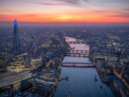
Illuminated River launches new engagement programme as artwork is revealed
(UK) - To celebrate the completion of its nine-bridge artwork, the Illuminated River Foundation has launched a new programme of engagement activities.
Launched on 13 April, the programme will evolve throughout the year, and will support the artwork through a mixture of on-site and digital activities, with free and bookable options. The programme includes interactive art trails and guided walking tours, as well as a new phase of musical collaboration with students from the Guildhall School of Music & Drama.
Spanning from London Bridge to Lambeth Bridge, the Illuminated River artworks were created by internationally acclaimed artist Leo Villareal, with award-winning architectural practice Lifschutz Davidson Sandilands. With a minimum lifespan of ten years, it is estimated that up to 90 million people a year will see the artworks in situ along the River Thames.
The Illuminated River Foundation has also commissioned new music uniquely inspired by the artwork, the Thames and its bridges, from students at the Guildhall School of Music & Drama. In this second iteration of the collaboration, dozens of original music compositions, each focusing on a specific bridge, have been created to celebrate the artwork, as well as the social history behind the structures. These will be shared in a series of releases over the coming weeks.
For example the arrangement ‘Still We Move’ by Lillian Chan, for example, explores the under-recognised contribution of the largely female workforce responsible for completing Waterloo Bridge, also known as ‘The Ladies Bridge’ during WWII. Alluding to the sentiment in Maya Angelou’s 1978 poem, ‘Still I Rise’, Chan’s commission layers female vocals with strings to emphasise a message of solidarity among women.
Free audio guides created with City of London Guides also delve deeper into the rich history of each bridge, highlighting key sites of interest along both the north and south banks of the river, and elucidating Villareal’s artistic vision.
Meanwhile, a calendar of guided tours of the Illuminated River artwork is planned throughout the coming months, with some events reserved especially for key workers. The 90-minute tours, available to book online for groups of up to six, take place on Tuesdays (for Blackfriars to Lambeth Bridge) and Fridays (from London to Millennium Bridge) and comprise a gentle evening stroll along the river accompanied by an informative professional guide.
Sarah Gaventa, Director of the Illuminated River Foundation, said: “We are delighted to be developing this programme of engagement to celebrate the completion of the next five bridges in the Illuminated River artwork.
“This launch marks the culmination of five years’ work by the Foundation, and we’re very excited to finally share it with the public. Through various collaborations with some incredible partners, we are offering a stimulating, educational and accessible calendar of activities and resources for all to enjoy.”